

AmassAI research for life sciences, with every claim traced to its source.
At a glance
- Design thinking
- Show the working before asking anyone to believe it. The plan comes before the run, and a source sits on every claim.
- Problem
- An AI research answer can draw on many sources at once, and nobody could tell by eye where a claim came from.
- Approach
- Each area was explored more than one way on real screens, and the version people could scan and edit won.
- Outcome
- Five product areas reworked, from the first question to a cited, reusable output. Our colour changes were merged into the live website.
- Role
- Lucie on product design, working with Emil Cronval, Head of Go-to-Market, and CEO Henrik Jensen. On the website, supporting Niels Andersen.
- What we designed
- Product strategy
- UX/UI design
- AI product design
- Prototyping
- Website design
- Platforms
- Web app
- Website
Four UX principles the whole product follows.
- 01Show the plan before it runsObjective, sources and steps are visible and editable while changes are still cheap.
- 02Ask only what changes the planOne question at a time, with a suggested default and a way to skip.
- 03Keep every claim next to its sourceEvidence is there at the moment a reader doubts a statement.
- 04Let evidence outlive the taskSources stay in the workspace, ready for the next project.
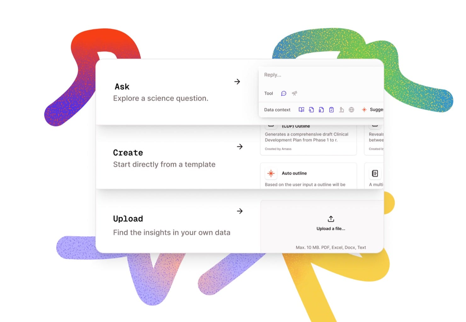
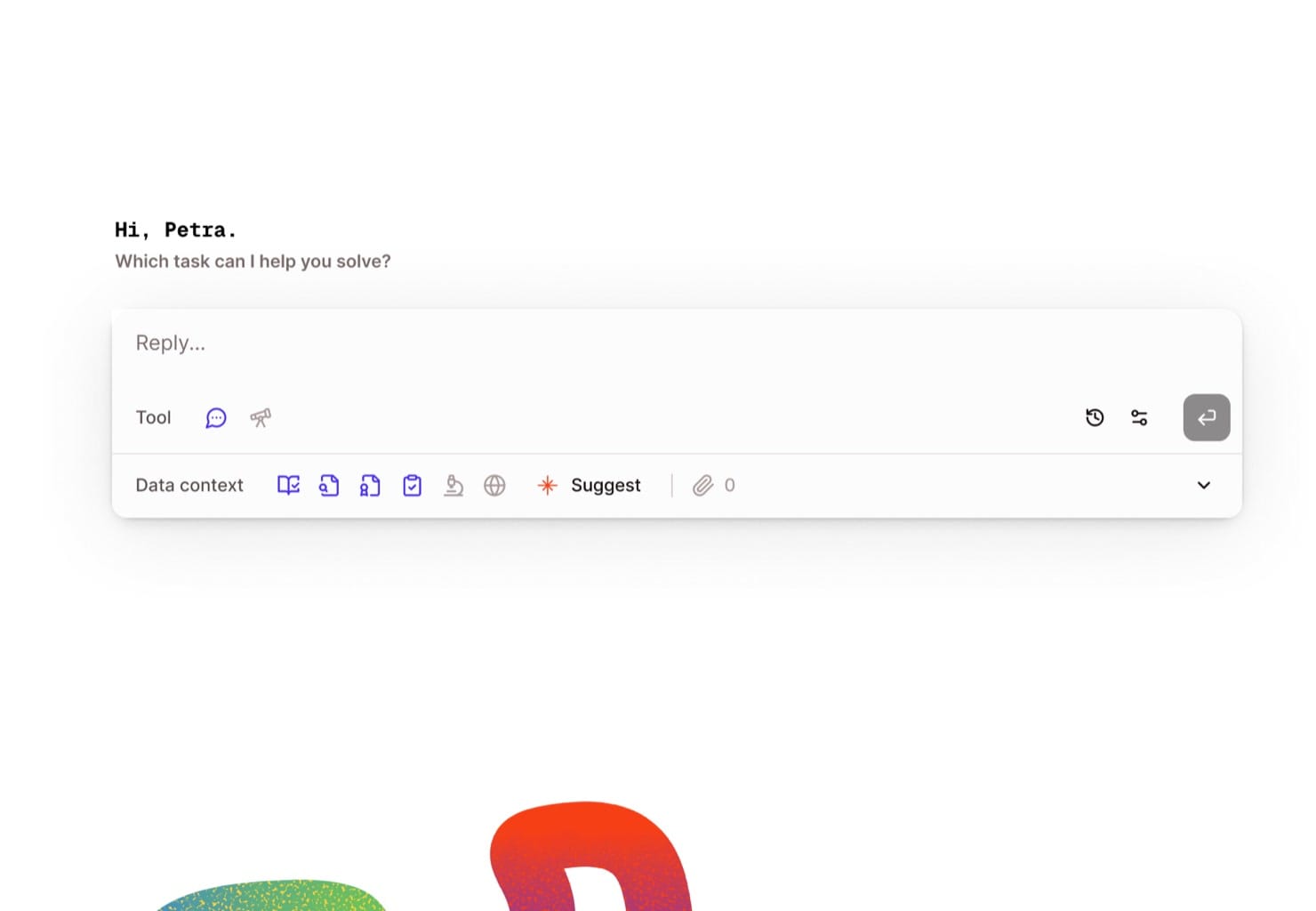
Three starting modes slowed people down, so home became one prompt.
Ask, Create and Upload each made sense, but people had to read and choose before they could type anything. One prompt with suggestions lets them start straight away.
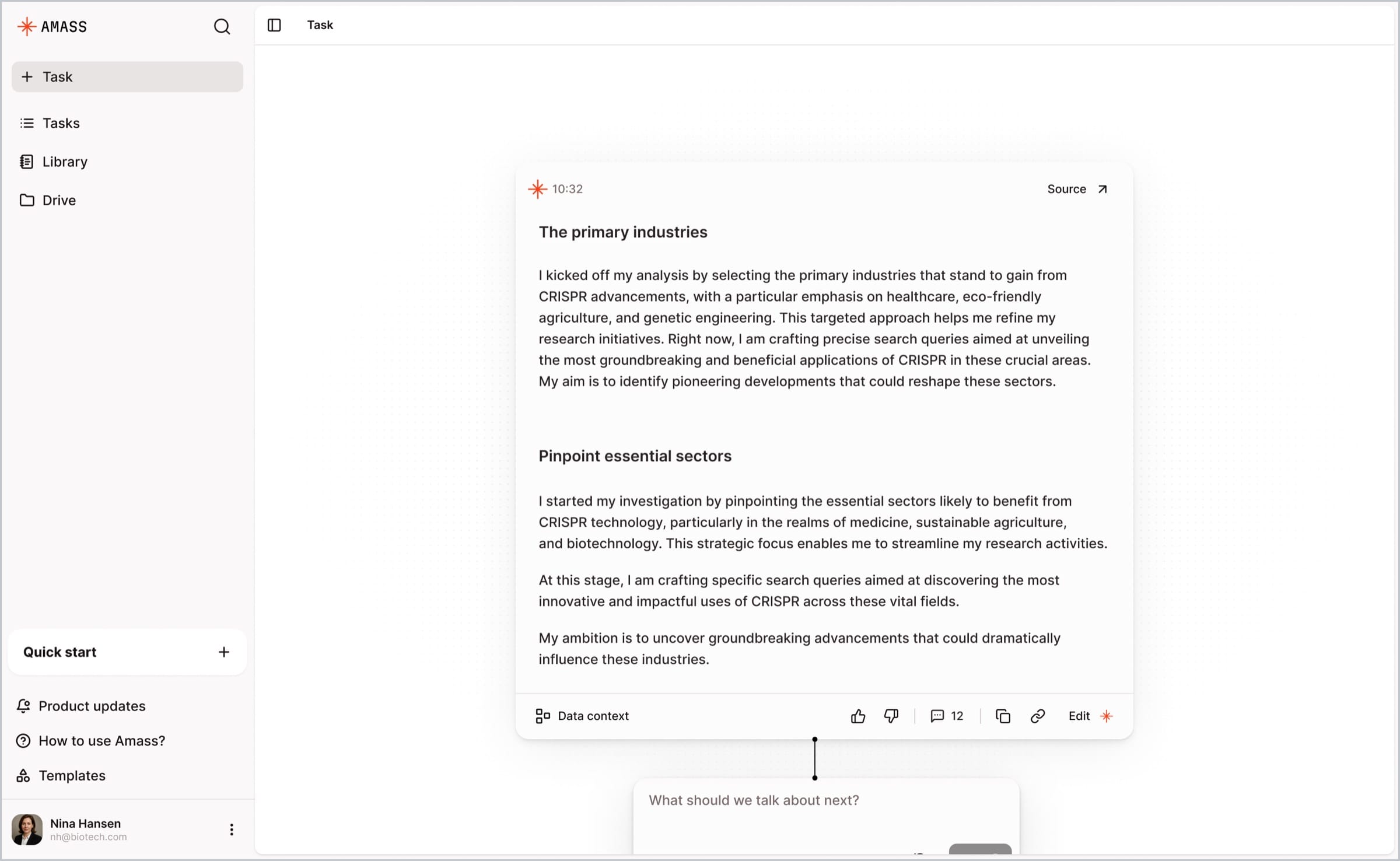
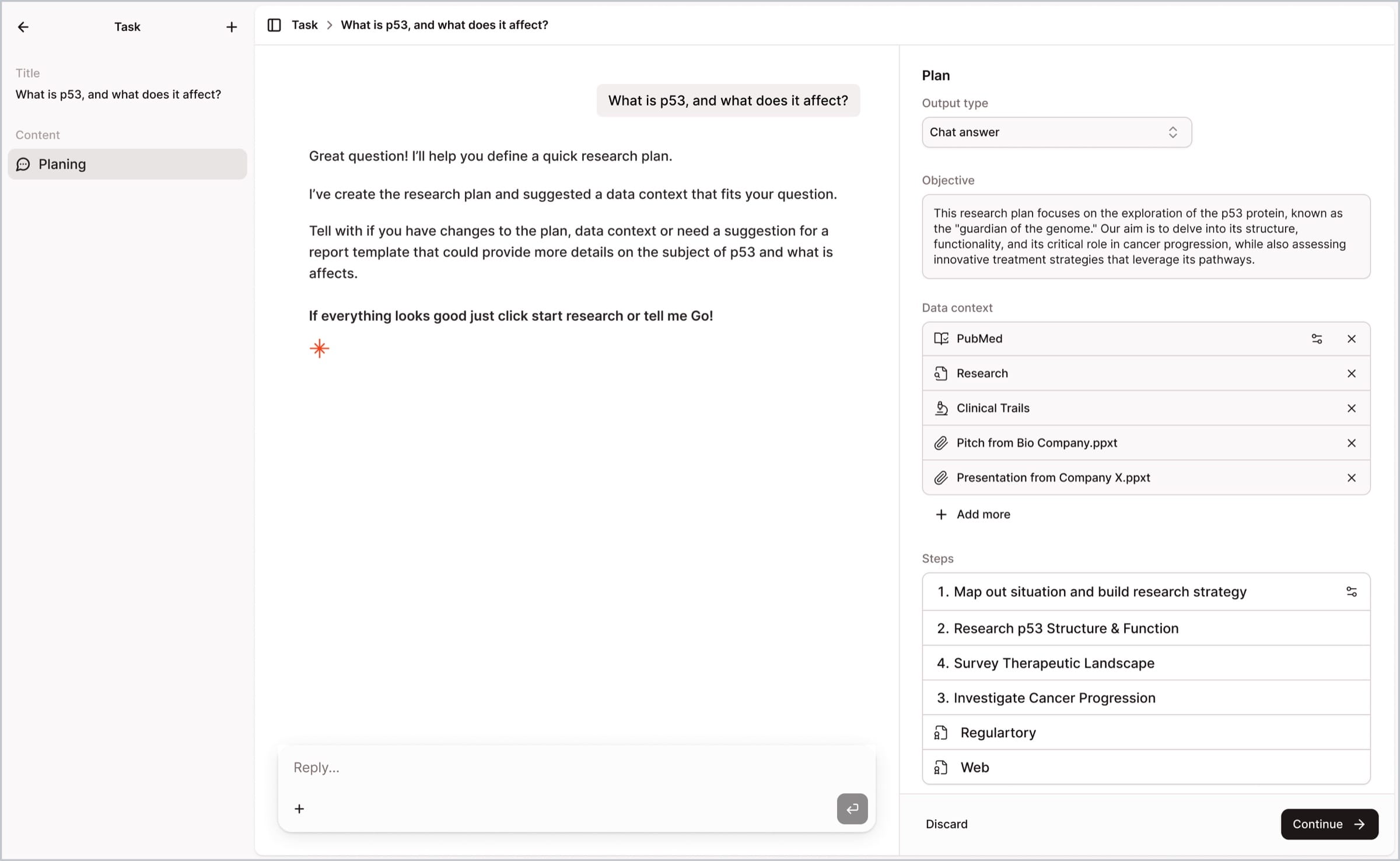
We tried a canvas, then chose a plan people can read.
An early experiment laid research out as answer nodes on a canvas. A plan has to be scanned and edited, so it moved beside the chat, in three sections that expand on demand.
Confidential work · on request
The detailed product screens are shared on request.
They show confidential client work, so Lucie sends a private link to each request she approves.
Already have access? Open the full case study
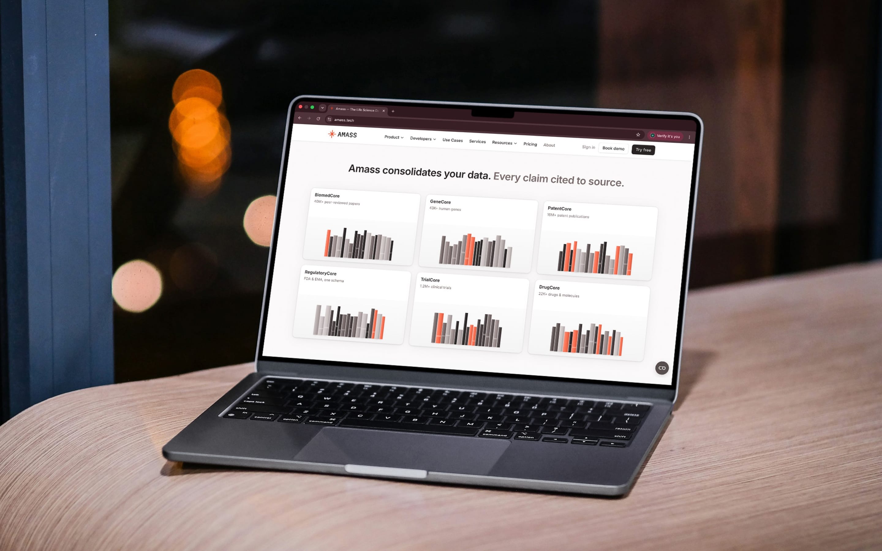
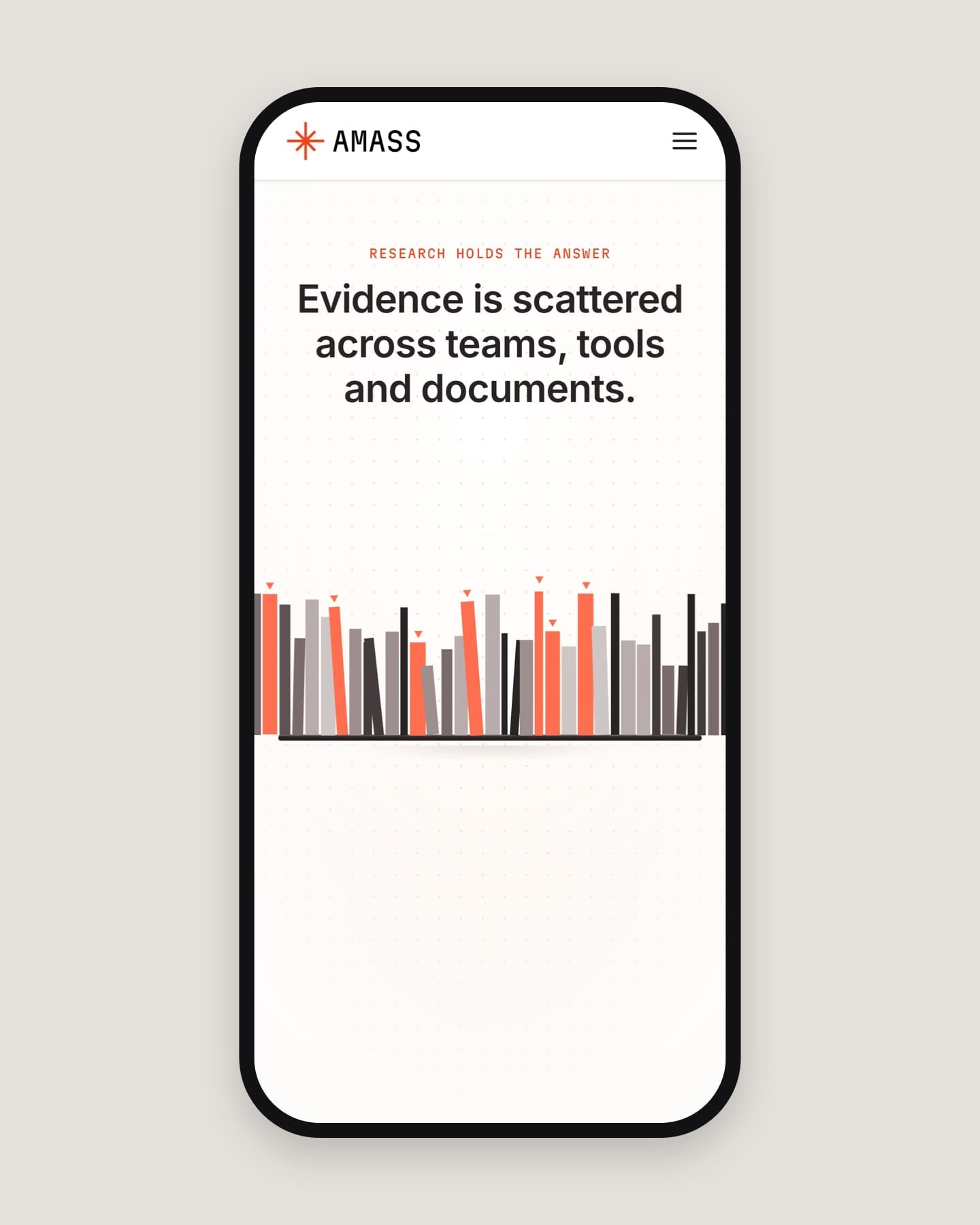
A scroll story: scattered evidence ends up on one shelf.
As you scroll, evidence scattered across teams and tools settles onto one shelf. Niels Andersen and the Amass team built the site; we supported them in its repository, reviewing colour and pacing on live previews.
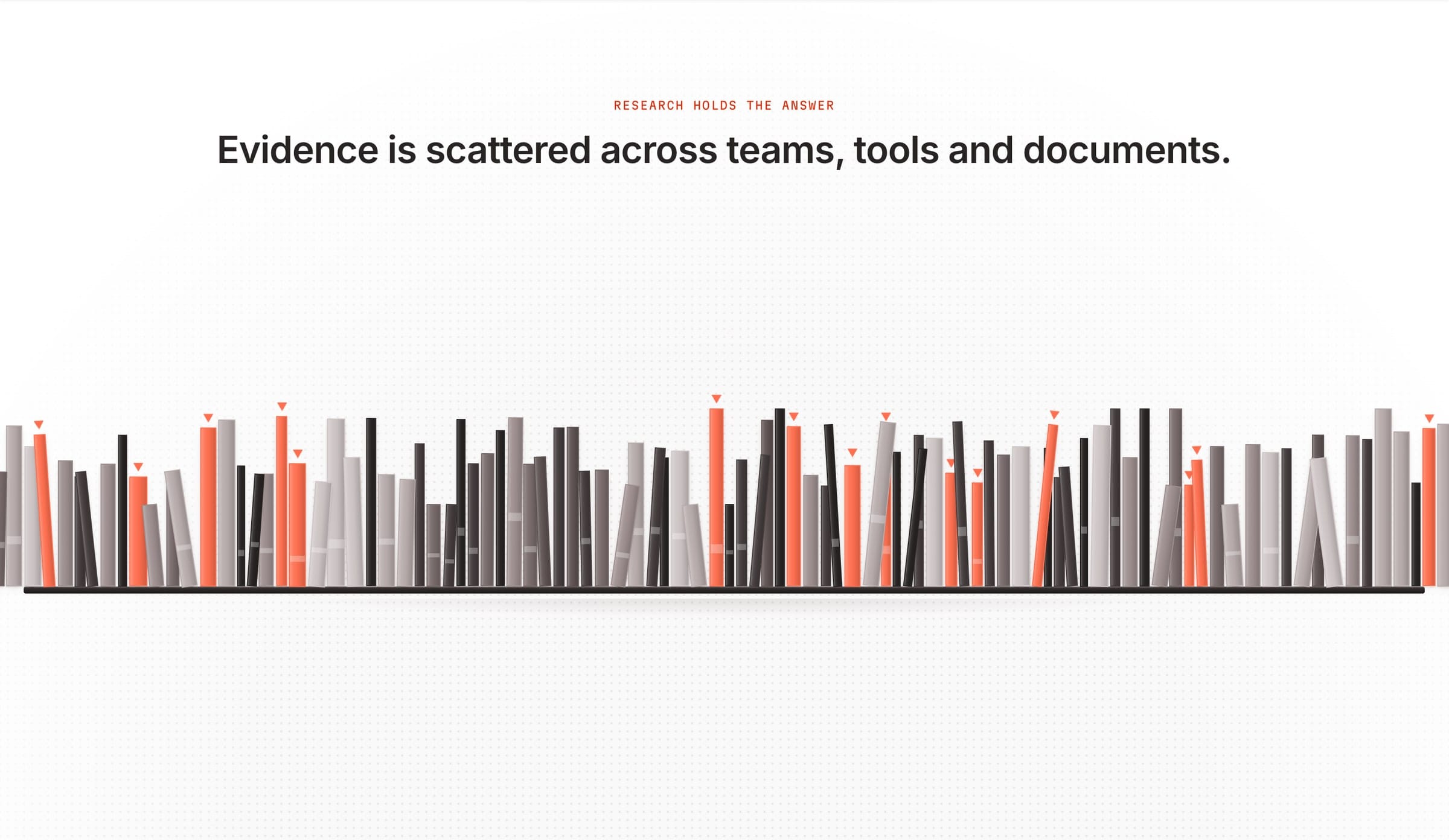
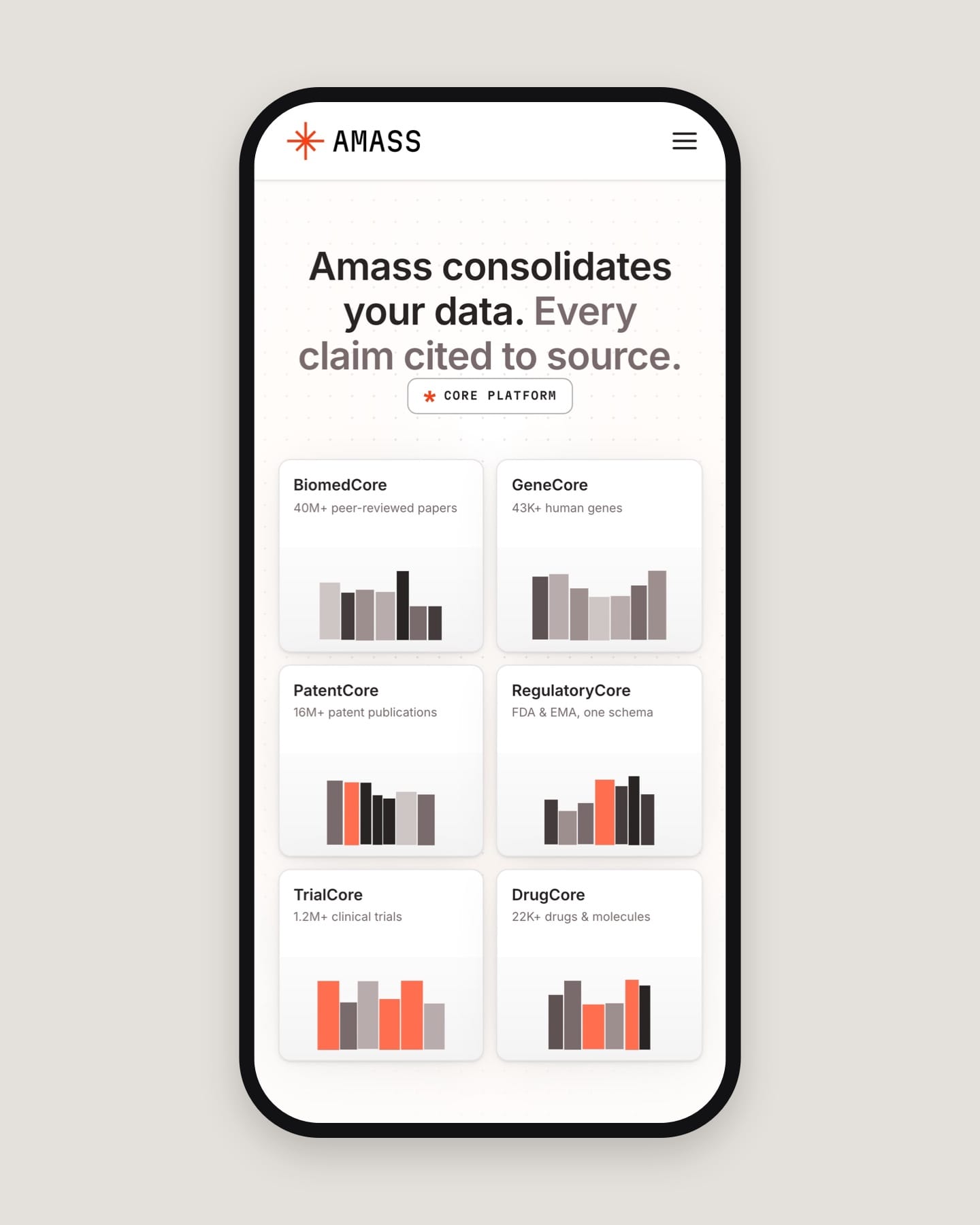
Colour marks the evidence, and everything else stays neutral.
The content spines went warm orange, the headlines neutral and the core cards cream, so colour marks the evidence and nothing else. The change was merged into the live site.
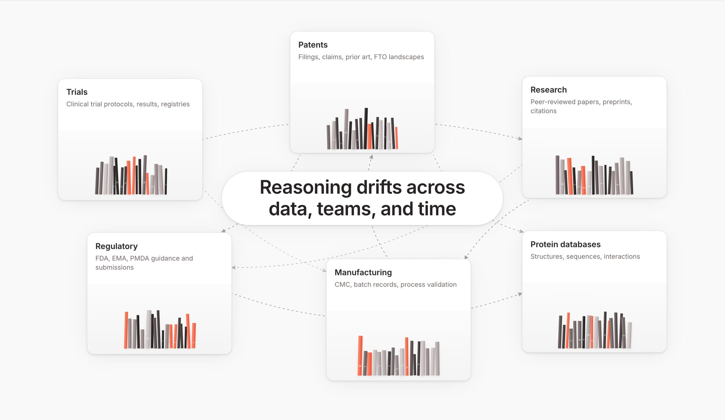
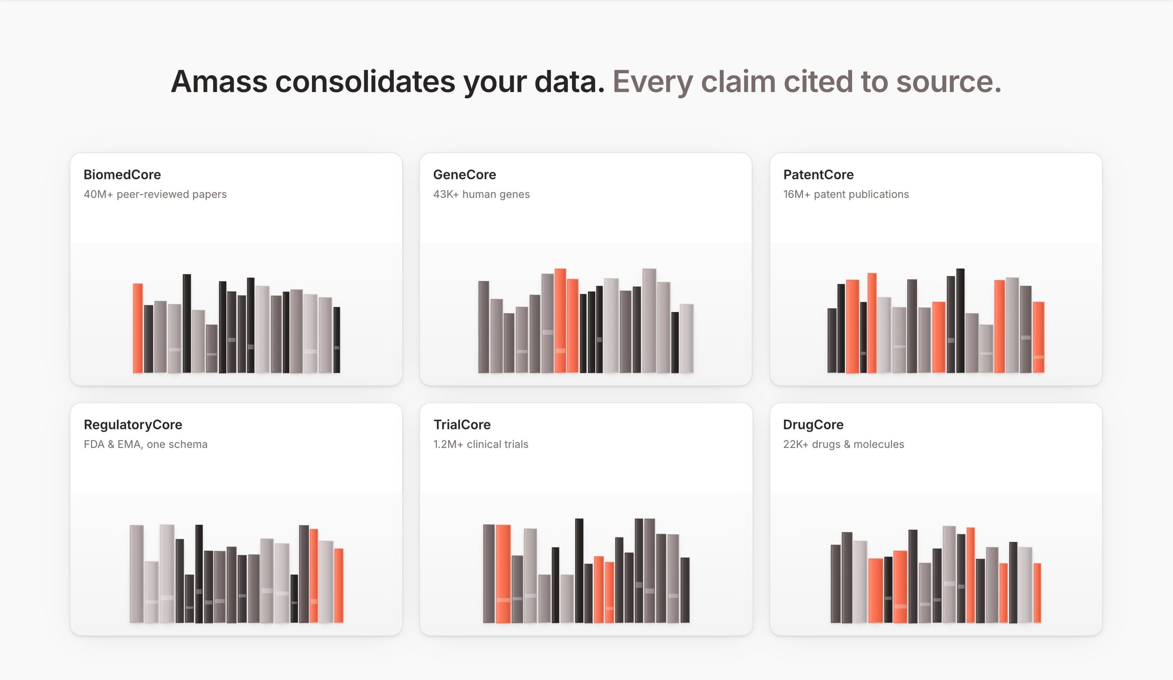
On mobile, less content but the same order: problem first, then the answer.
More work
All projects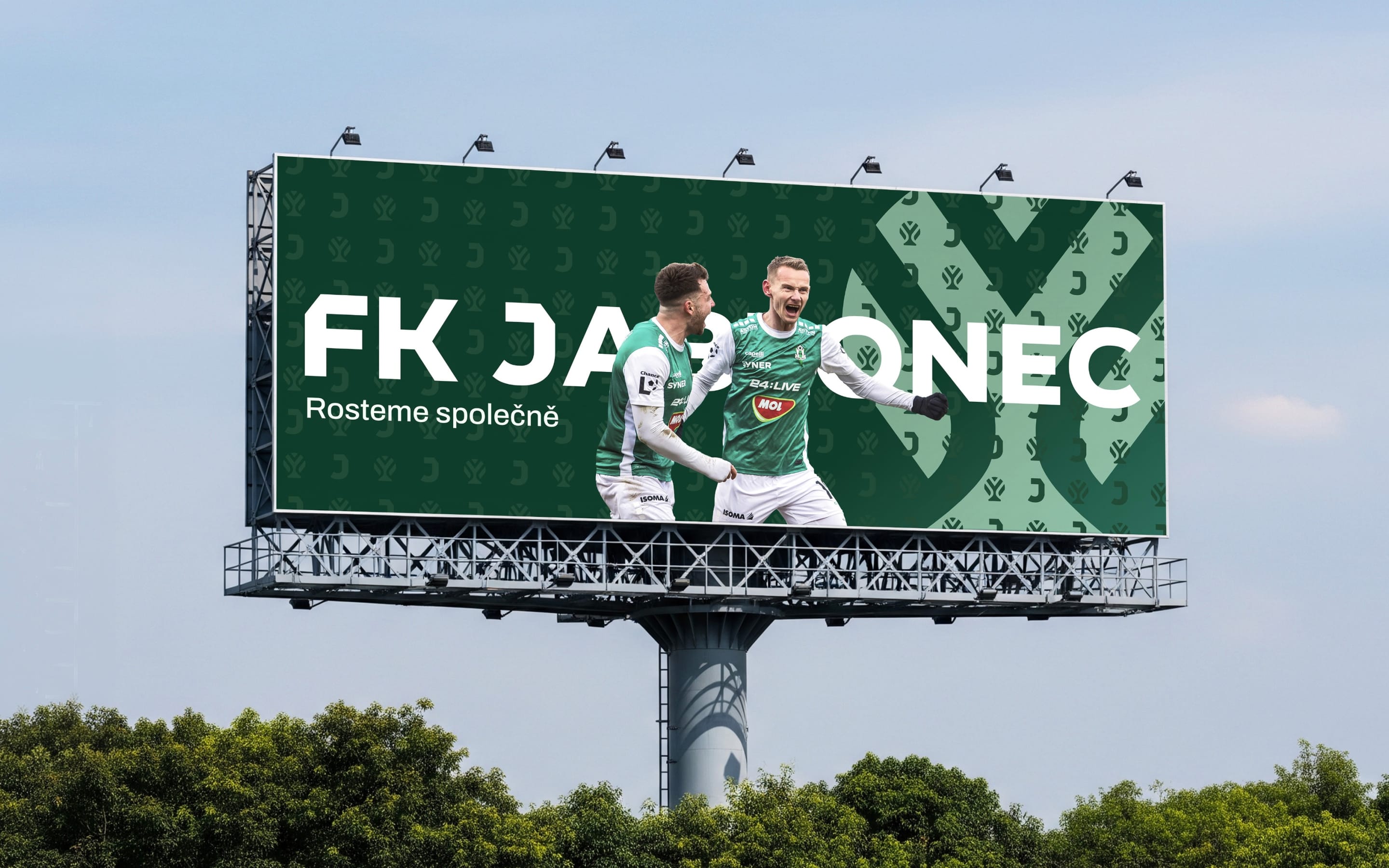 SportsFK JablonecJablonec never falls far from the tree.Branding / Campaign / Website
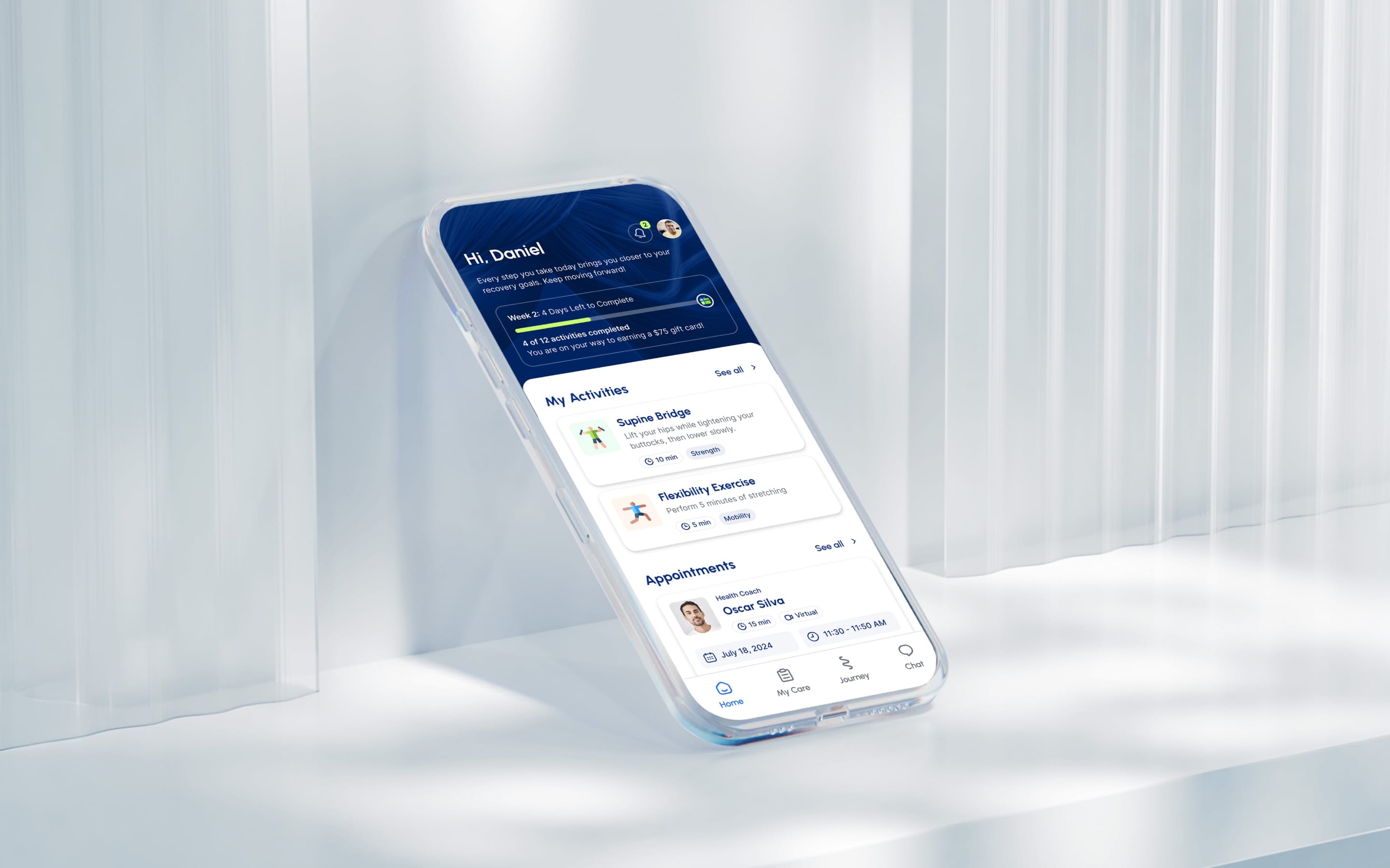 HealthMovidoA physio programme for the days between appointments.Product & Design / App
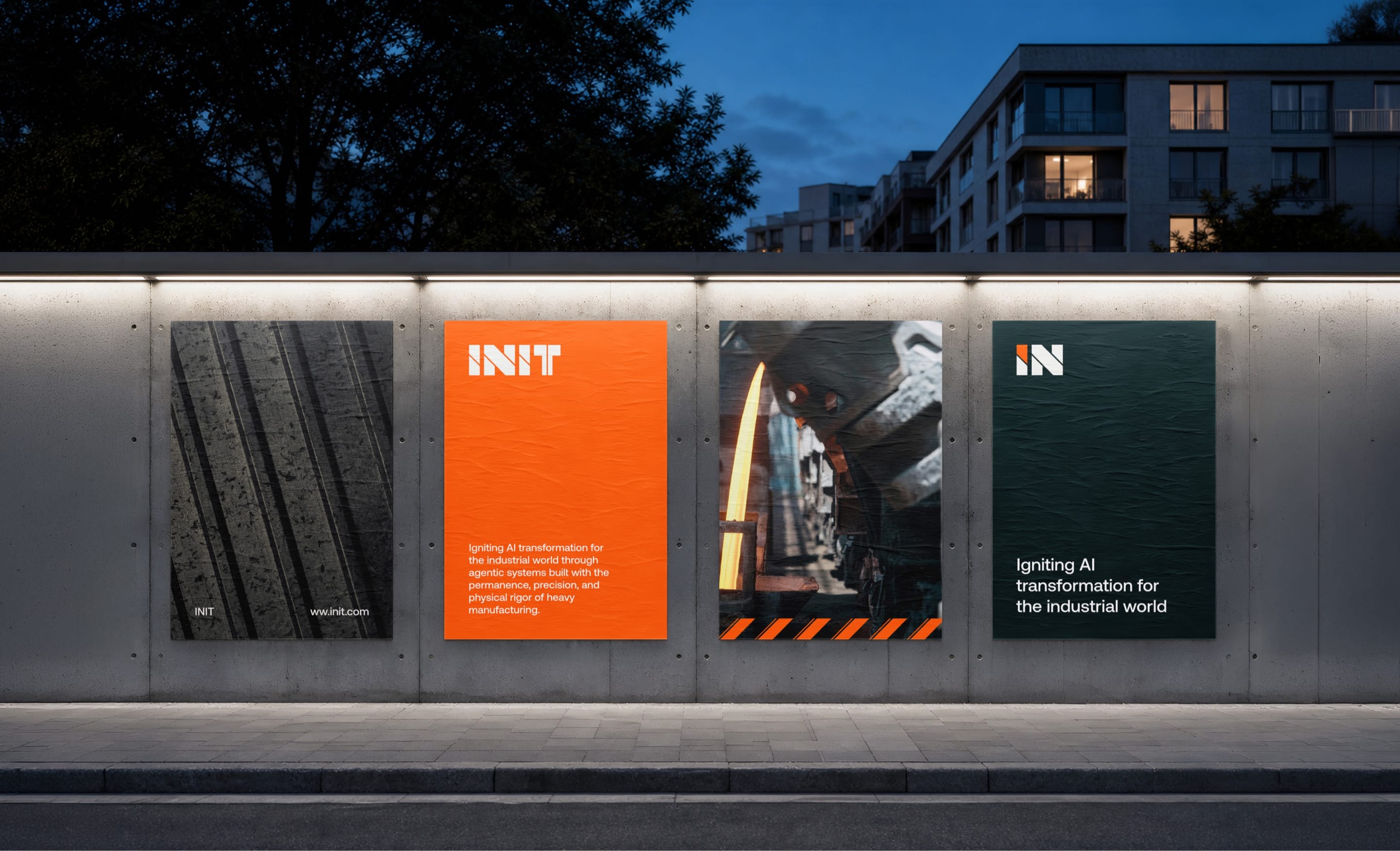 AIINITEngineering intelligence for the industries that build the world.Branding / Website
 Real EstatePenta Real EstateAutomating apartment specification sheets.Engineering / Product & Design
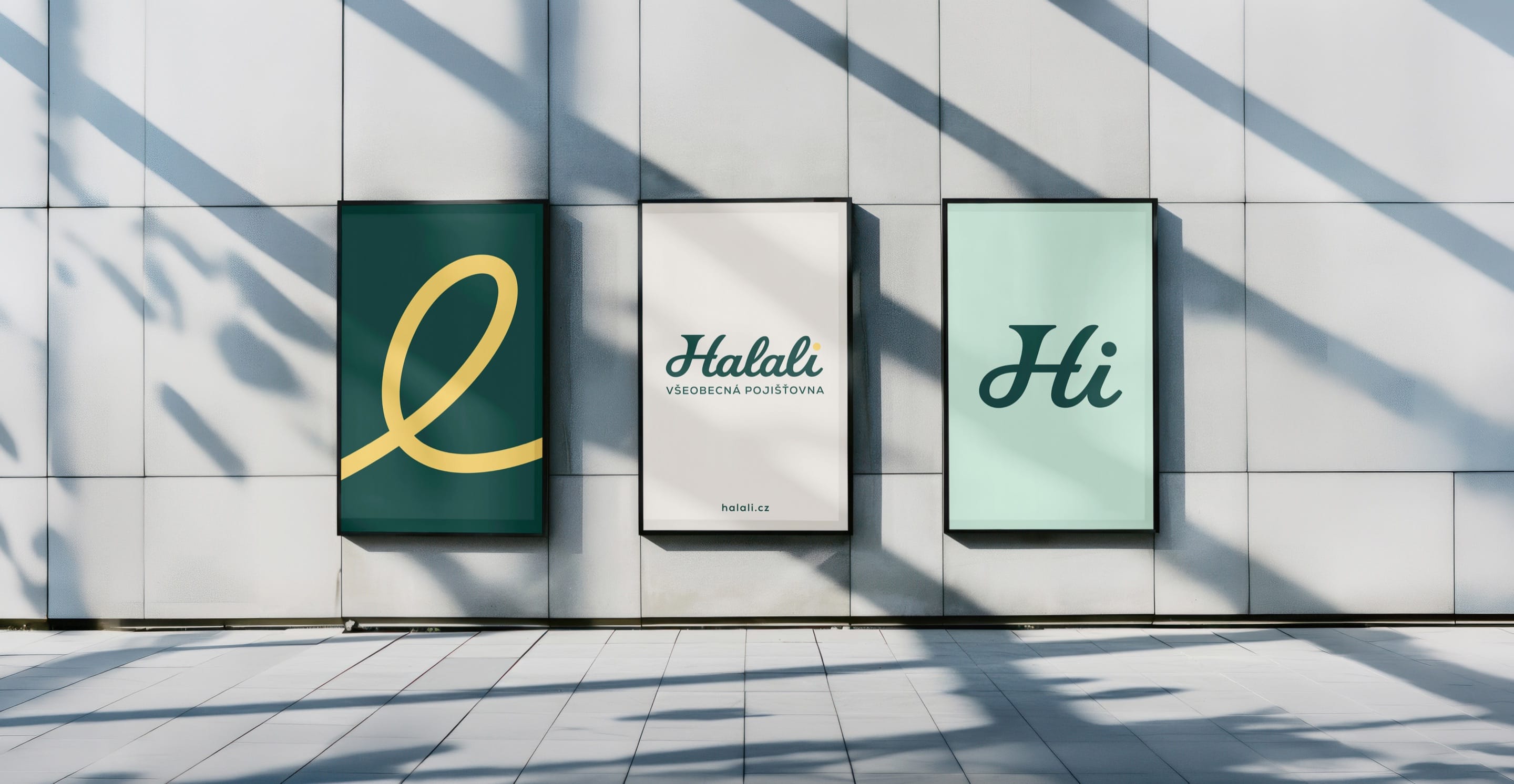 Financial ServicesHalaliEvolution, not revolution. A new identity built on existing trust.Branding / Campaign
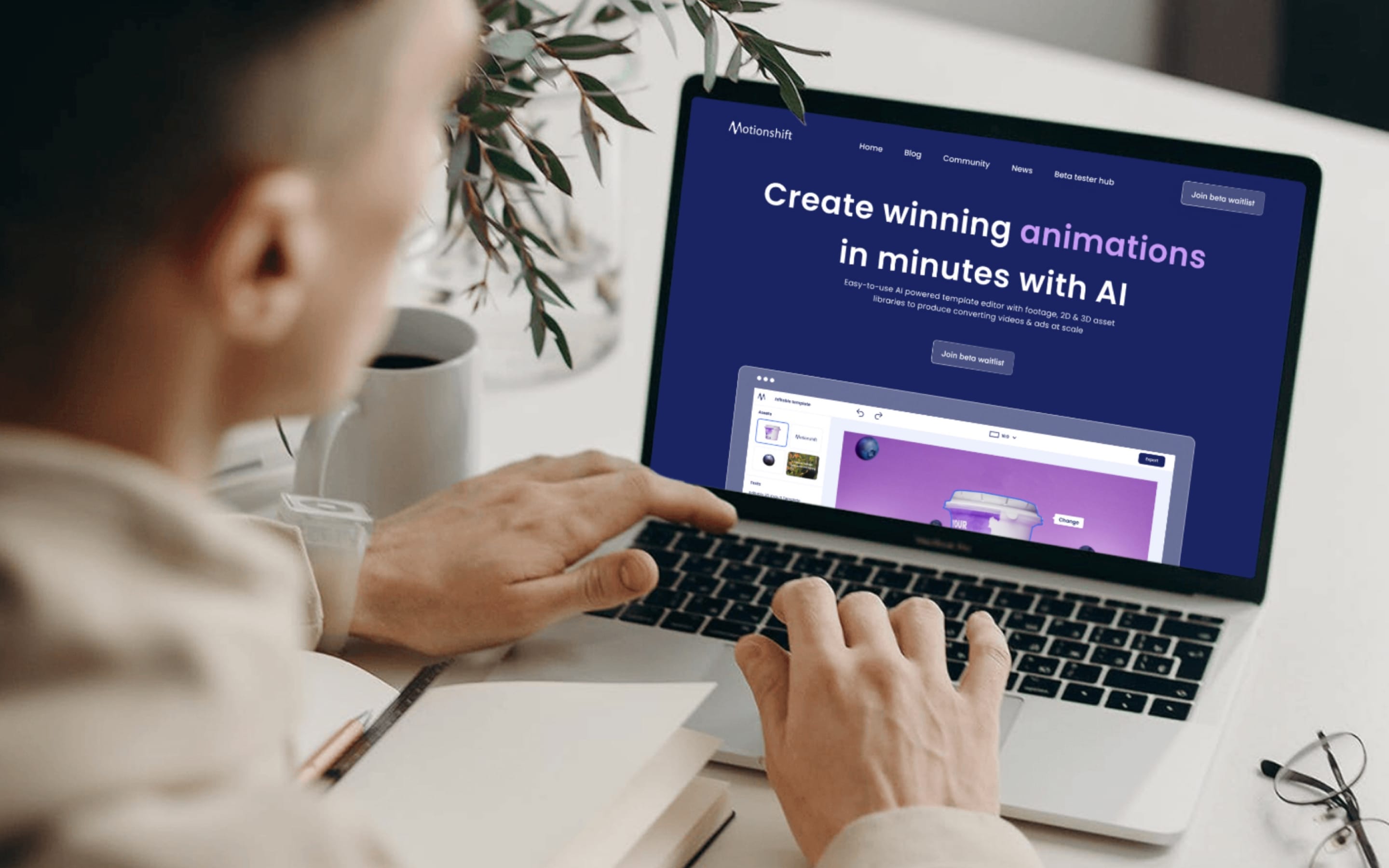 AIMotionshiftUnlocking AI-powered video & animation.Product & Design / Website / AI & Agentic