

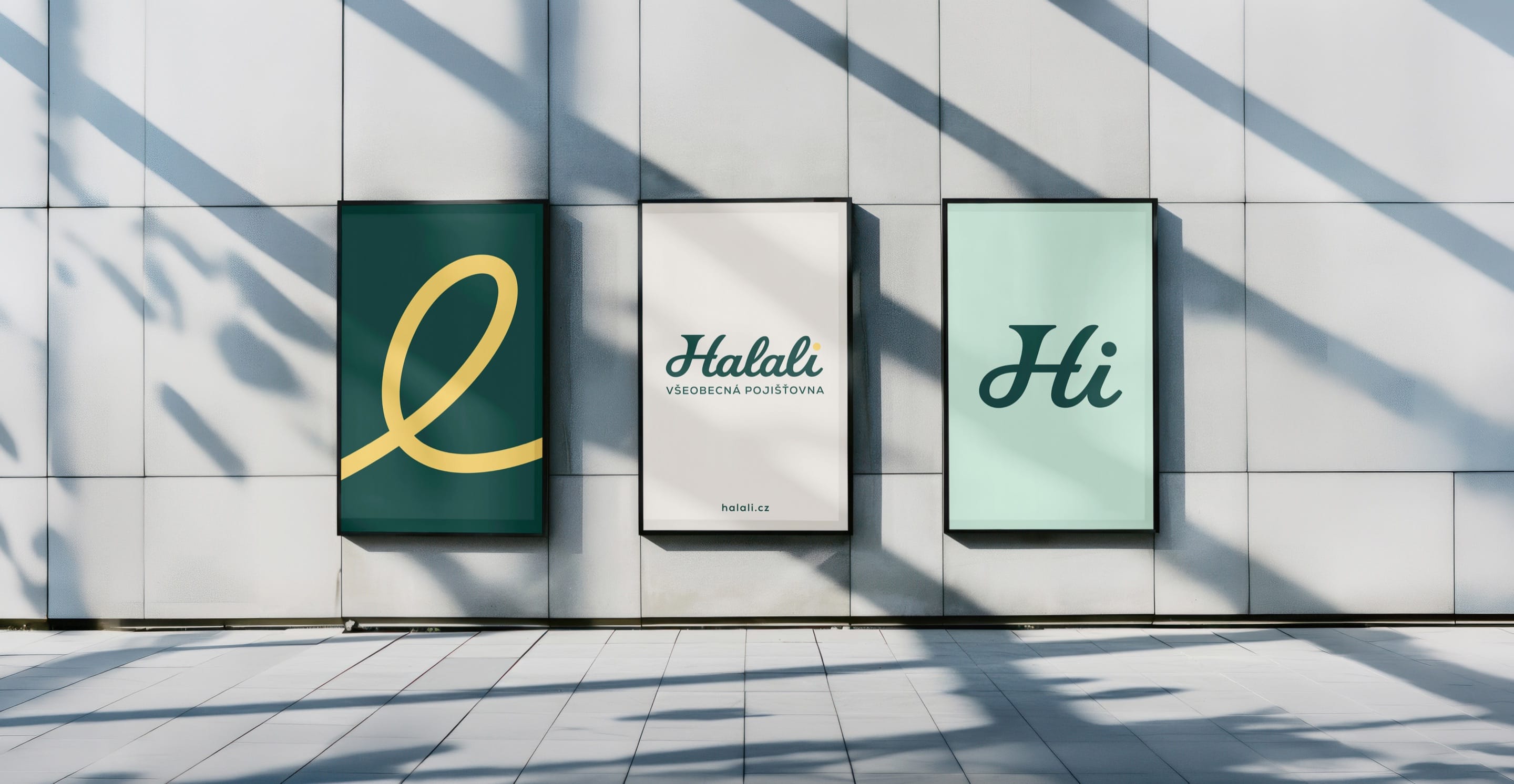
HalaliEvolution, not revolution. A new identity built on existing trust.
At a glance
- Design thinking
- Stay serious about insurance and let the campaign carry the humour, so the brand can be calm and still human.
- Problem
- Halali’s reputation sits with Czech hunters. To insure the wider public it had to modernise without looking like a different company.
- Approach
- We kept what existing customers already trusted, and drew the new letter loops from the logo’s own script.
- Outcome
- The identity is designed and applied, from billboards and banners to the homepage and business cards.
- Role
- Lucie as design and project lead, with Halali’s marketing team and the agency Start Online.
- What we designed
- Logo design
- Visual identity
- Campaign
- Website design
- Merchandise
- Platforms
- Brand identity
- Campaign and outdoor
- Website
- Stationery and merchandise
The claim
What you see is what you get.
Insurance you can actually understand.
In Czech: To, co vidíte, platí. Pojištění na rovinu.
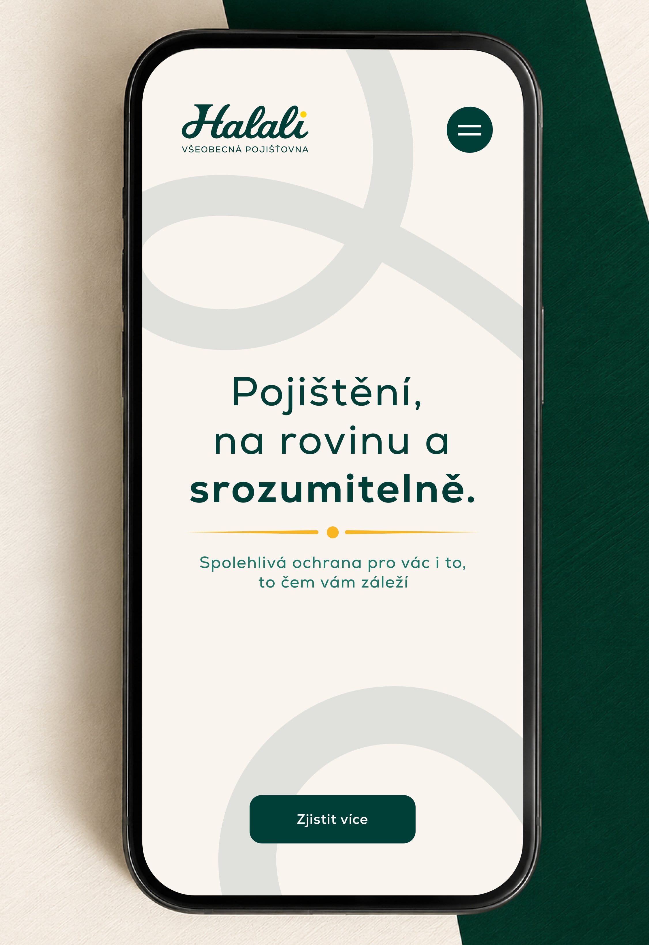
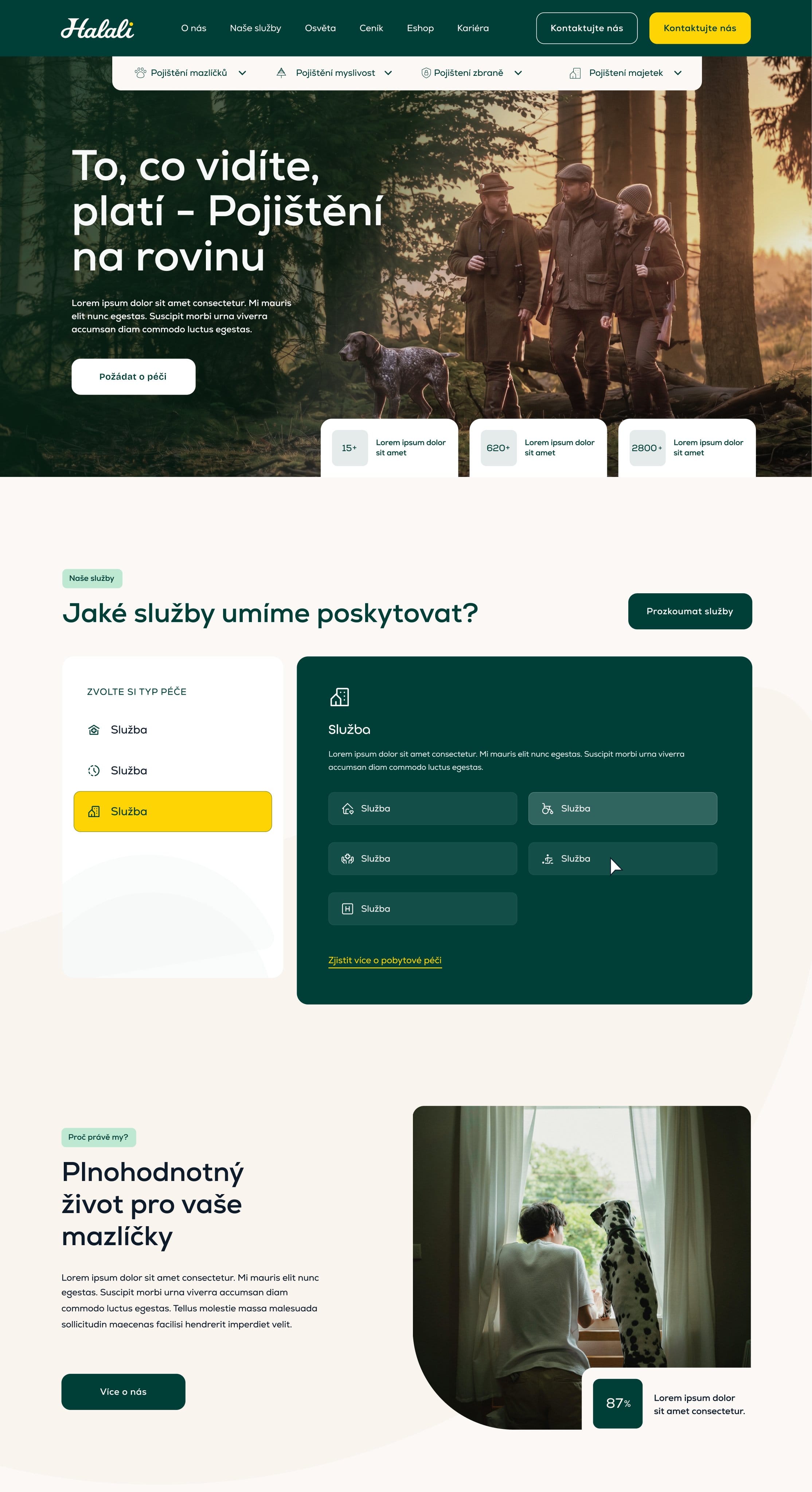
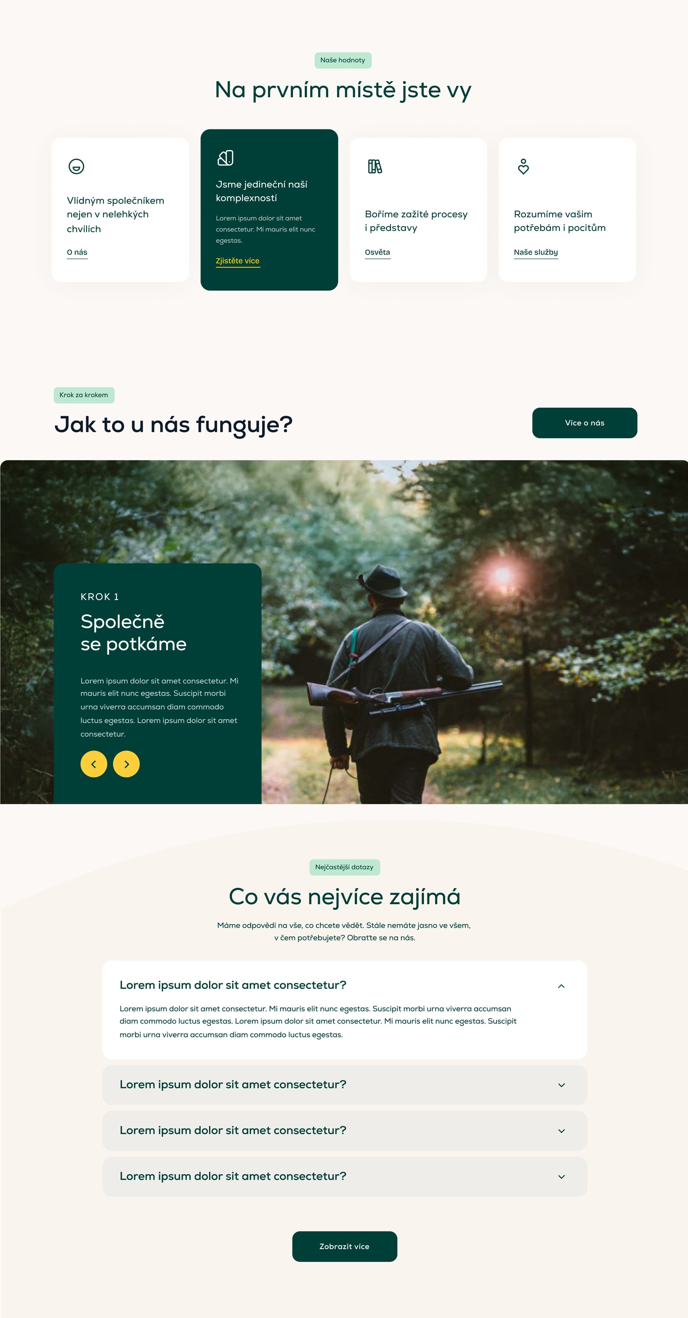
The mobile site leads with the promise in plain Czech.
“Pojištění, na rovinu a srozumitelně” (insurance, straight and clear) comes before any product, so a new customer meets the promise first.
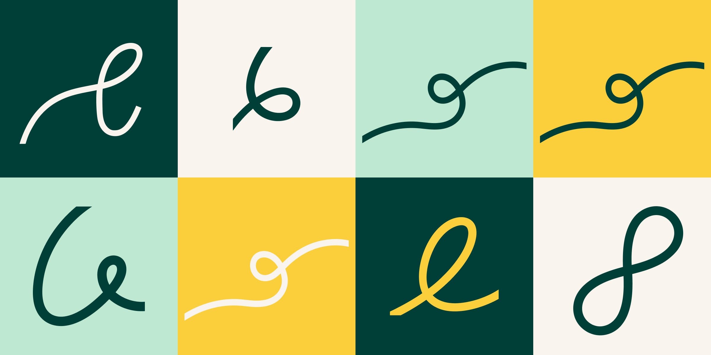
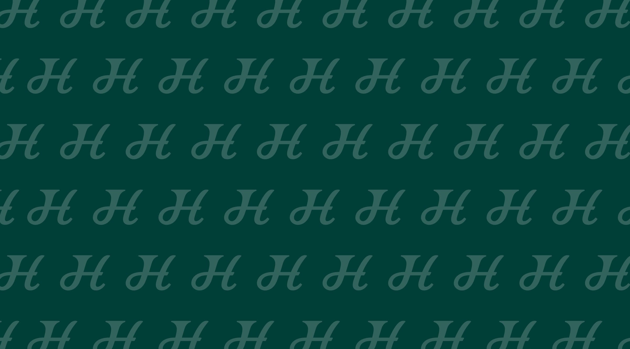
The new graphics are drawn from the old logo’s script, so existing customers still recognise the company.
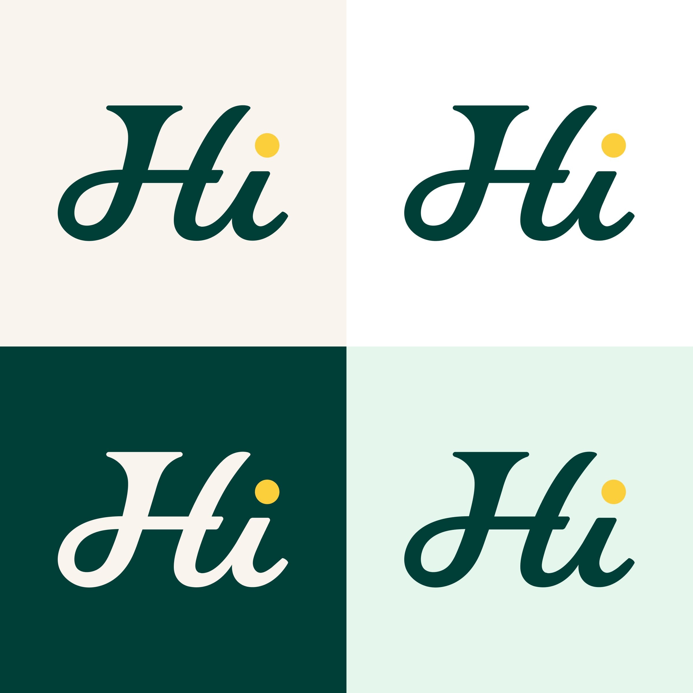
The Hi monogram works in every brand colour. The loops run through the layouts like paths through a forest.
- Dark Teal#001A17
- Forest Teal#003F38
- Light Mint#BFE8D2
- Dark Mint#1F7A6A
- Warm Sunset#FBCE3C
- Light Champagne#F9F4EE
- Pure White#FFFFFF
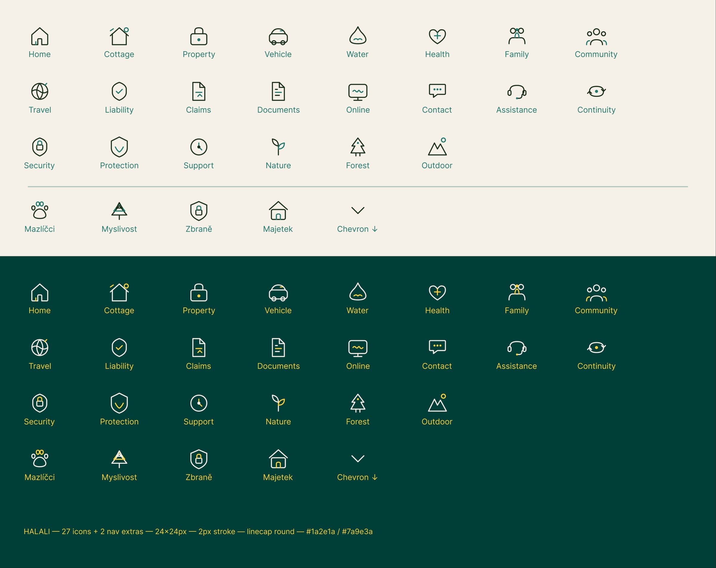
We designed the brand system, down to its icons.
Every icon uses the same 2px rounded stroke, so a home policy and a forest policy look like they came from the same company. The set works on champagne and on Forest Teal.
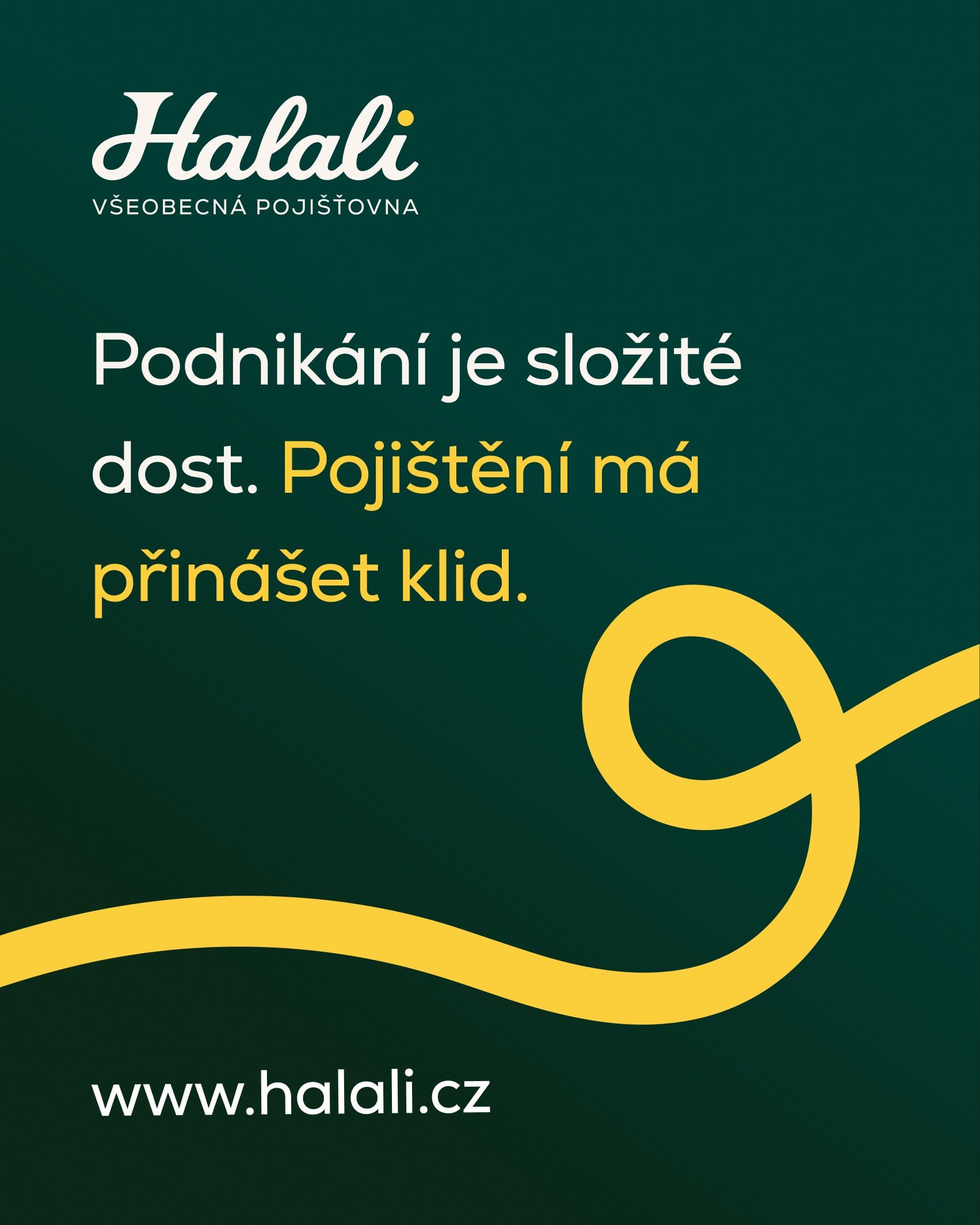
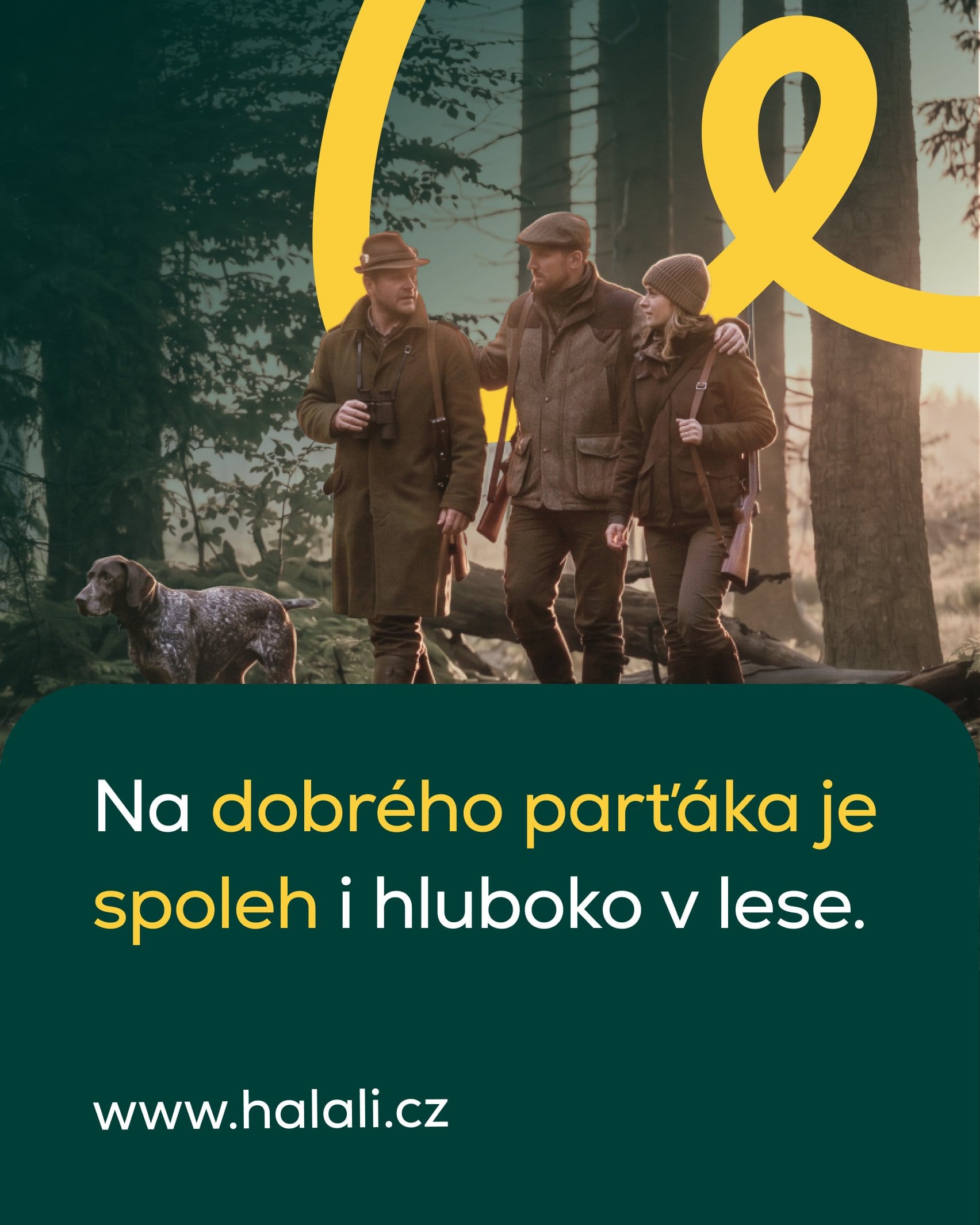
One campaign, speaking to business owners and to hunters.
The tone
Serious about insurance, never too serious about life.
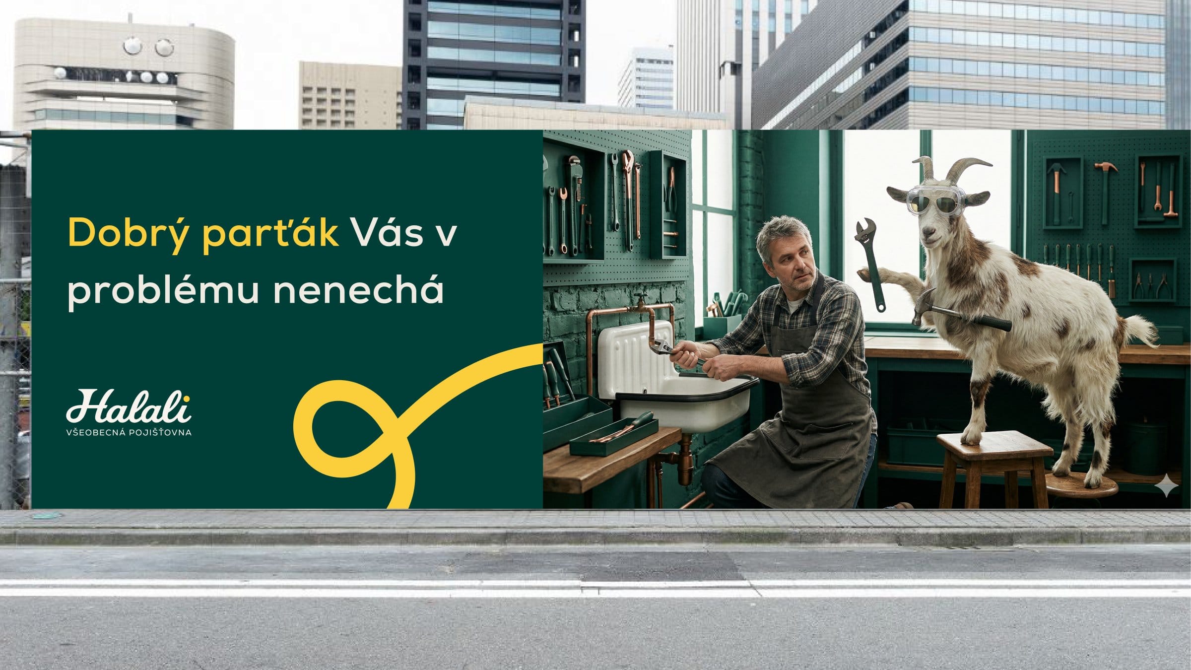
The billboard line “Dobrý parťák Vás v problému nenechá” means “a good partner won’t leave you in trouble”. The identity stays calm and leaves the humour to the campaign.
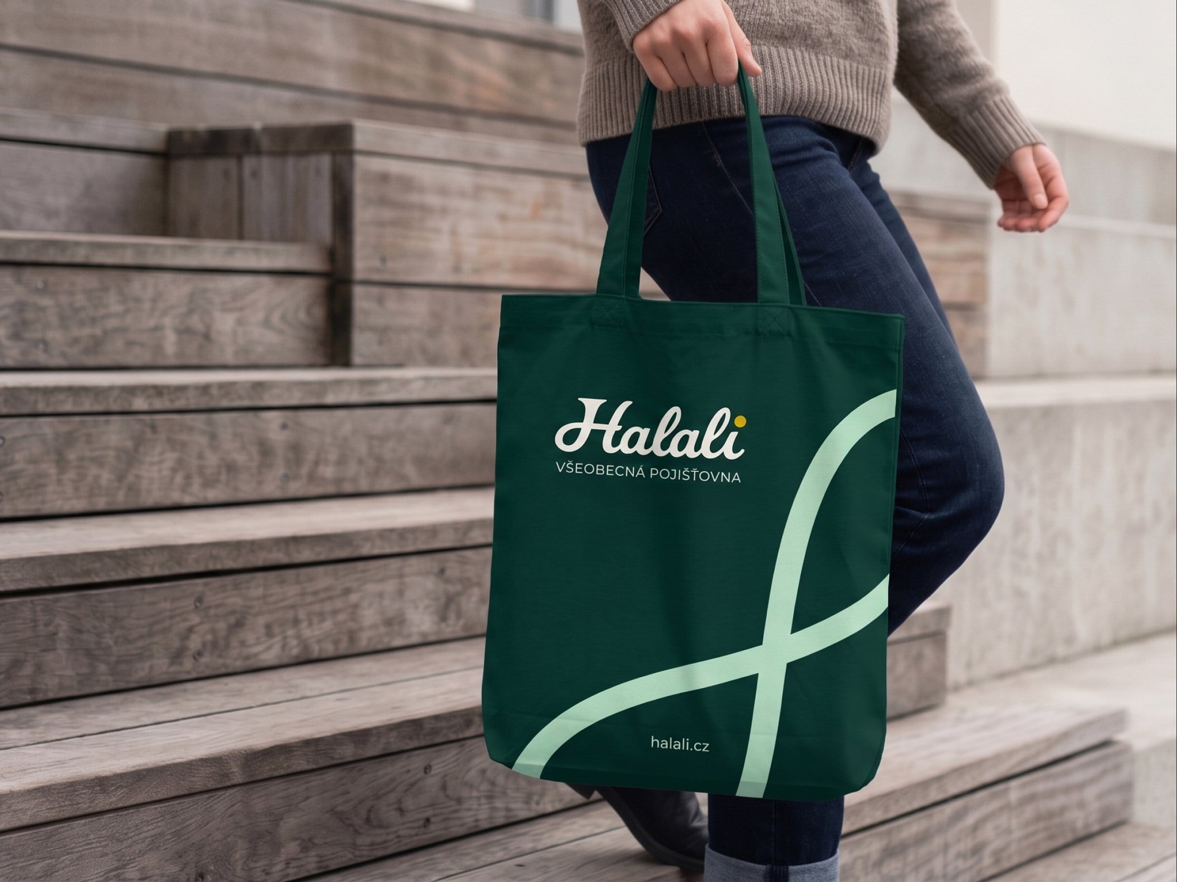
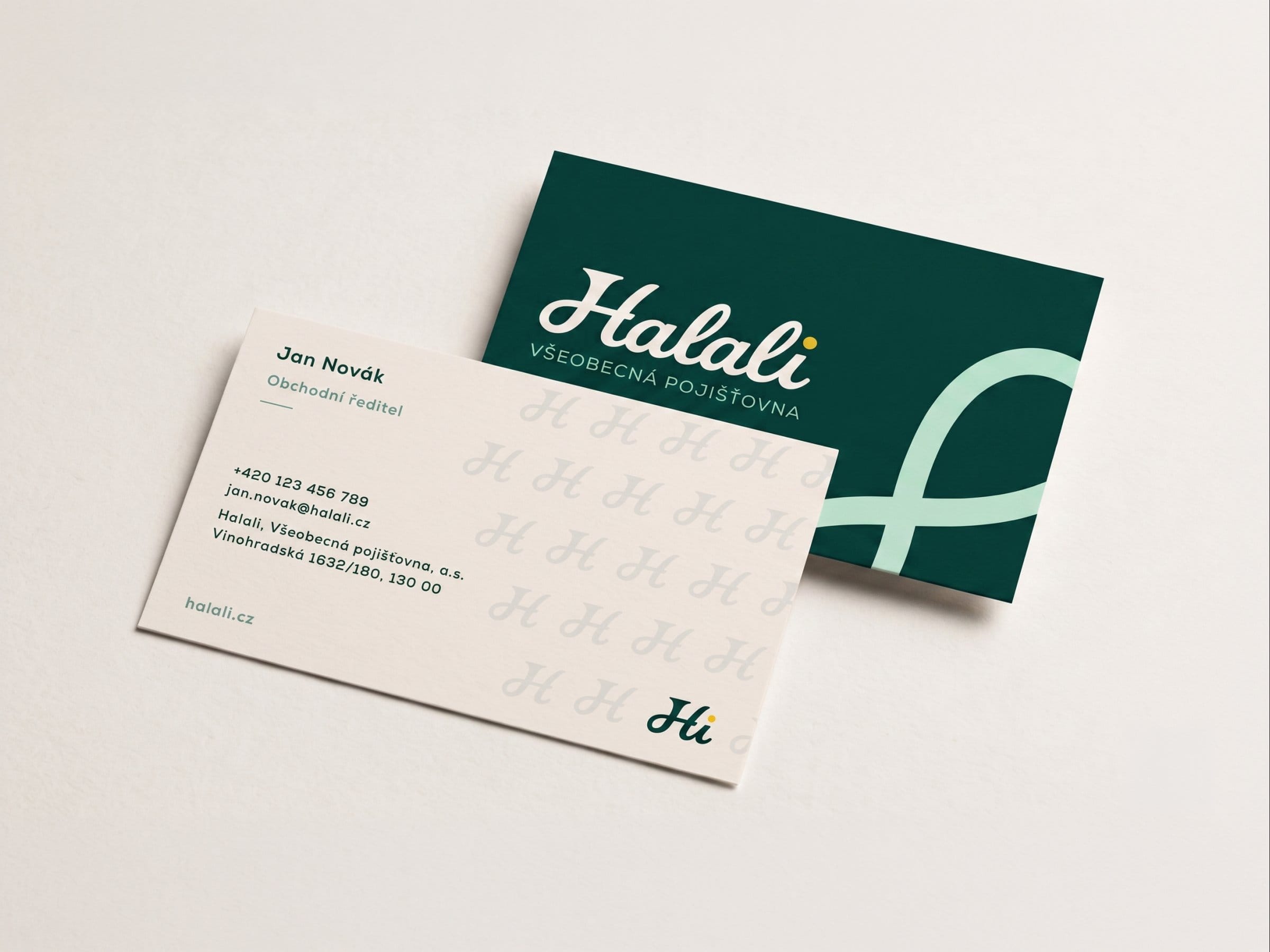
The loop carries onto tote bags and business cards.
The homepage shows hunters and families side by side, so old and new customers both see themselves.
More work
All projects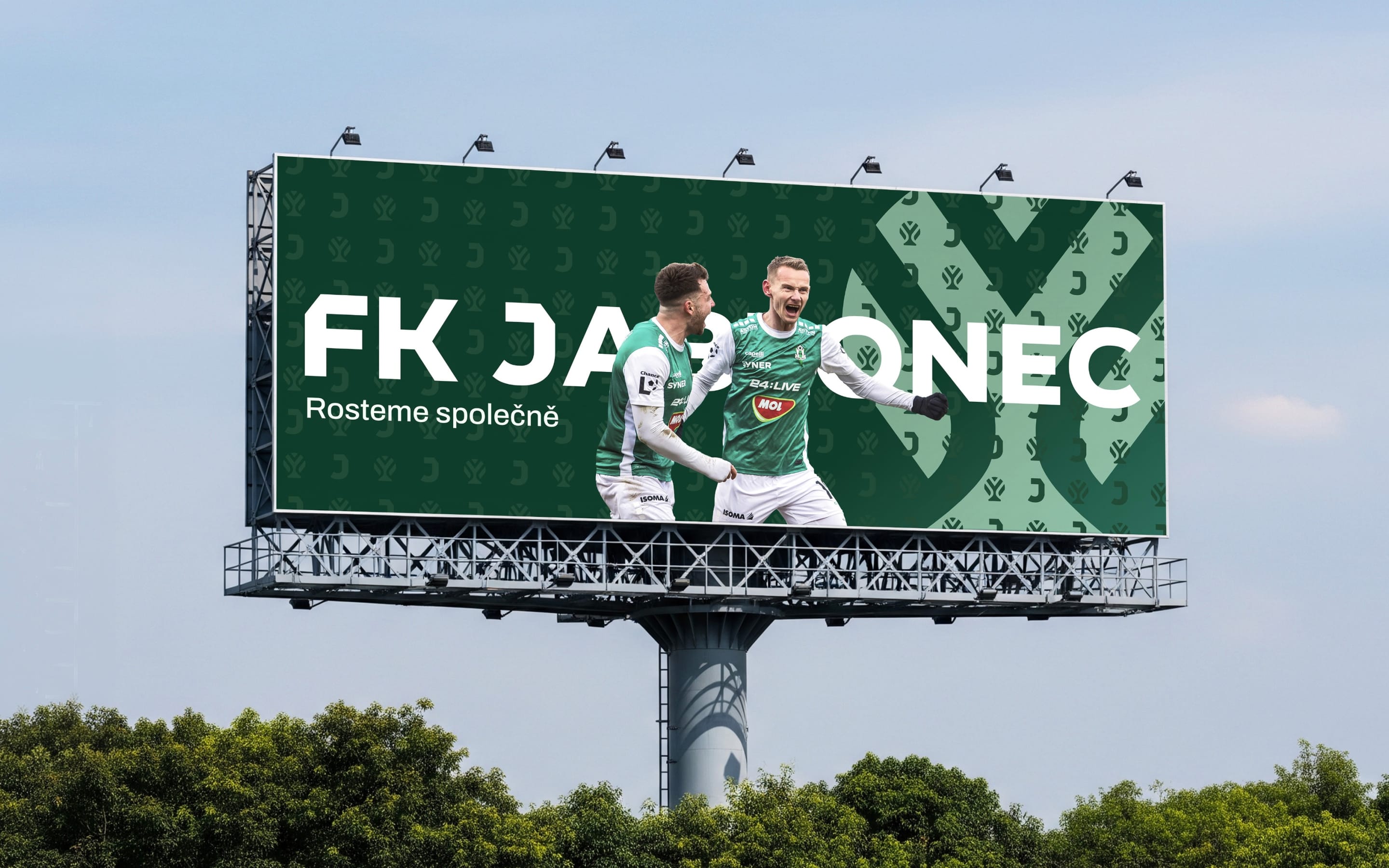 SportsFK JablonecJablonec never falls far from the tree.Branding / Campaign / Website
 HealthMovidoA physio programme for the days between appointments.Product & Design / App
 AIINITEngineering intelligence for the industries that build the world.Branding / Website
 Real EstatePenta Real EstateAutomating apartment specification sheets.Engineering / Product & Design
 ConsumerLEGOAn event app for LEGO, mapped before anyone drew a screen.App / Strategy
 SportsLiga ženStep into the light of the game.Branding / Campaign