FK JablonecJablonec never falls far from the tree.
At a glance
- Design thinking
- Start from what is already the club’s own. Jablonec holds the Czech word for apple, so the symbol became an apple tree.
- Problem
- The club needed a symbol rooted in its own history, ready before kit production began for the 2026/27 season.
- Approach
- We ran workshops to learn who the club talks to, then explored two directions before choosing the apple tree.
- Outcome
- The identity was revealed at the club’s gala evening, then launched in June 2026 with a microsite and the first fanshop collection. The new club website is live.
- Role
- Lucie as the only design and project lead, with the club’s communication team, also coordinating eSports.cz, which delivered the website’s data.
- What we designed
- Brand workshop
- Verbal identity
- Visual identity
- Campaign
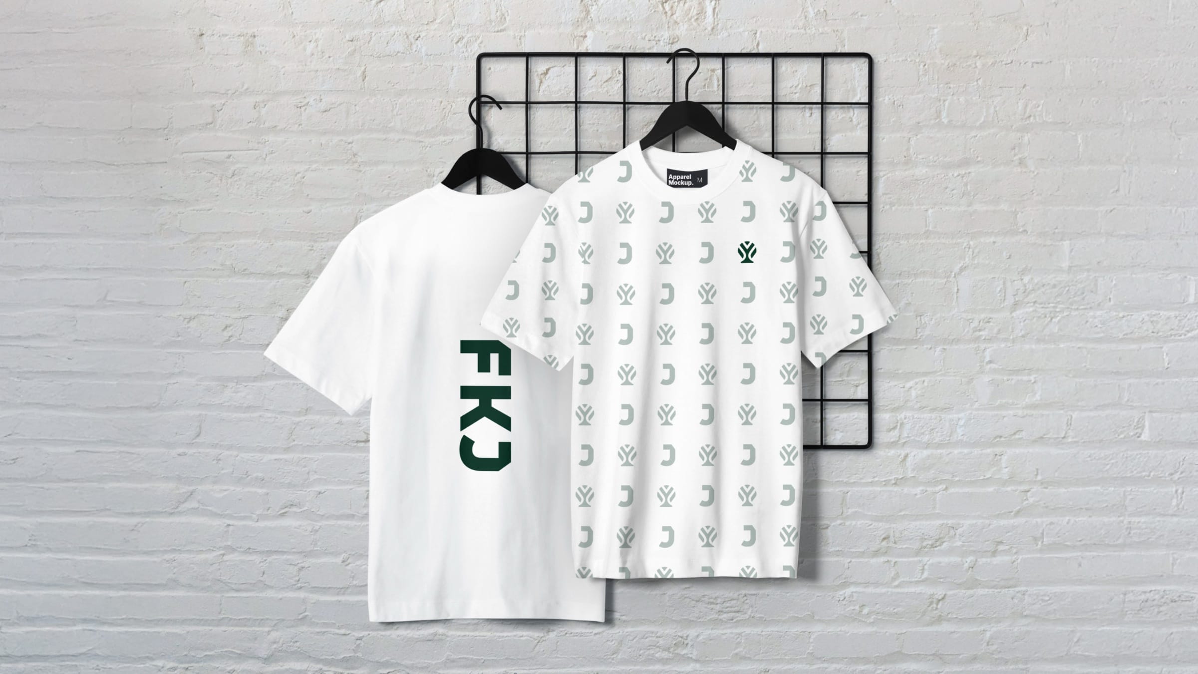
- Merchandise
- Website design
- Duration
- January–July 2026
- Platforms
- Stadium
- Kits and merchandise
- Social and matchday
- Club website
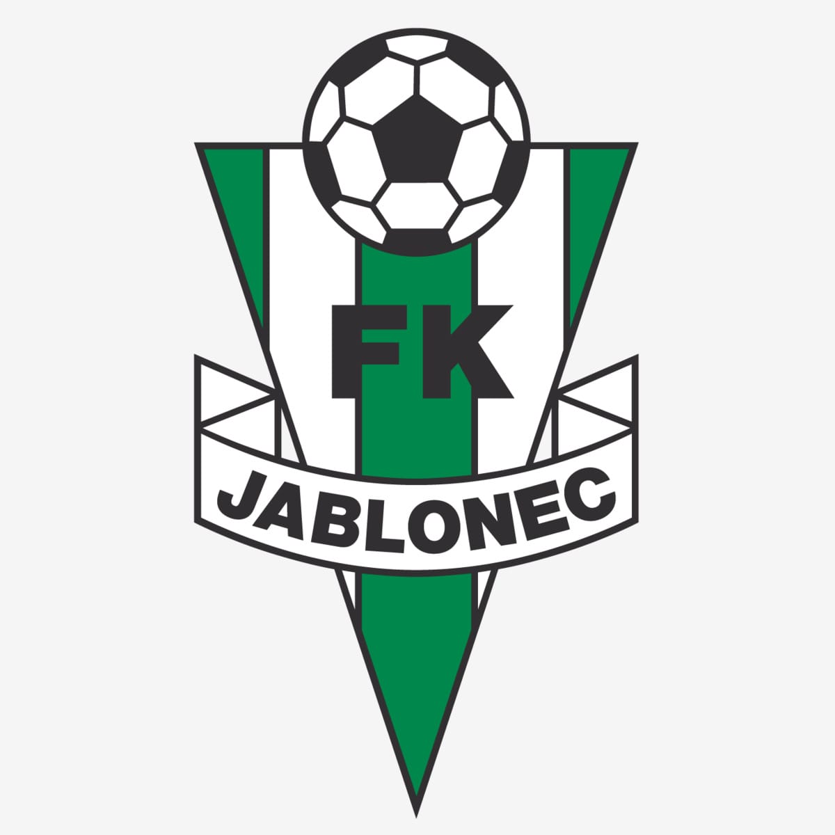
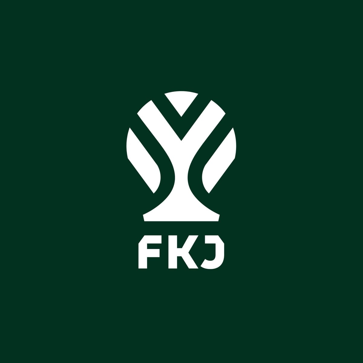
The new symbol keeps the old crest’s triangle, ball and stripes, and brings back the tree.
The brief was already there, in the club’s own words.
Management workshops · reference crests and kits · four personas
The club wanted to reach young families better.
Growing across generations became the heart of the claim.
Evidence
The academy trains children from 6 to 19, so young parents are already close to the club.
Many followers live far from the stadium.
Matchday posts show the region, so a fan watching from far away still recognises home.
Evidence
In the first workshop the club asked for posts with local meaning, for fans who follow it from afar.
At Jablonec, fans are family.
The club shares a small region with Liberec, so being the bigger club was never the plan. It says plainly what it is instead: a family club, where bigger rivals feel corporate.
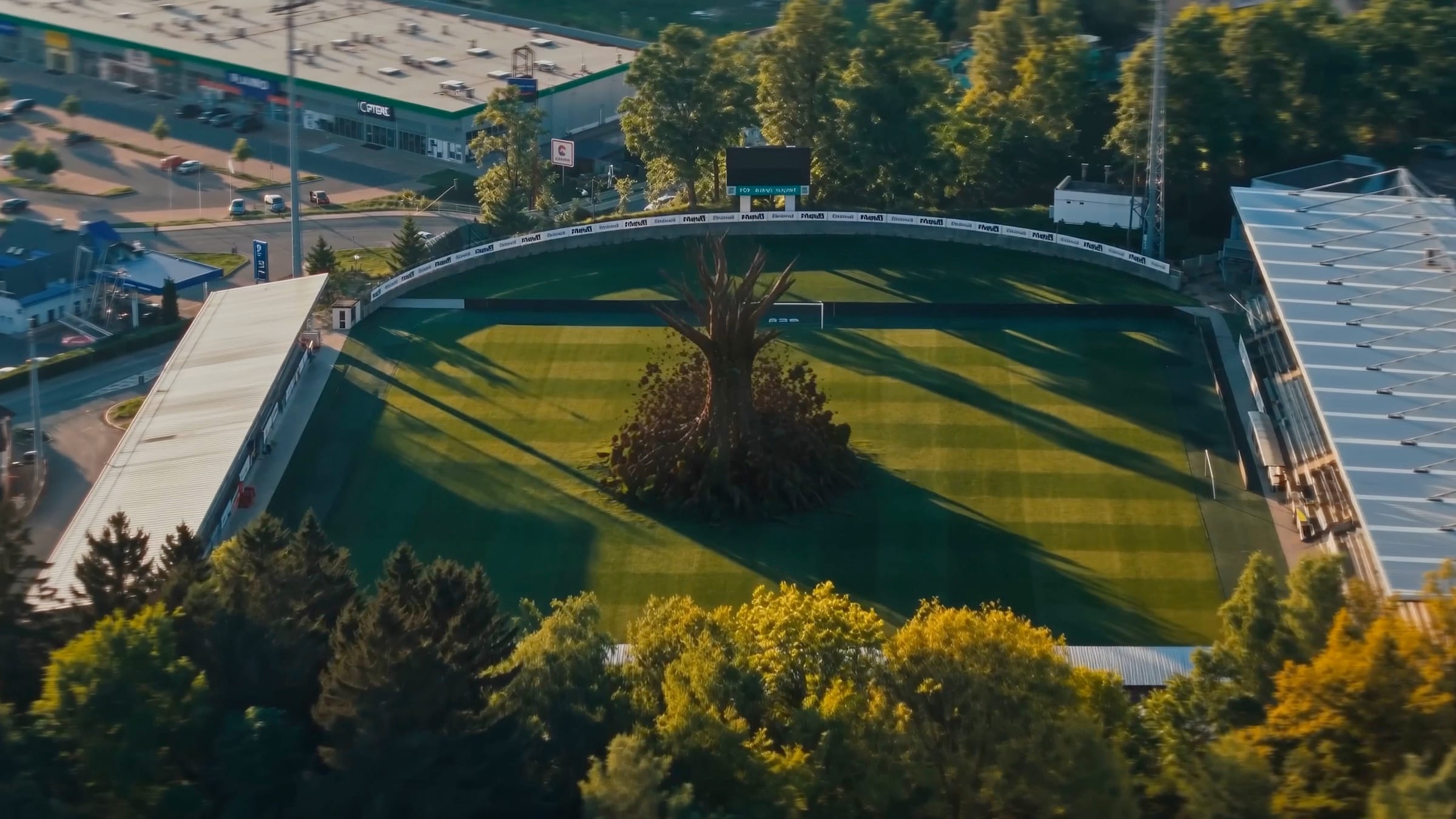
Rosteme společně
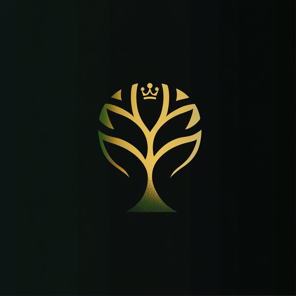
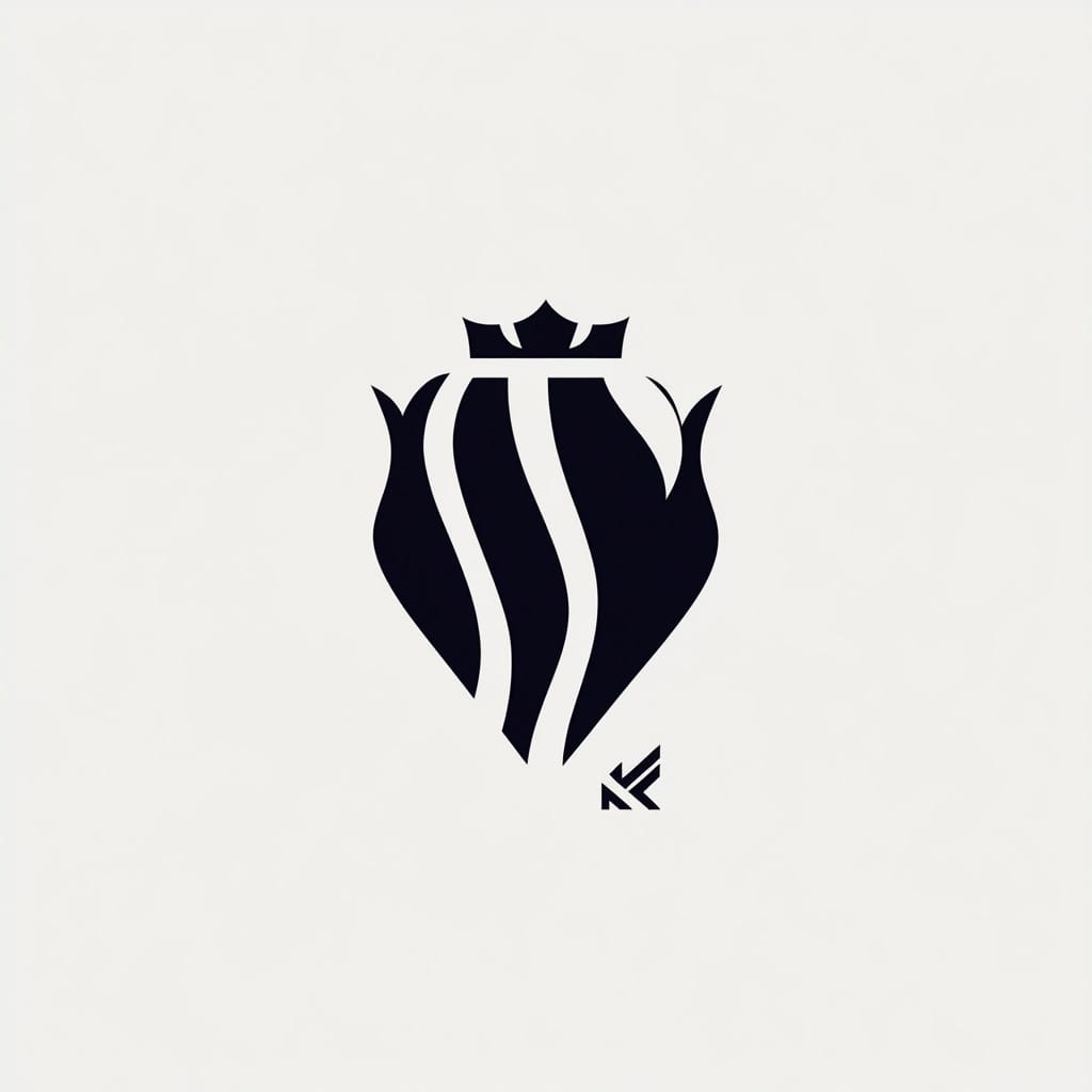
The club’s favourite idea, a mountain king, was explored first.
“Jizerský král” (King of the Jizera) points at the mountains and regional pride. Management also proposed the apple tree. We sketched the king first, with AI assistance.
The decision
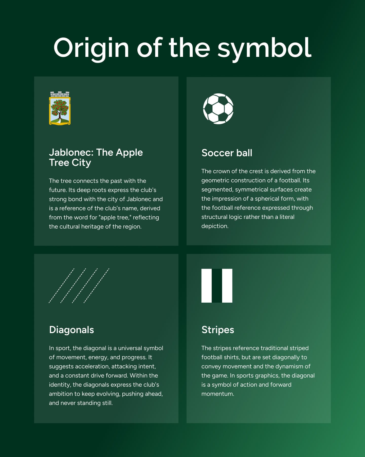
The new symbol builds on the old crest. The tree returns, the round crown recalls the crest and a football, and the diagonals the club’s striped shirts.
The launch explained the symbol piece by piece.
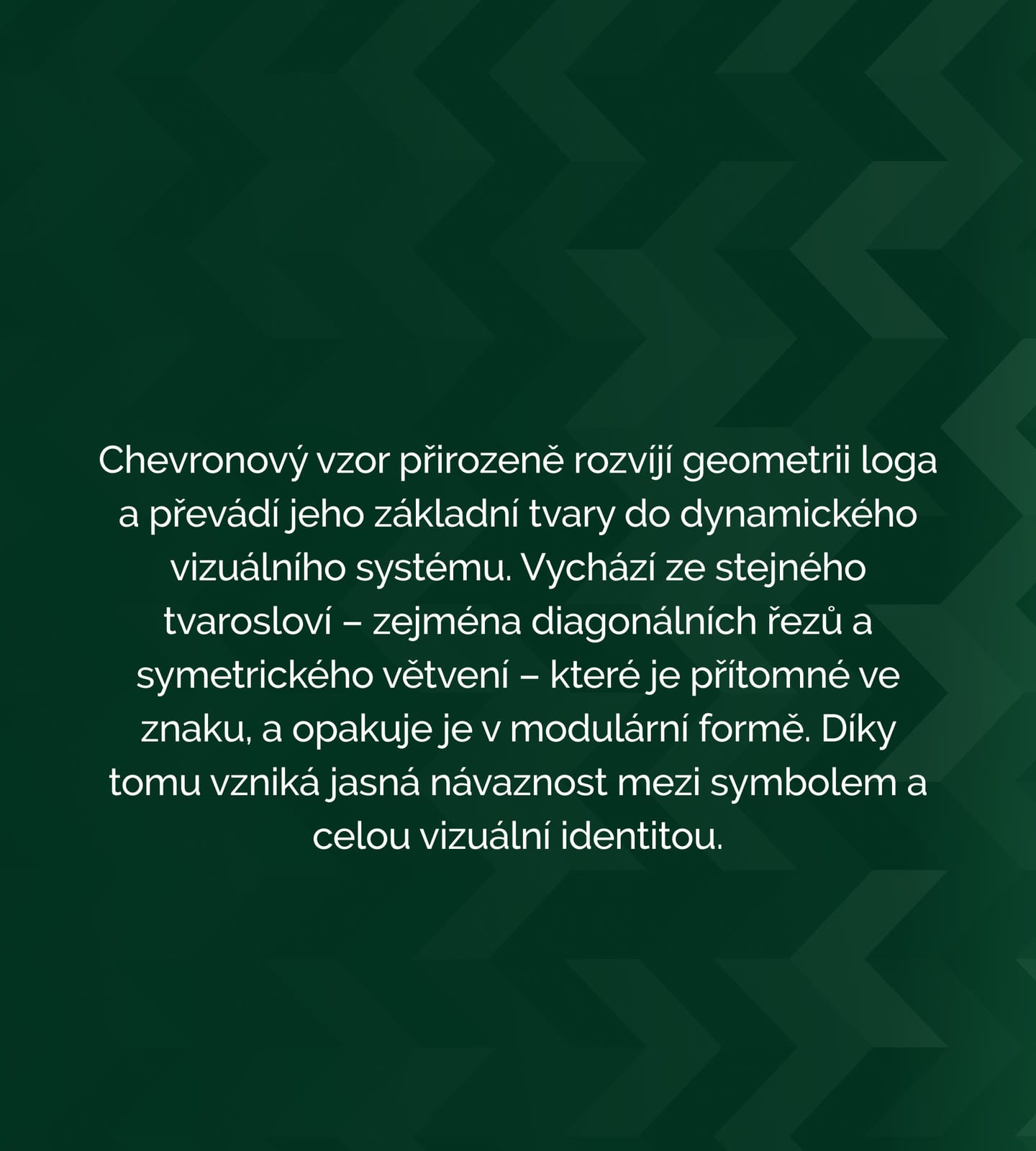
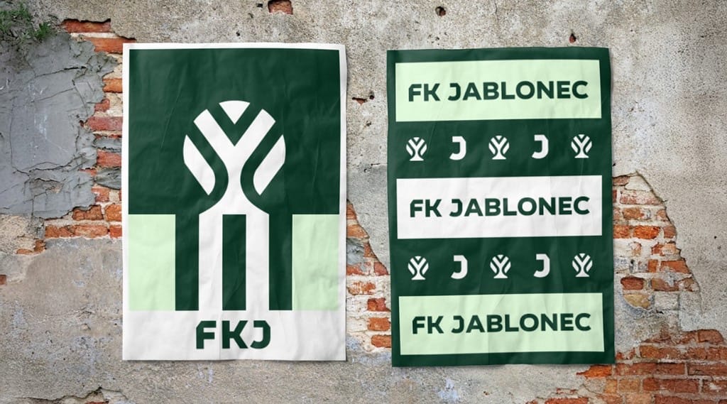
Posts at launch showed where each part comes from: the apple tree of the town’s name, the ball in the round crown, the stripes of the shirts and the diagonals that give it direction. A second post introduced the chevron pattern built from the same shapes.
The symbol is built on precise geometry, which means it can be animated from its own construction lines. The club’s microsite replays that build in a loop.
One diagonal cut runs through the whole identity.
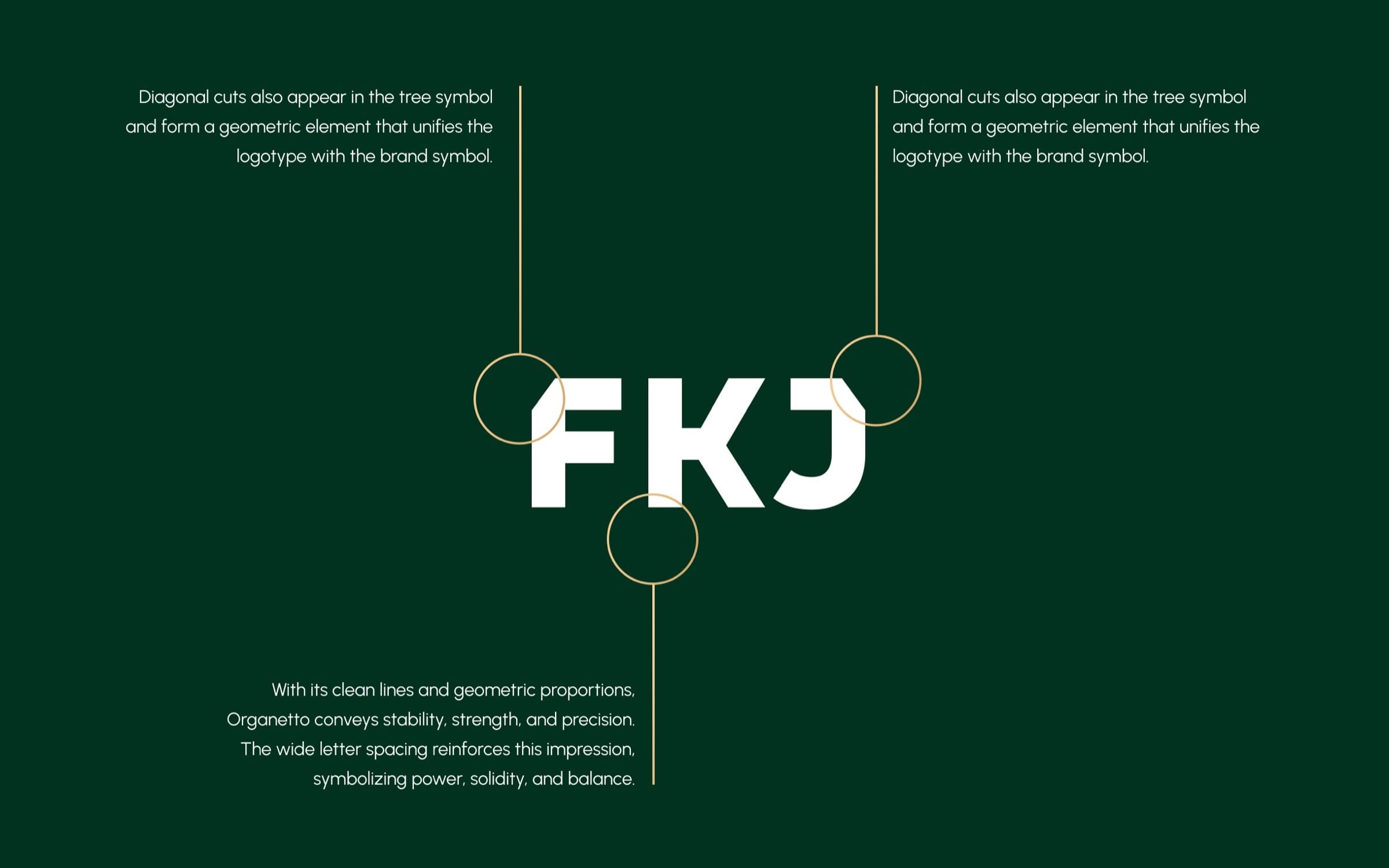
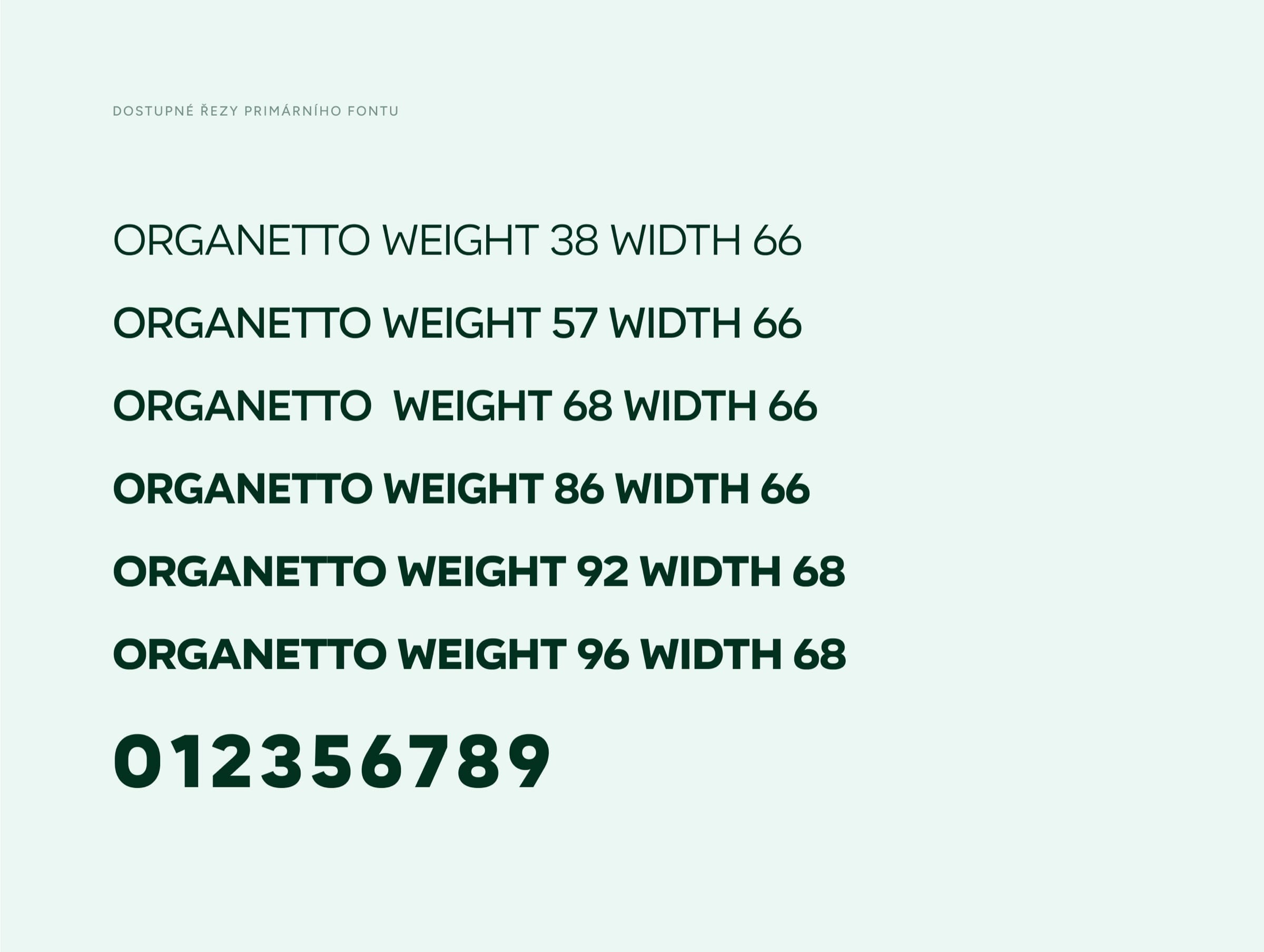
The tree’s diagonal cuts return in the FKJ logotype and in every pattern, which is what holds the parts together. Gold is kept for celebrations, so winning still looks like an event.


- PrimaryLegacy green#01311F
- PrimaryFresh green#006625
- PrimaryPure White#FFFFFF
- PrimaryStone Black#111612
- PrimaryGreen apple#E5F1EC
The decision
Rosteme společně (we grow together), a claim every fan can wear.
The claim ties the tree’s growth to the people around the club. We avoided the shorter “spolu” because of its political connotations, and kept the claim in Czech.
The tone of voice follows it. The club speaks to fans as “ty”, proud but never talking down: “Tady začínají sny malých fotbalistů” (this is where young footballers’ dreams begin).
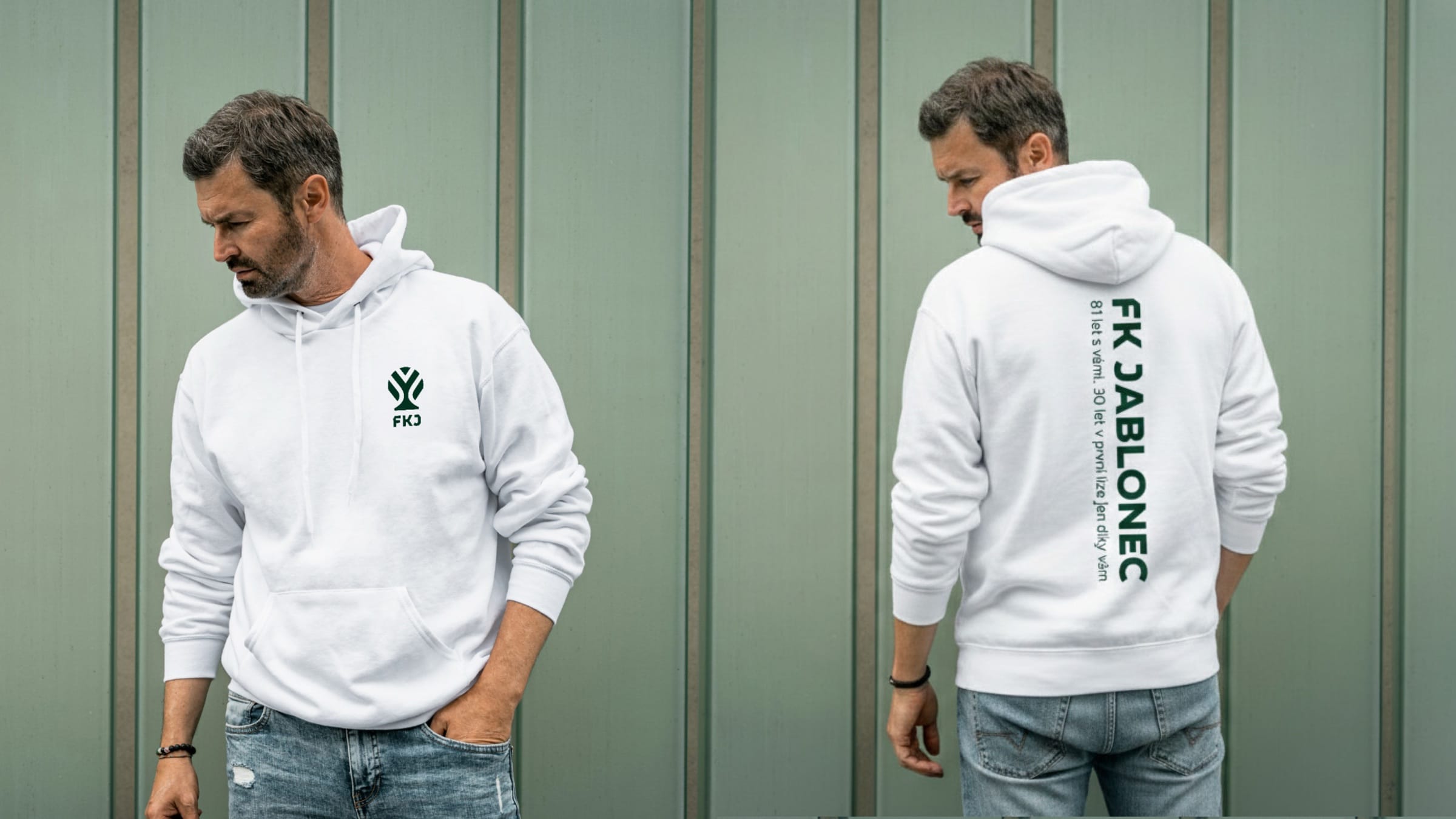
Home and away kits, with a message sewn inside.
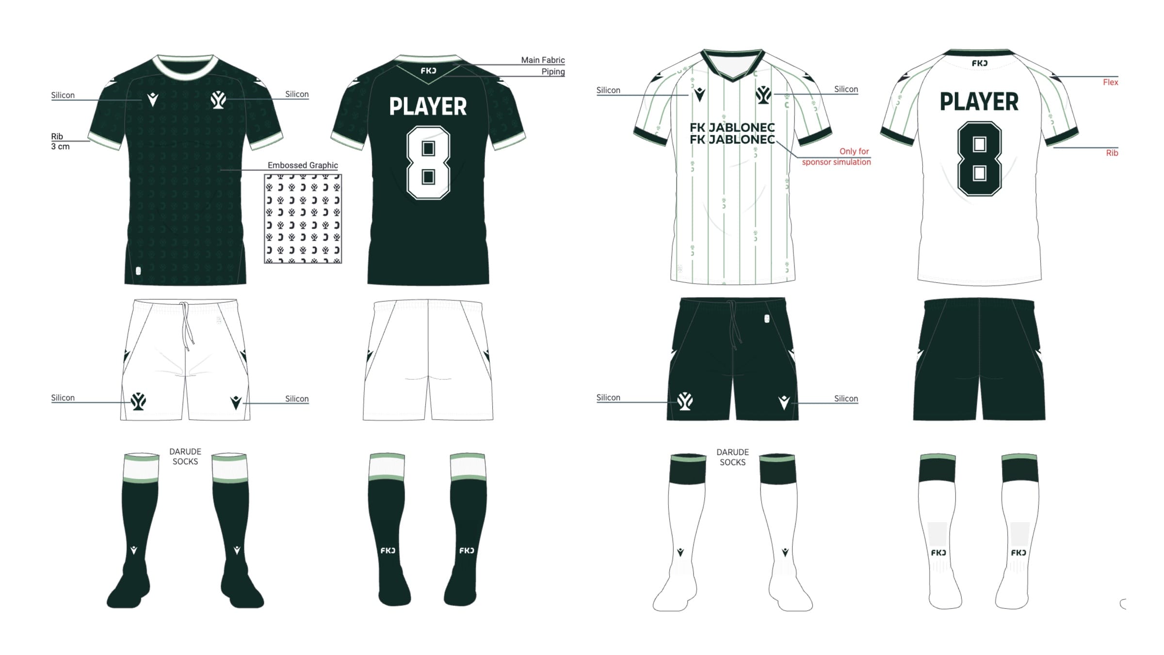
Macron made the kits for the 2026/27 season. The inner hem tape reads “Síla severu” (Strength of the North), a line only the player wearing it ever sees.
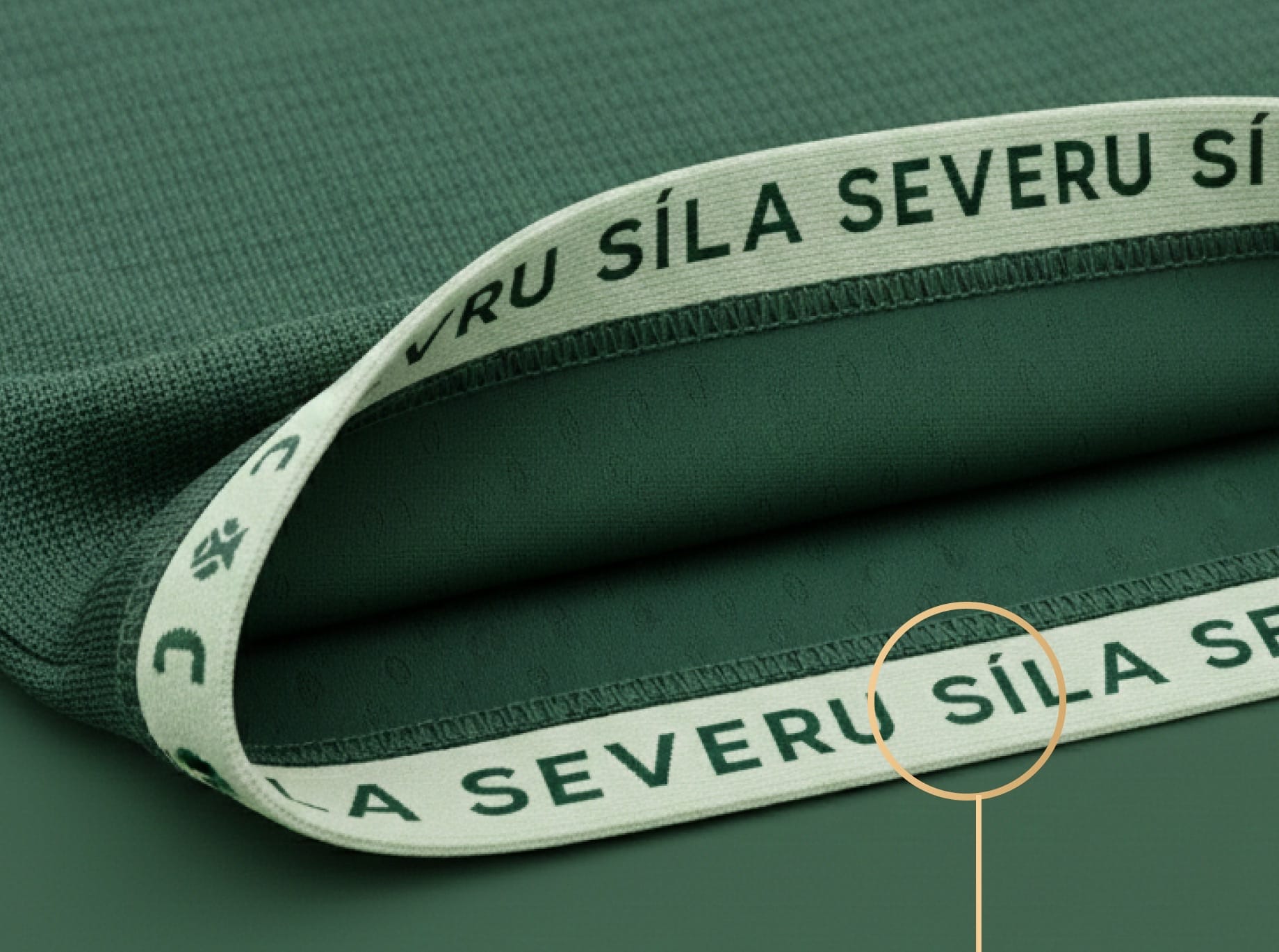
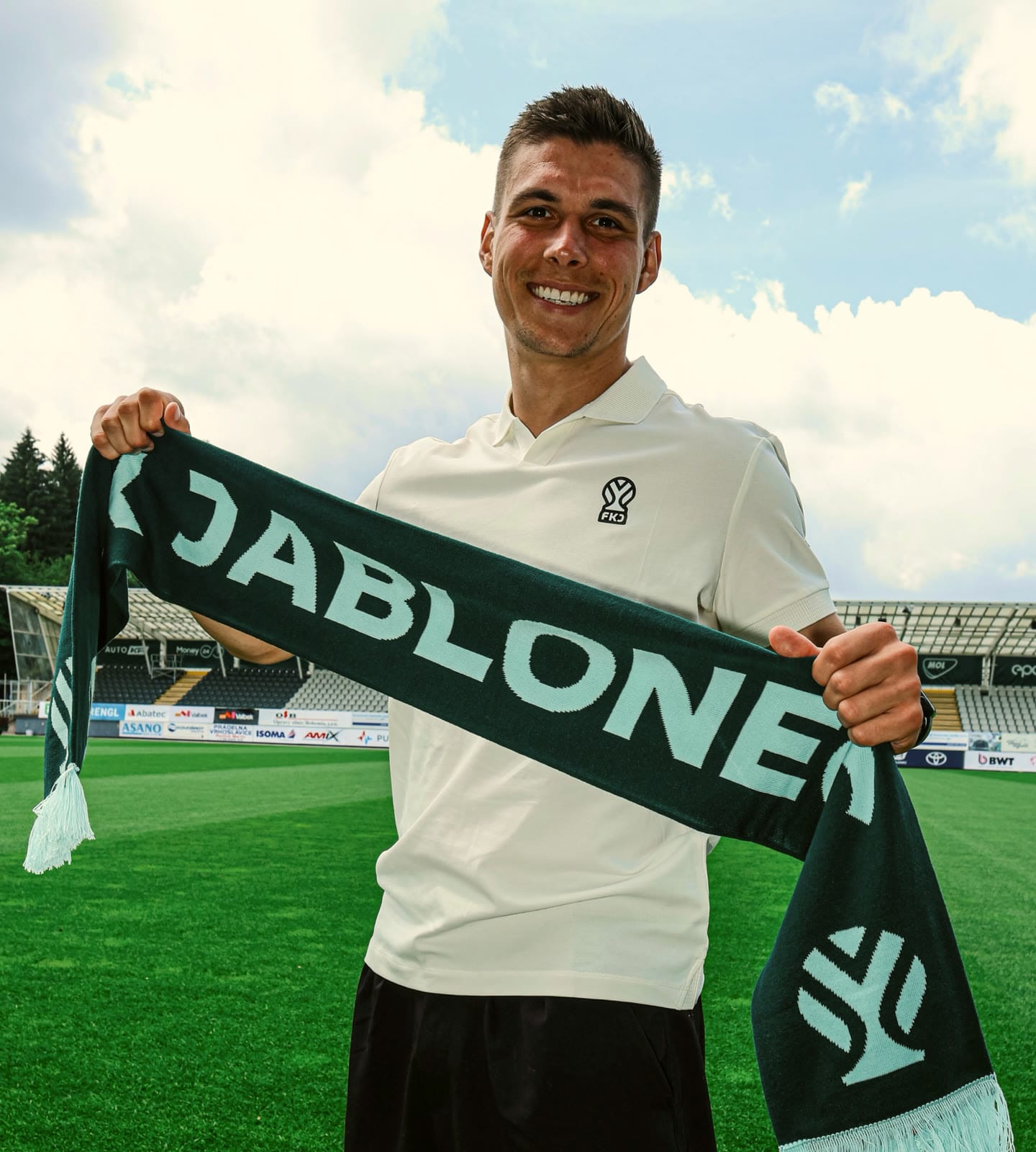
The symbol went straight into the club’s daily life.
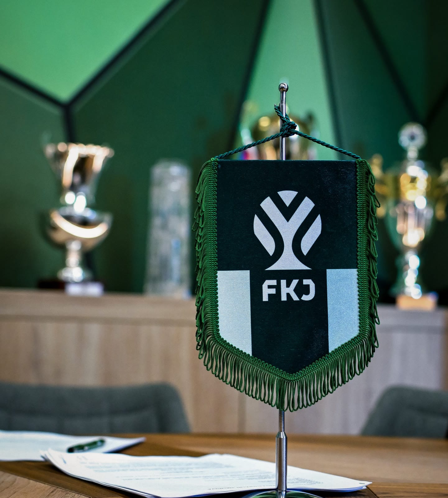
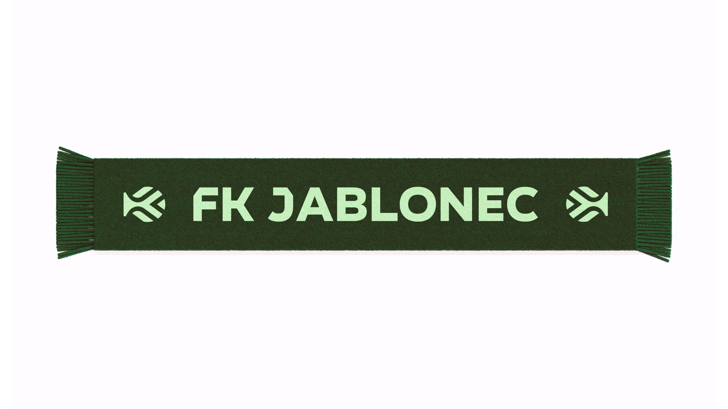
A new scarf in the stadium, the training kit with the diagonal cut and the club pennant on the boardroom table.

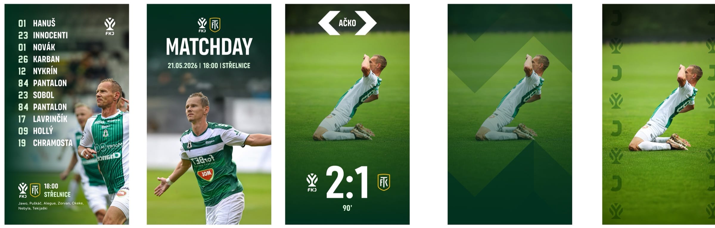
A matchday post is recognisable before anyone reads it.
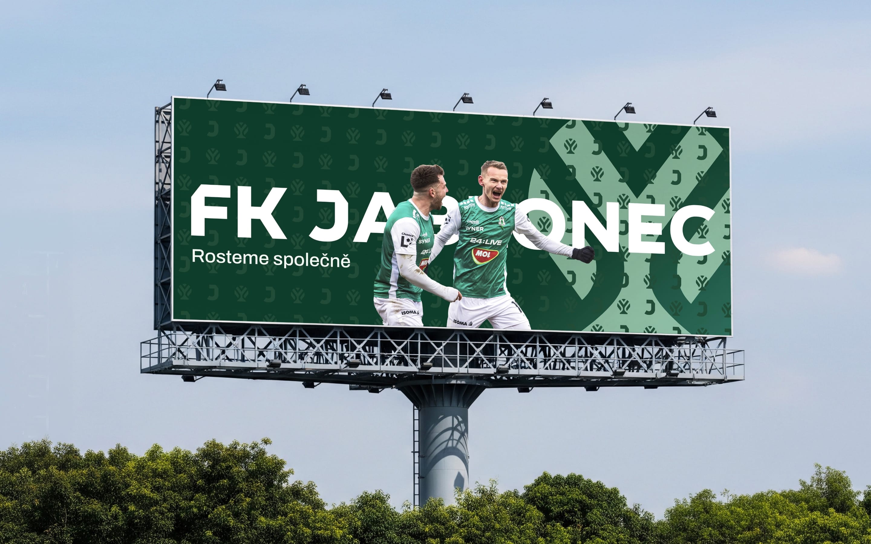
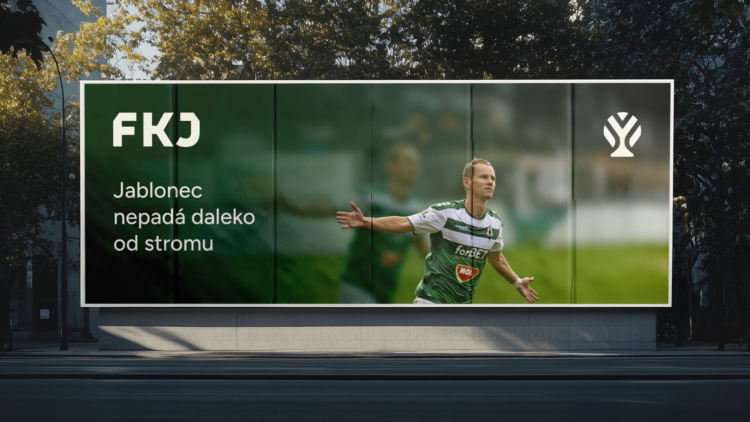
The pattern and the gradient do that work in every matchday template. The billboards and posters carry the new voice in Czech.
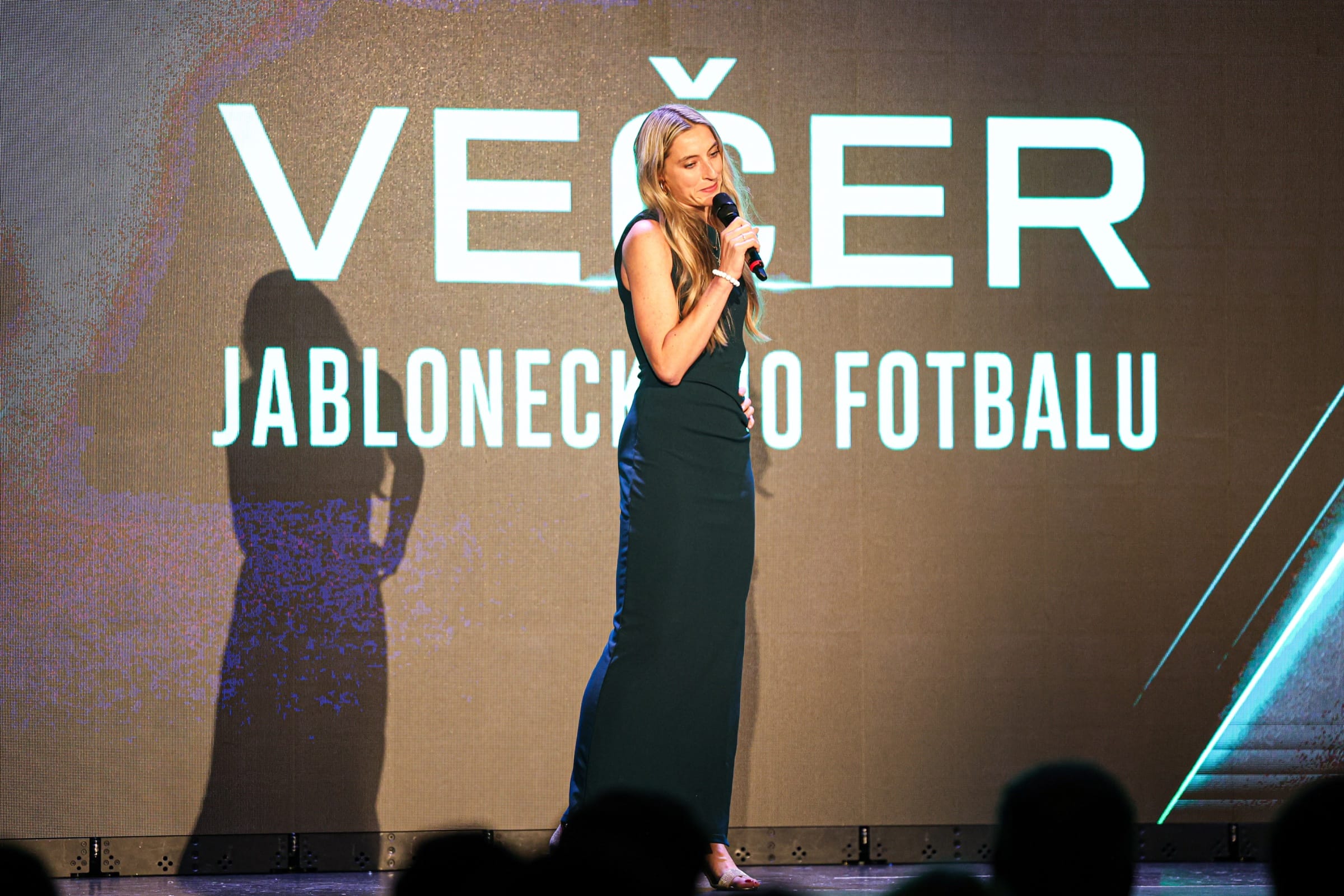
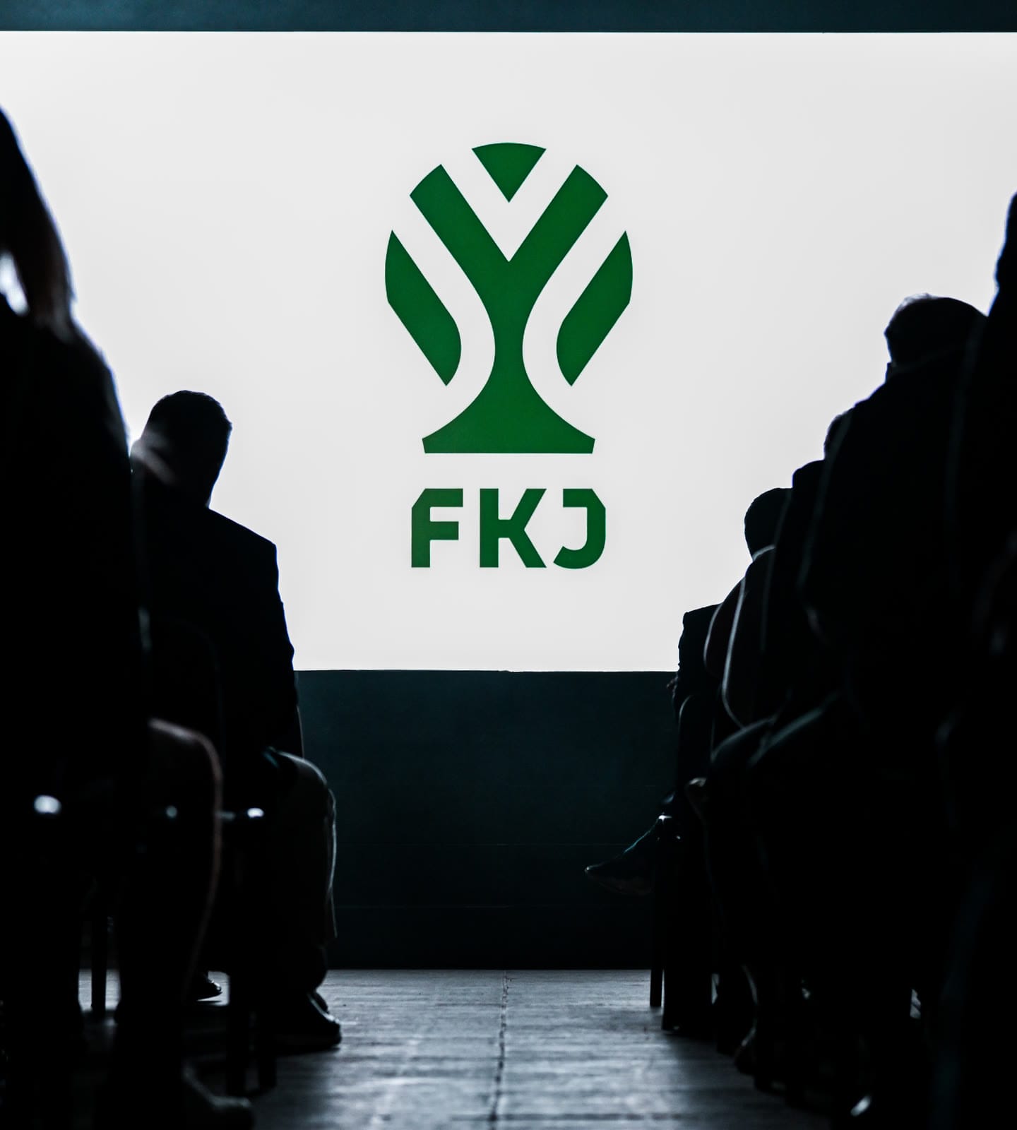
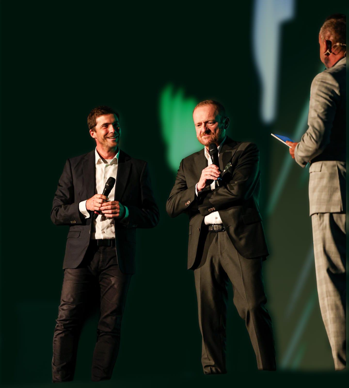
The new identity was revealed at the club’s gala evening.
The new symbol and the claim were first shown on stage at Večer jabloneckého fotbalu, the club’s gala evening.
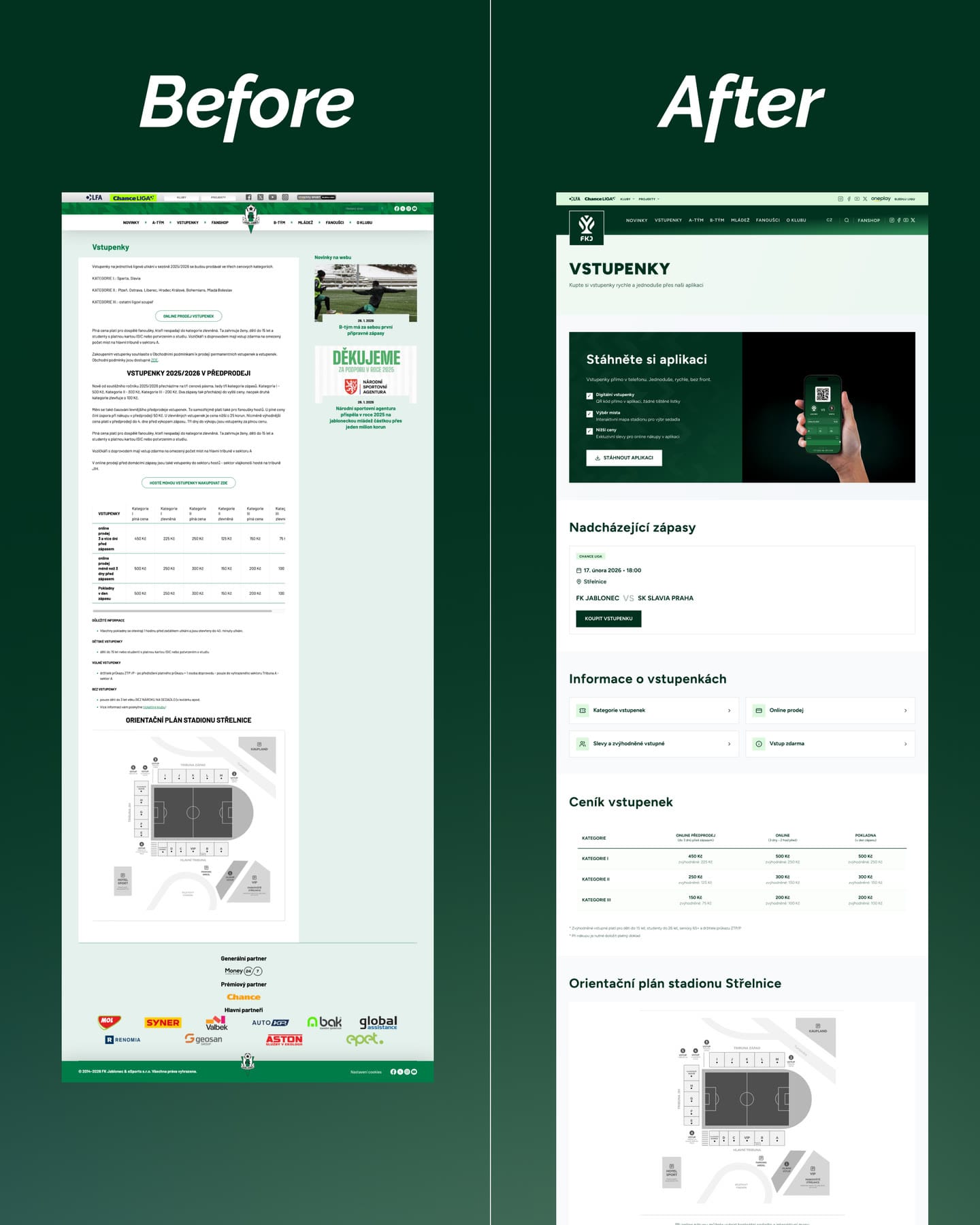
The ticket page, before and after.
The old page was a long run of text and tables. The new one leads with the app, then the next match, ticket information, prices and the stadium plan.
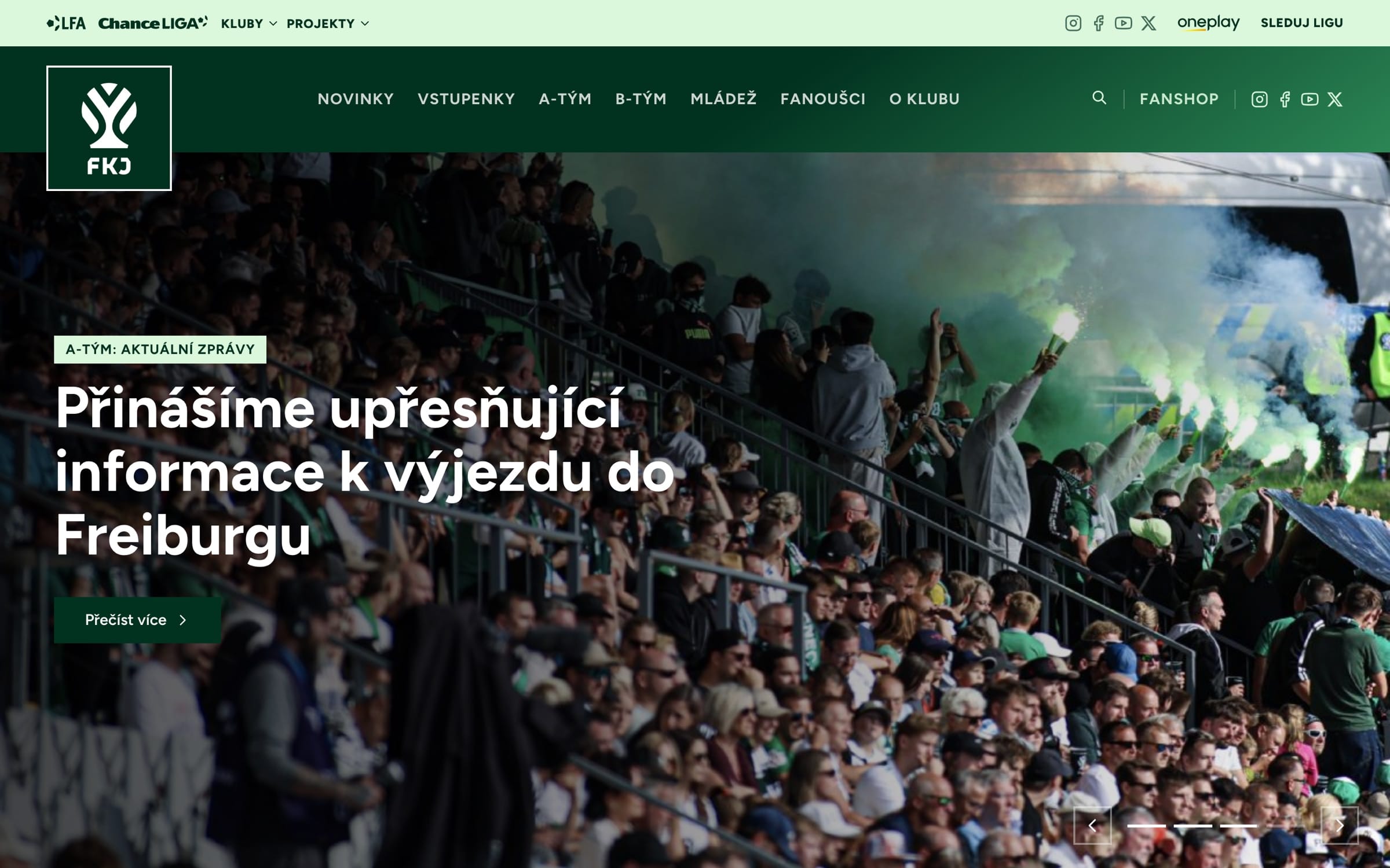
The old site was crowded, so we replaced it instead of patching it.
We built the new one with eSports.cz. Match data sits inside every page, with live commentary from Onlajny.com and InStat credited.
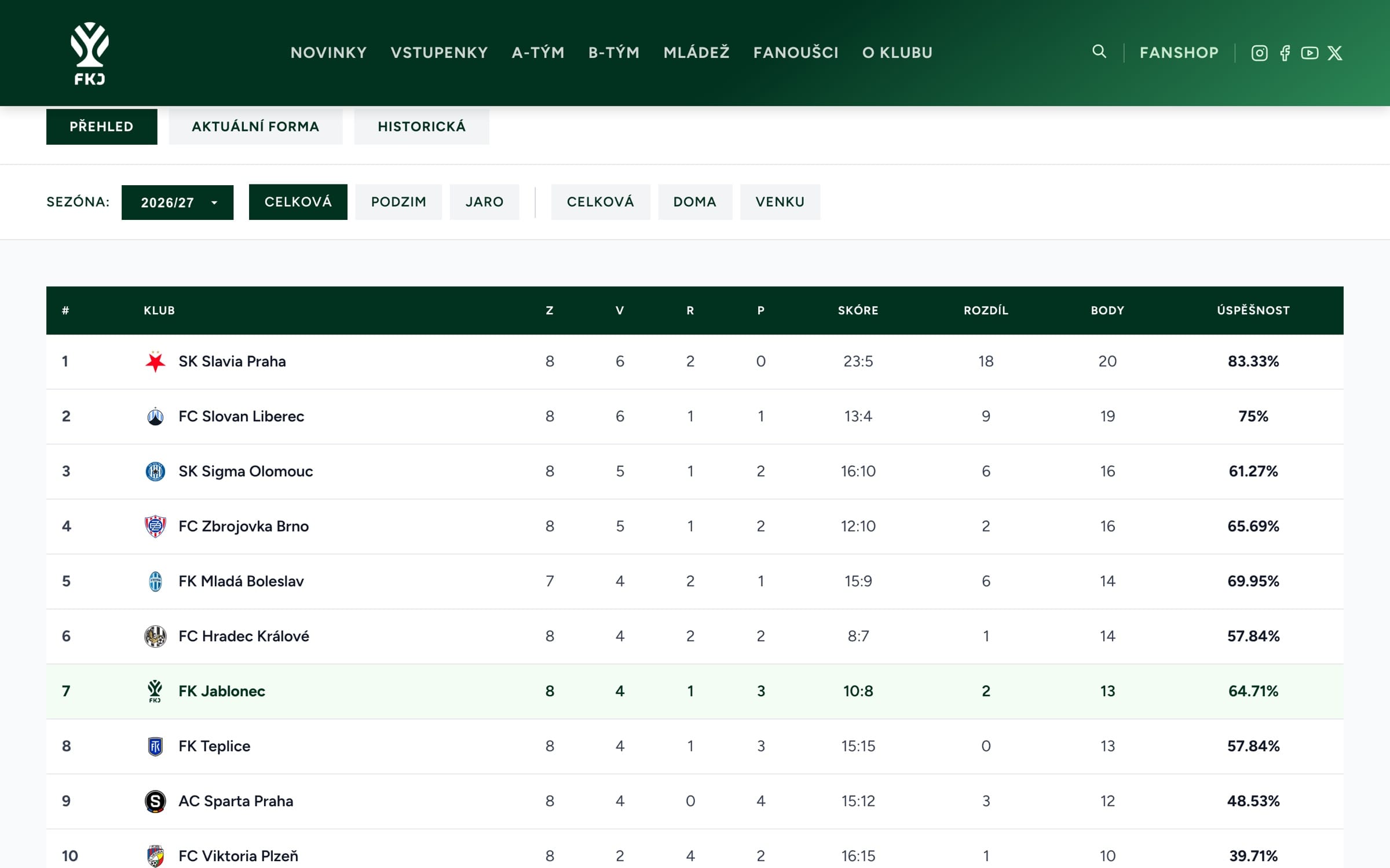
Nothing is cut from the mobile site.
Most fans check a result on a phone, so the mobile version is the same set of pages rather than a reduced one.
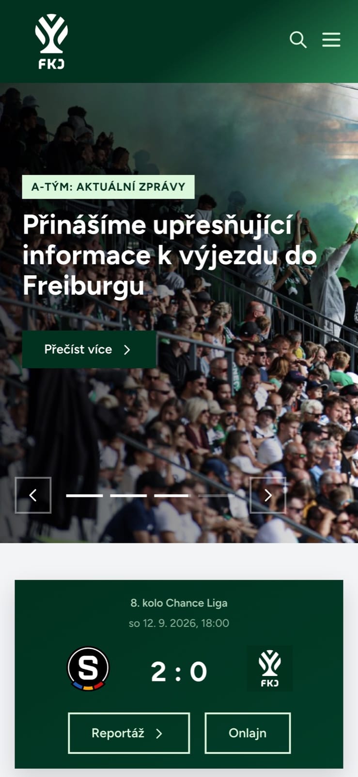
01HomepageThe lead story, then the latest result.
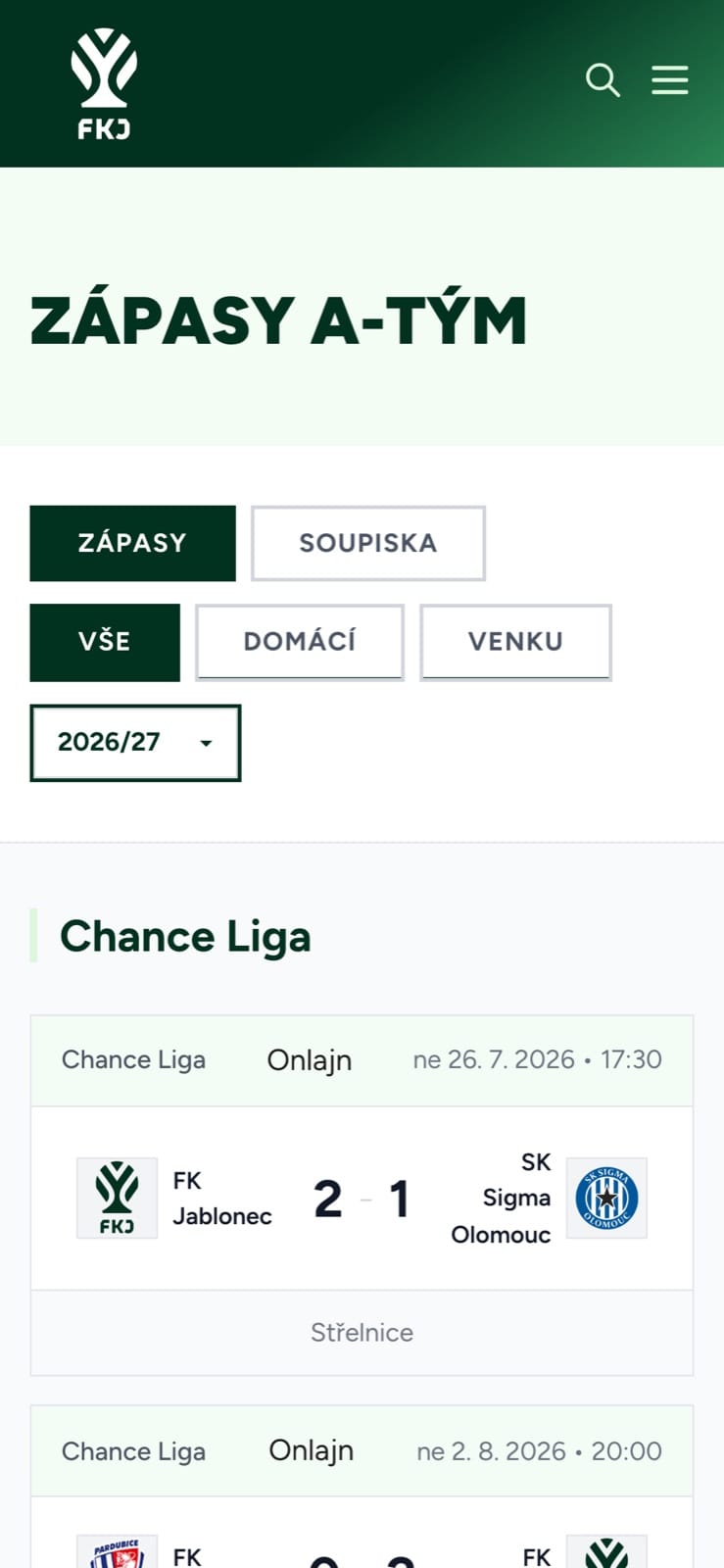
02MatchesResults and fixtures, season by season.
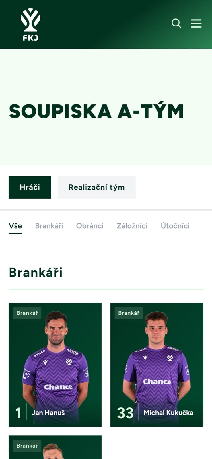
03SquadThe squad, by position.
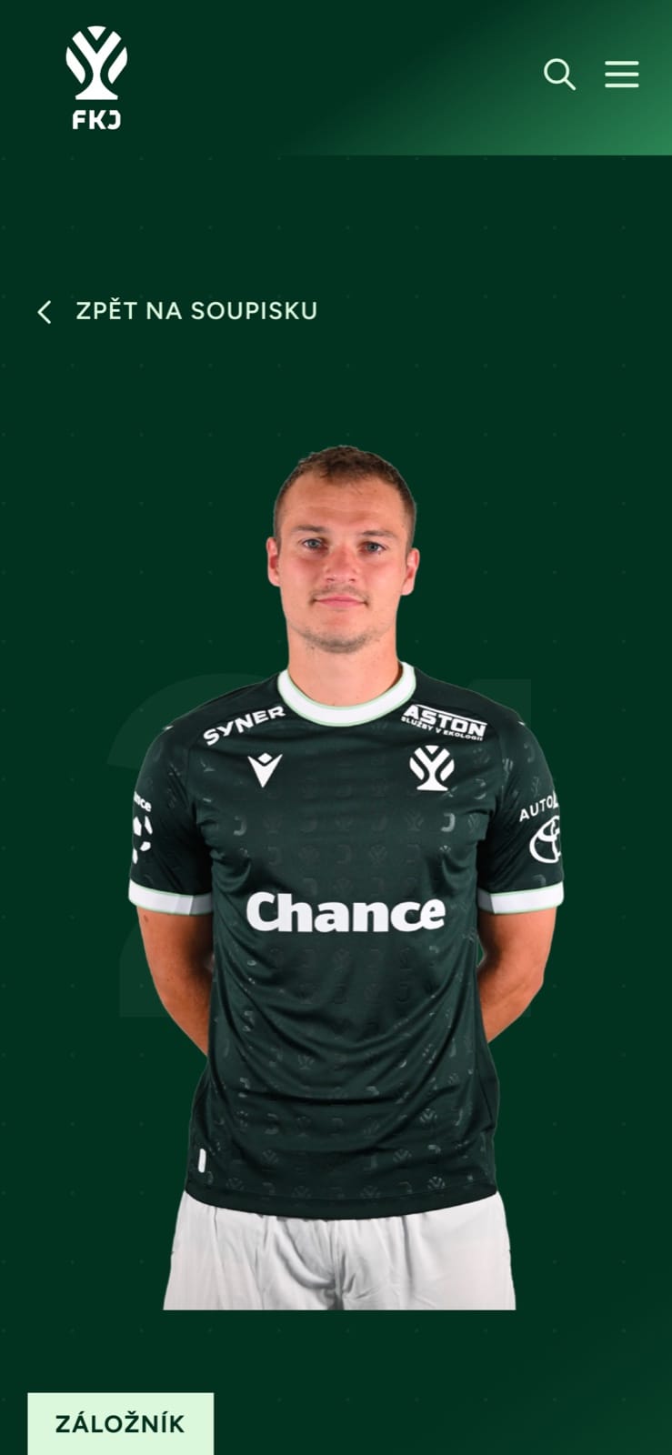
04PlayerEvery player has a profile.
More work
All projects AIINITEngineering intelligence for the industries that build the world.Branding / Website
 Real EstatePenta Real EstateAutomating apartment specification sheets.Engineering / Product & Design
 Financial ServicesHalaliEvolution, not revolution. A new identity built on existing trust.Branding / Campaign
 AIMotionshiftUnlocking AI-powered video & animation.Product & Design / Website / AI & Agentic
 ConsumerLEGOAn event app for LEGO, mapped before anyone drew a screen.App / Strategy
 SportsLiga ženStep into the light of the game.Branding / Campaign