INITEngineering intelligence for the industries that build the world.
At a glance
- Design thinking
- Keep one bright signal. Ignition Orange appears once per layout, and a single diagonal cut gives every layout its direction.
- Problem
- INIT was still introducing itself with a generic wordmark, while buyers compared it with consultancies and agencies that all look alike.
- Approach
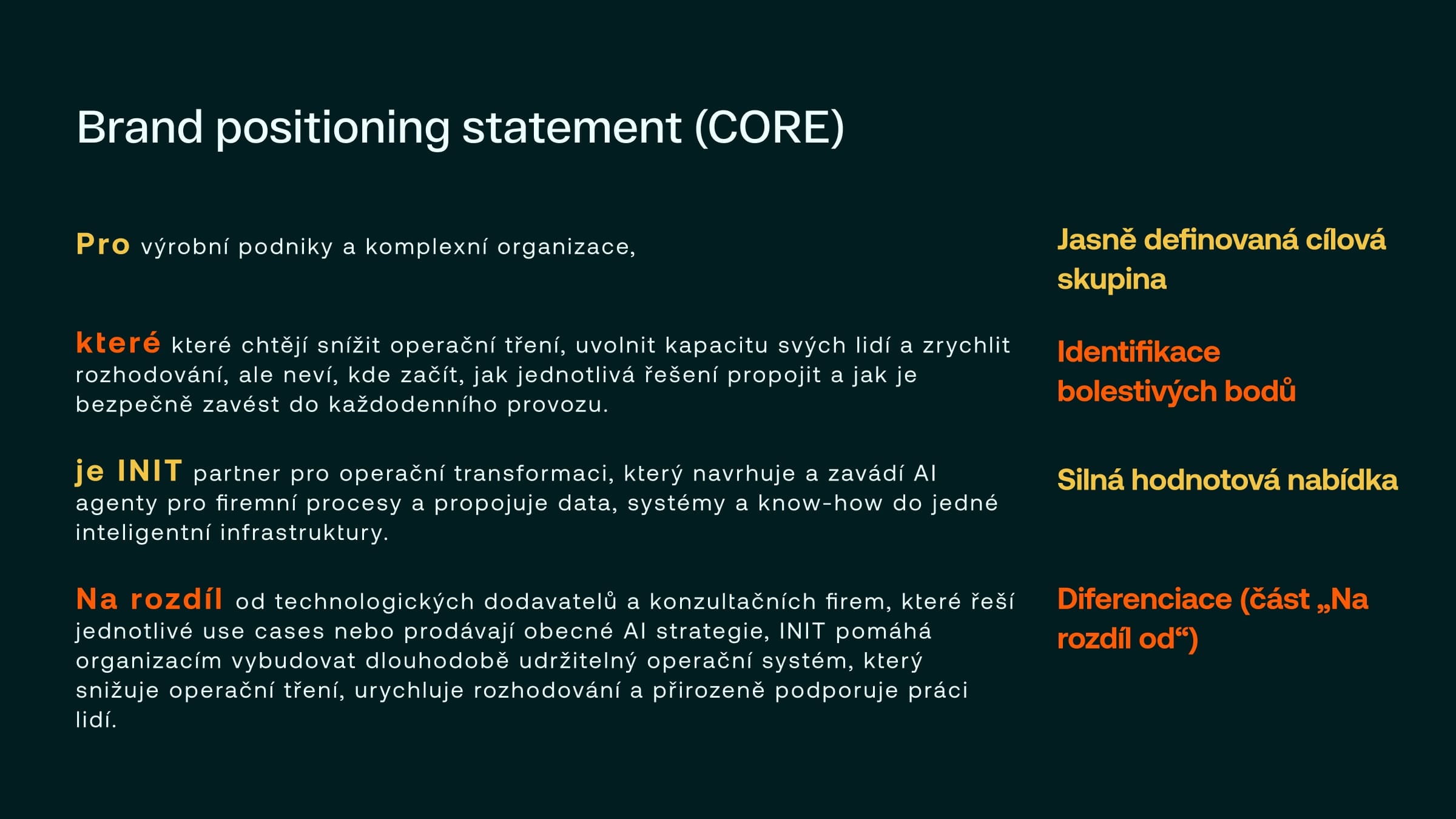
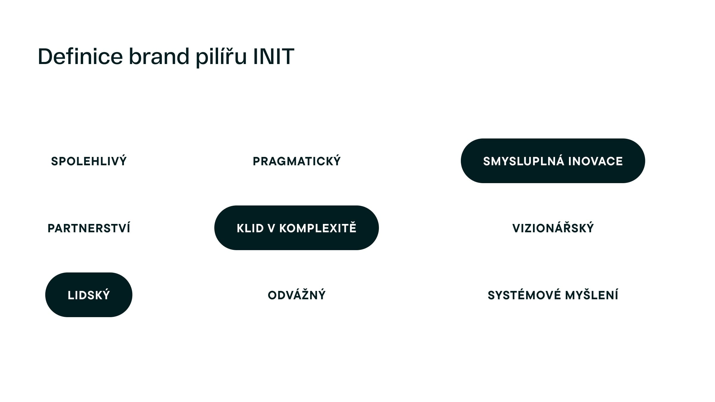
- A brand workshop set the position first, and three of nine candidate pillars were chosen to carry it.
- Outcome
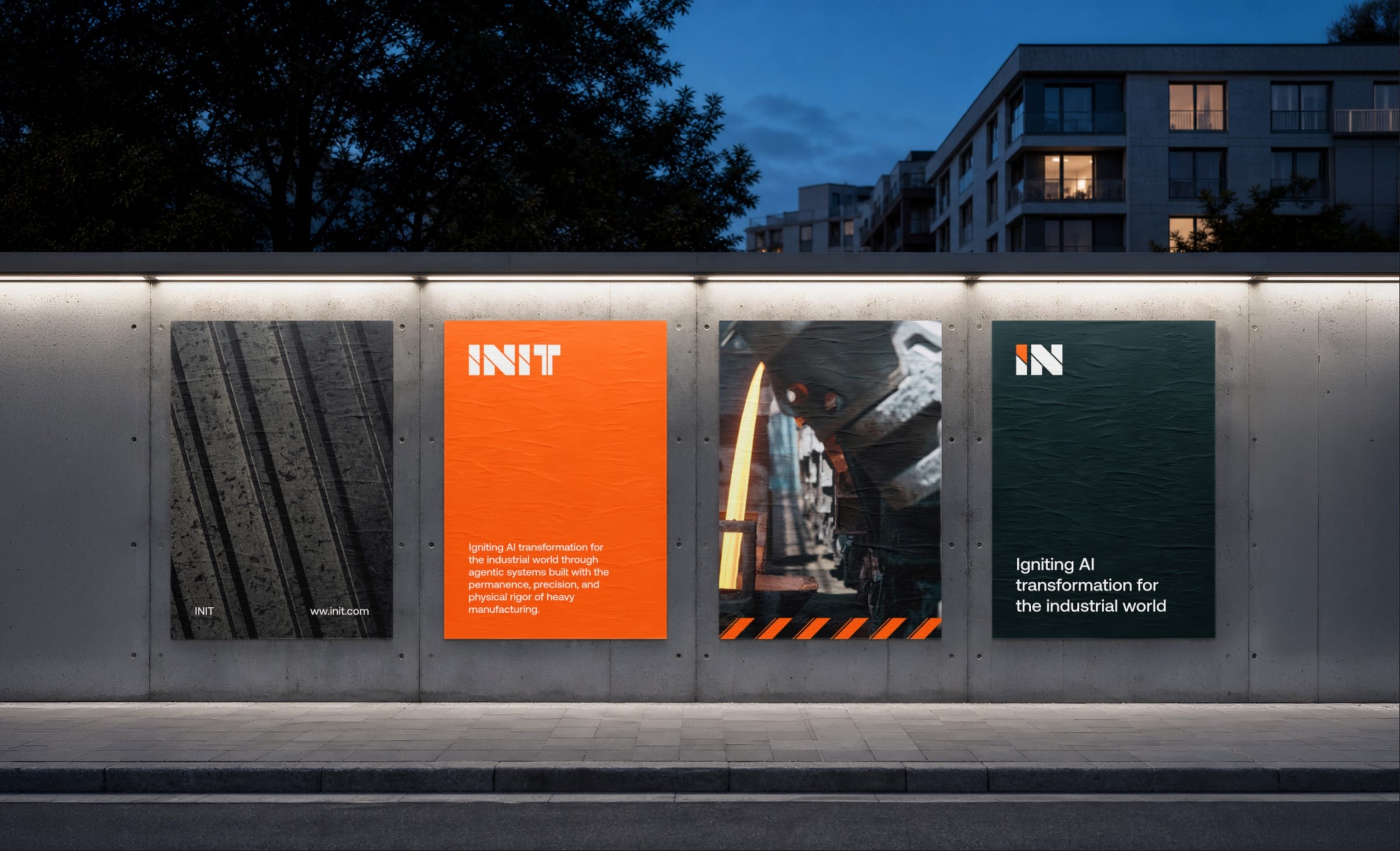
- The identity is live on INIT’s website under the claim Engineered Agentic Intelligence, with print and outdoor designed to match.
- Role
- Lucie as the only designer and project lead, working directly with the founders, Radek Novotný and Jan Jaroměřský.
- What we designed
- Brand workshop
- Positioning
- Brand pillars
- Verbal identity
- Logo design
- Website design
- Duration
- April–June 2026
- Platforms
- Brand identity
- Print and outdoor
- Website
A partner for operations, not another AI vendor.
INIT is for manufacturers that want faster decisions and less operational friction but don’t know where to start. Three of nine candidate pillars carry that: calm in complexity, human, and meaningful innovation.
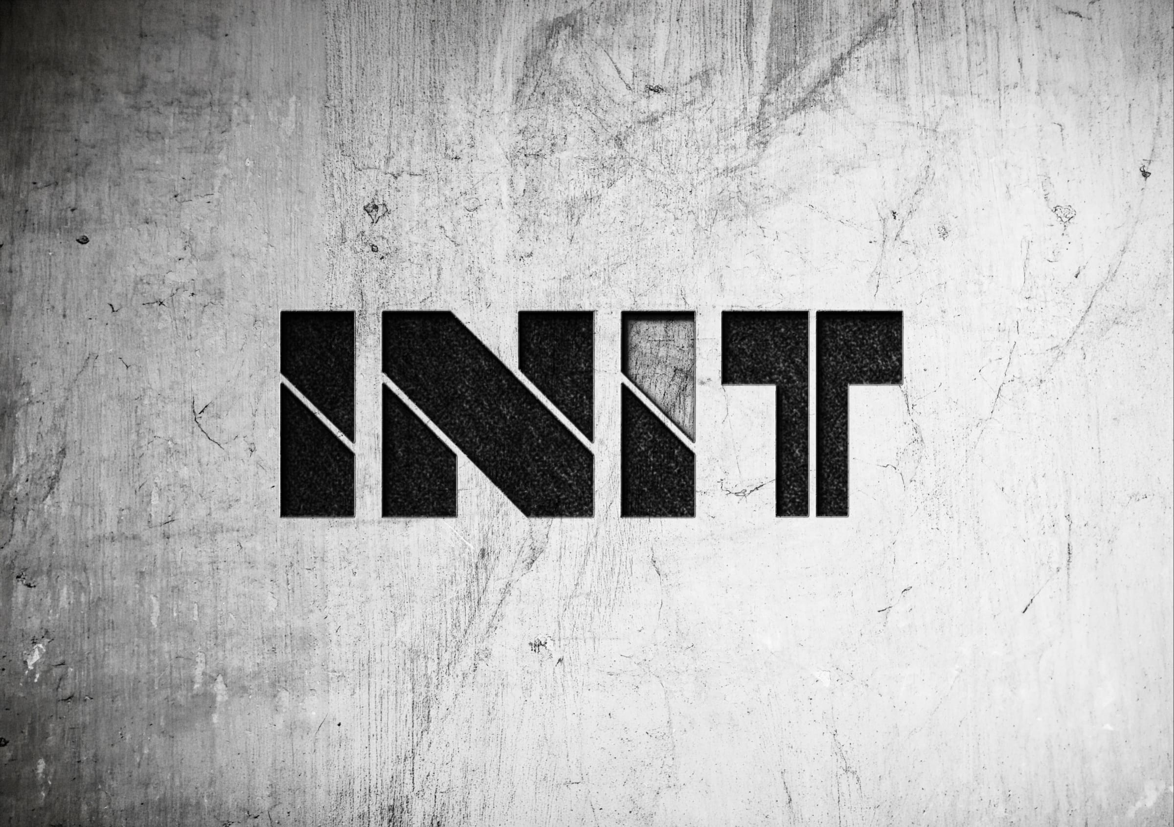
One diagonal cut, one signal of orange.
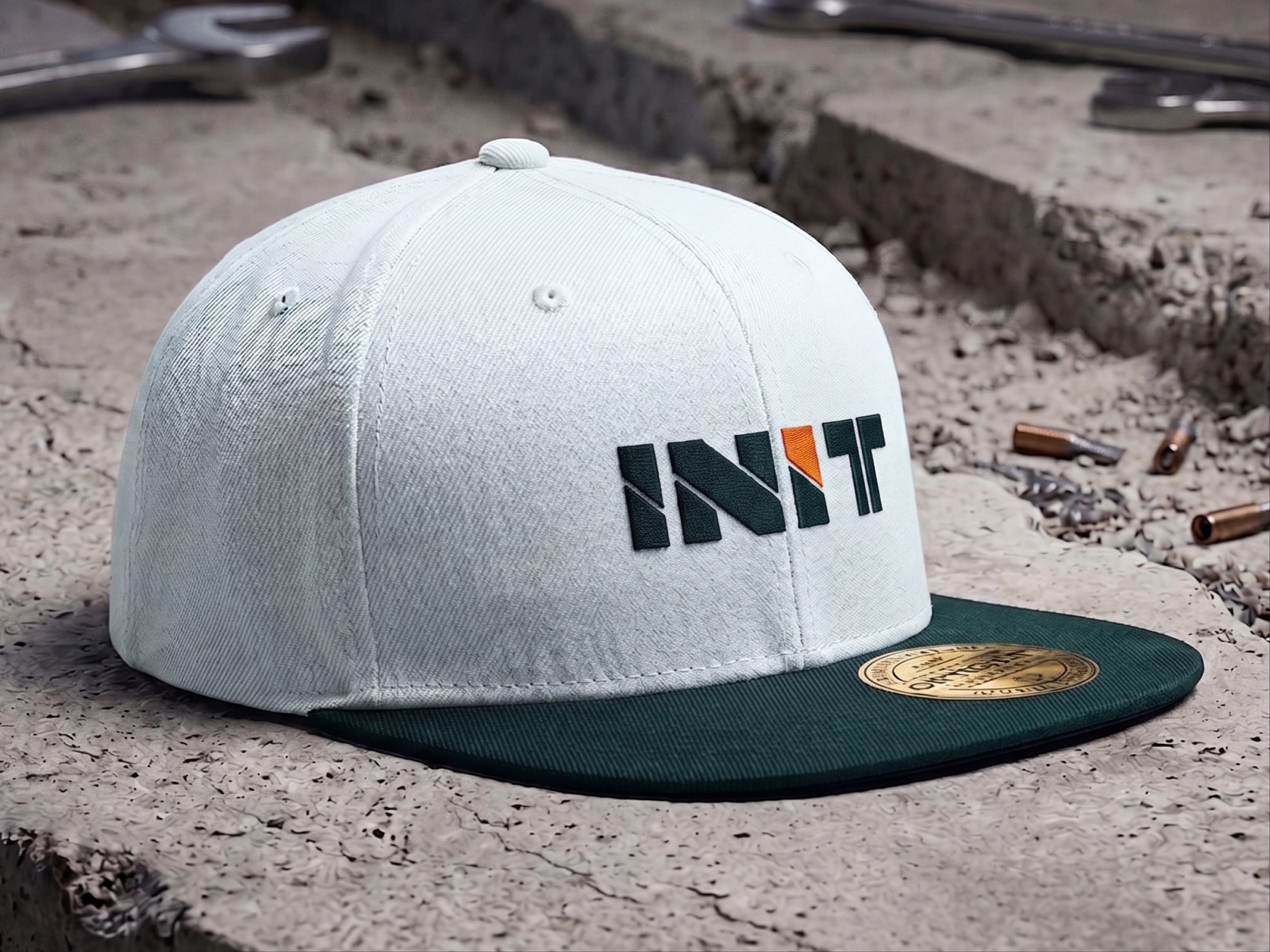
The cut in the logotype becomes a compact IN symbol, so the brand can sign a cap or a slide where the logotype would not fit. It holds on orange, mist, obsidian and teal.

An industrial palette with one bright signal.
Near-black cyan and the engineered teals do the serious work. Ignition Orange appears once in a layout, which is what keeps it reading as a signal rather than decoration.
- Dark Obsidian#011214
- Obsidian Cyan#021D1F
- Deep Harbor#075056
- Oxide Teal#318488
- Arctic Mist#DFFBFB
- Light Mist#F6FFFF
- Process Gold#F2C545
- Ignition Orange#FF5B04
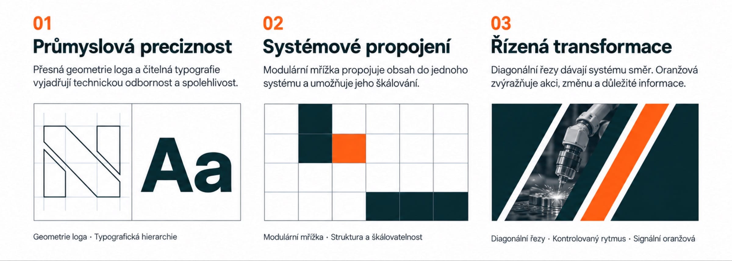
Three rules decide how anything new gets drawn.
The logotype’s geometry sets the type, a modular grid absorbs new content, and the diagonal cut gives every layout its direction. Nothing is added that breaks one of the three.
Human judgment. Machine precision.
People set the direction; systems deliver the performance. An orange cut splits each word.
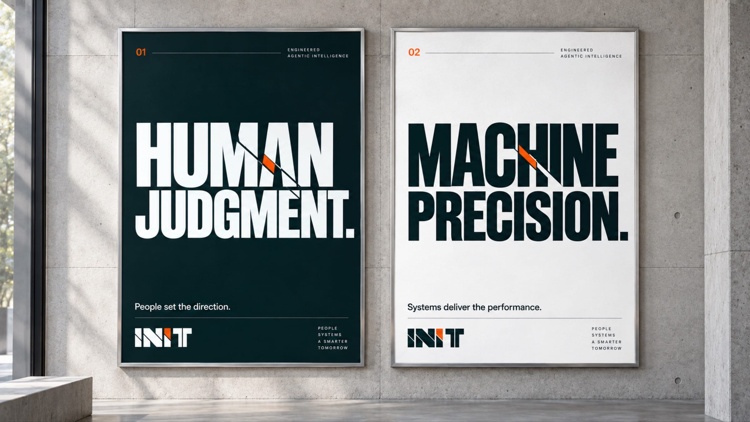
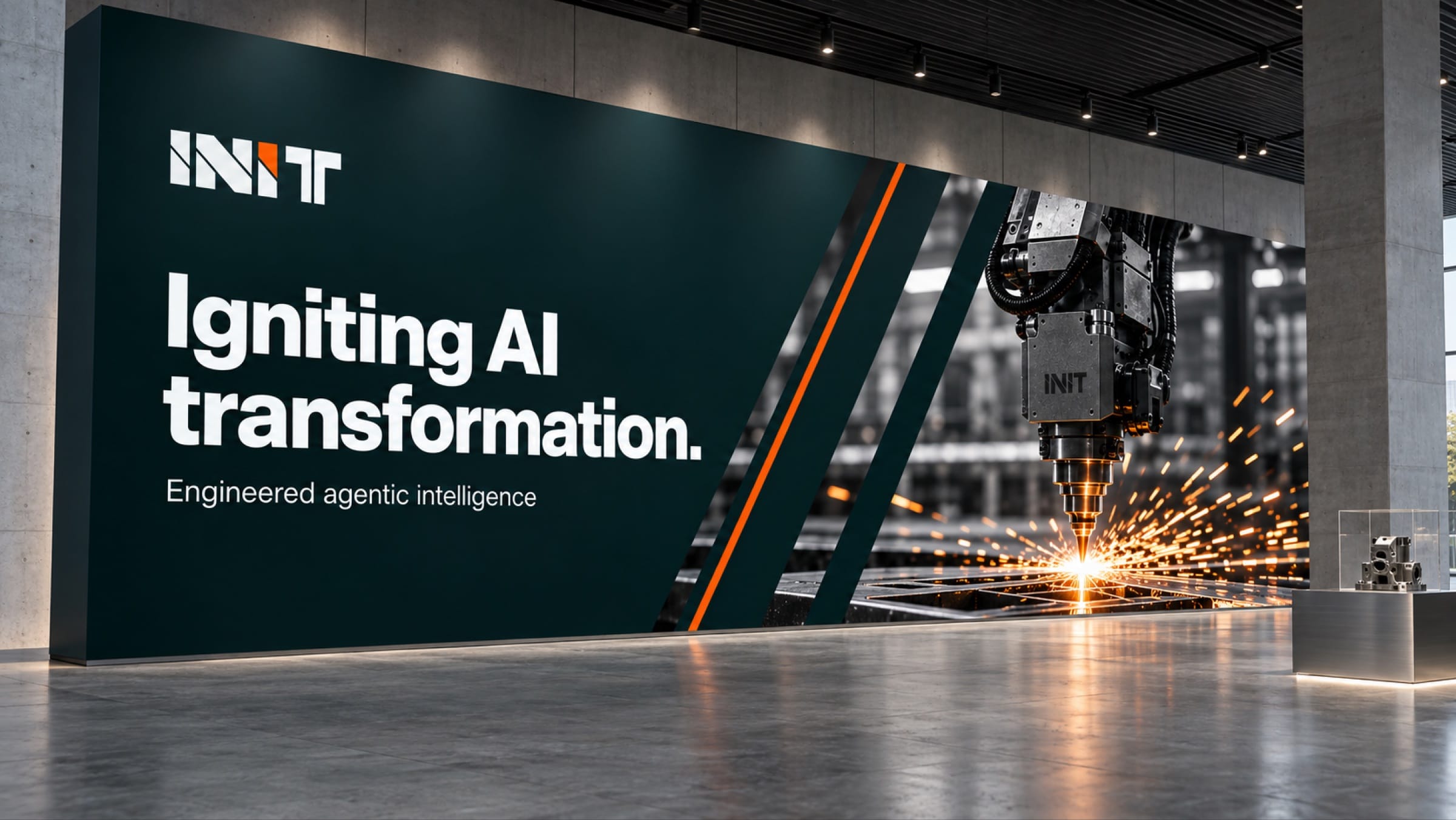
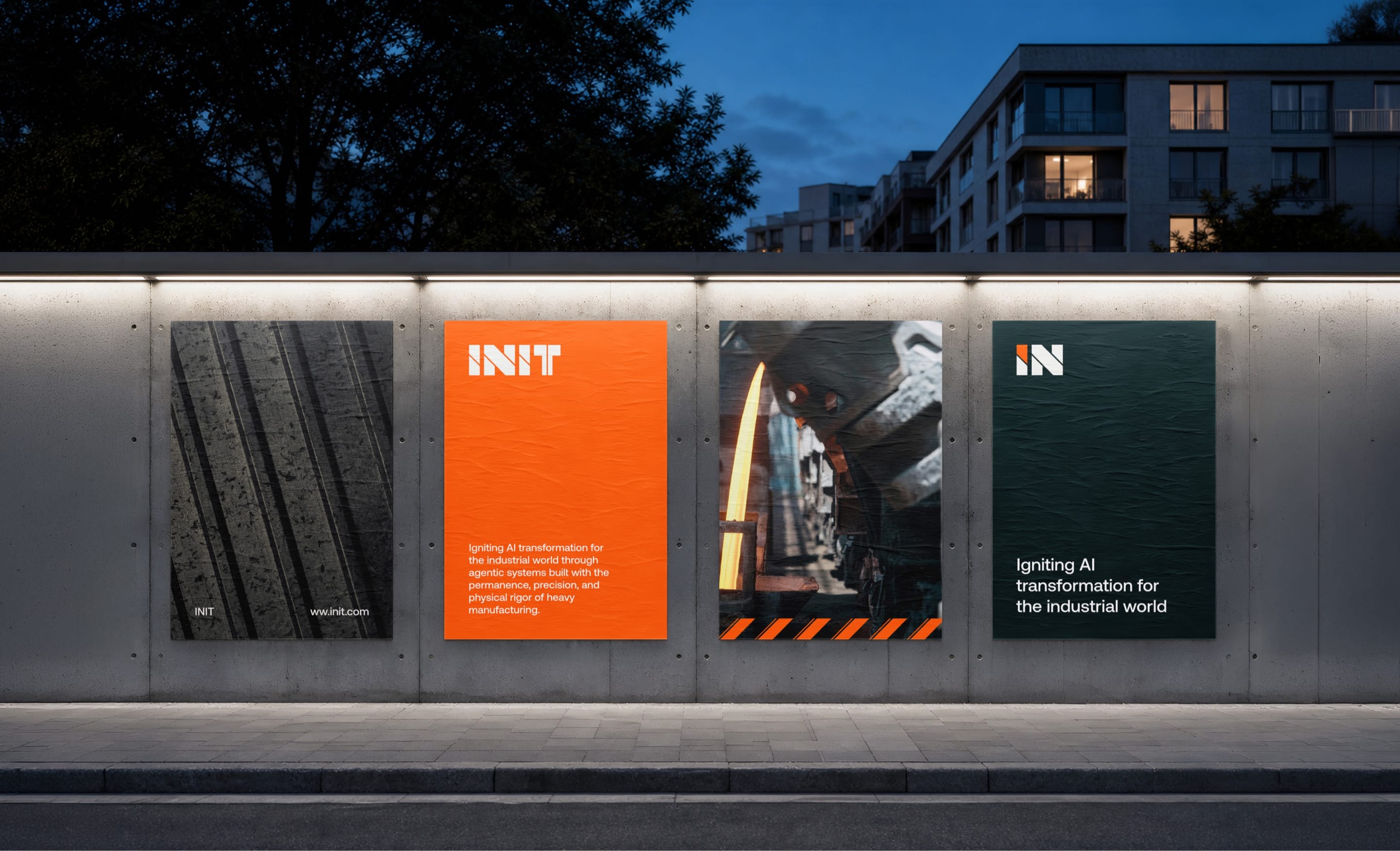
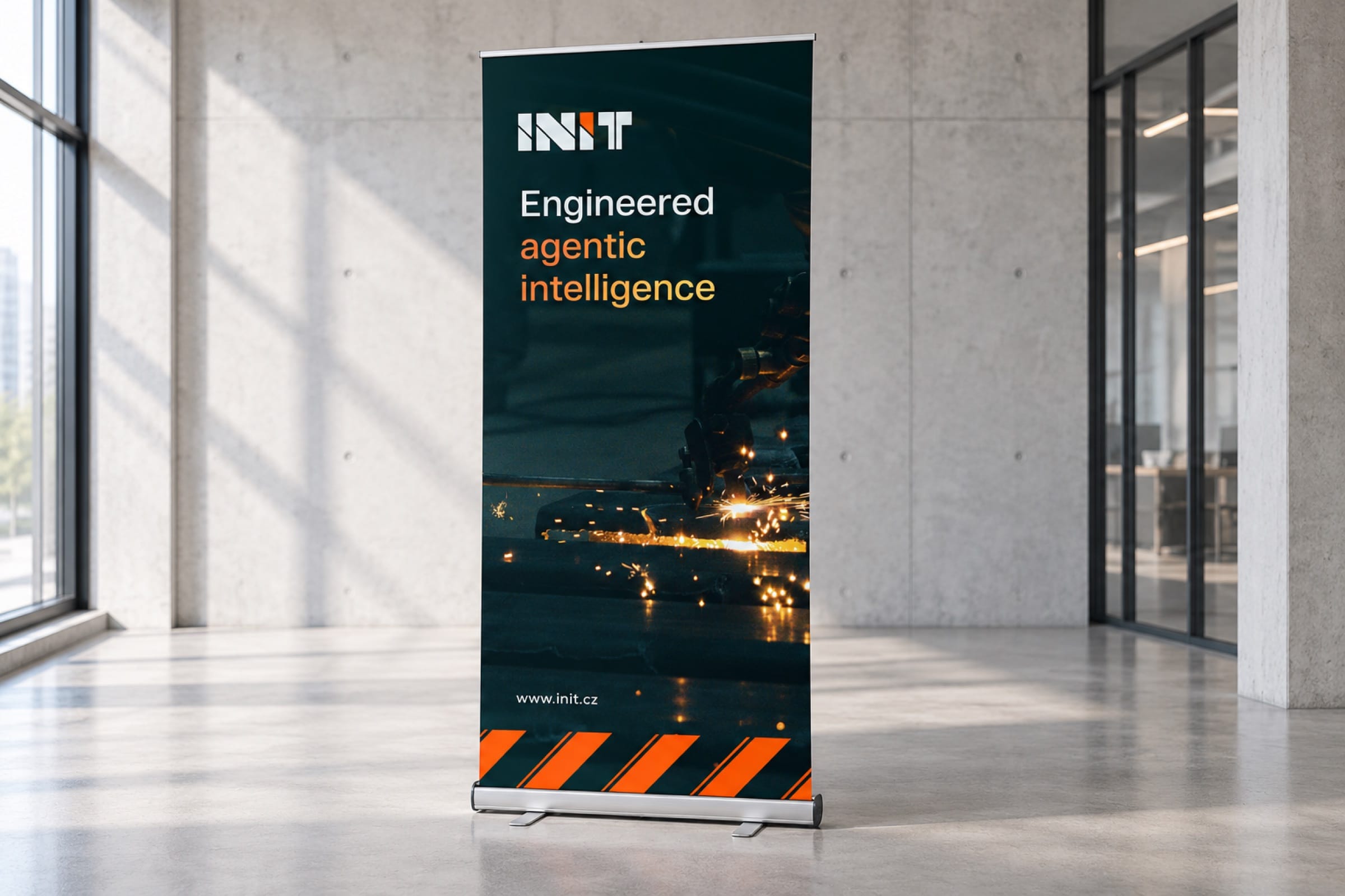
Three fixed elements make every piece recognisable, from a cap to a roll-up.
Each piece is built from the same kit: dark obsidian, one diagonal cut and a single orange line. It needs no extra graphics to be recognised, even in a hall full of machines.
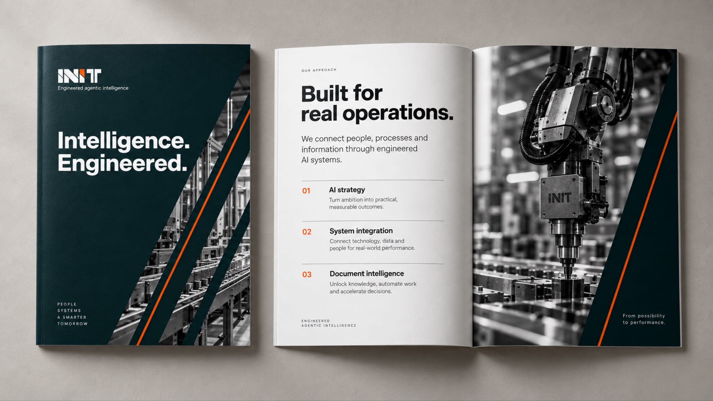
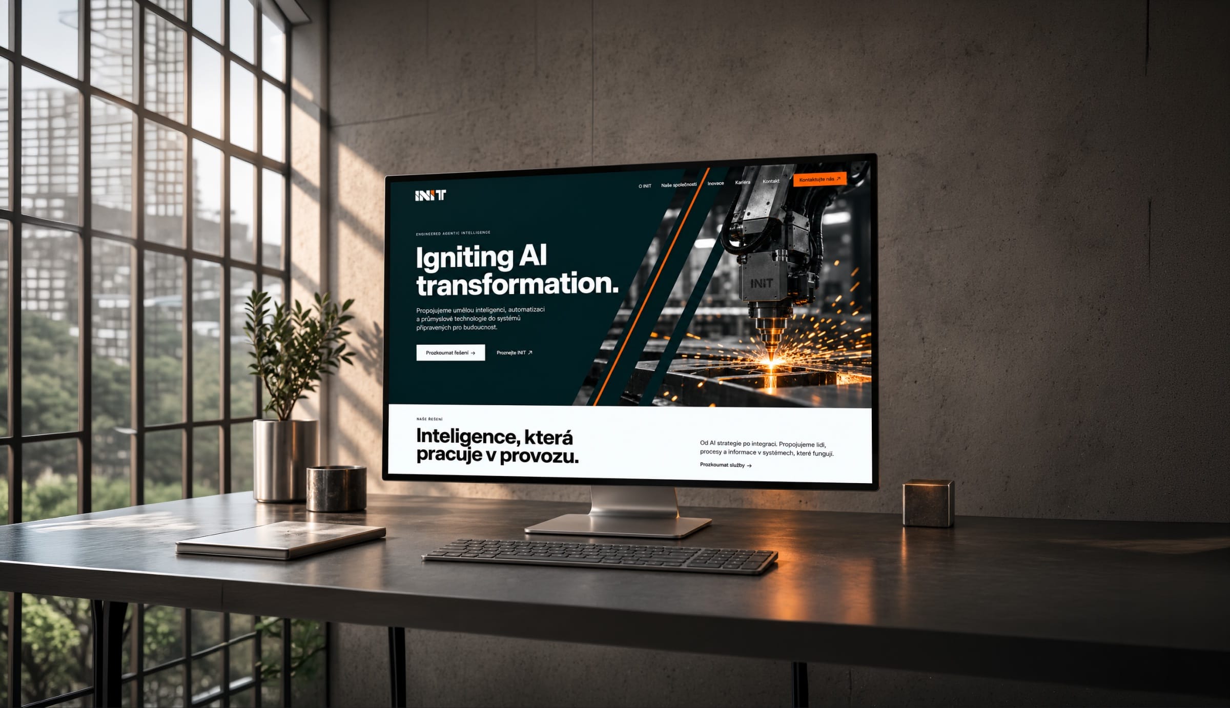
The homepage opens on a production line, not on abstract AI imagery.
INIT sells to manufacturers, so the first screen shows a machine throwing sparks under the claim Igniting AI transformation. Below it, the site uses the same obsidian and diagonal cuts as the print.
More work
All projects SportsFK JablonecJablonec never falls far from the tree.Branding / Campaign / Website
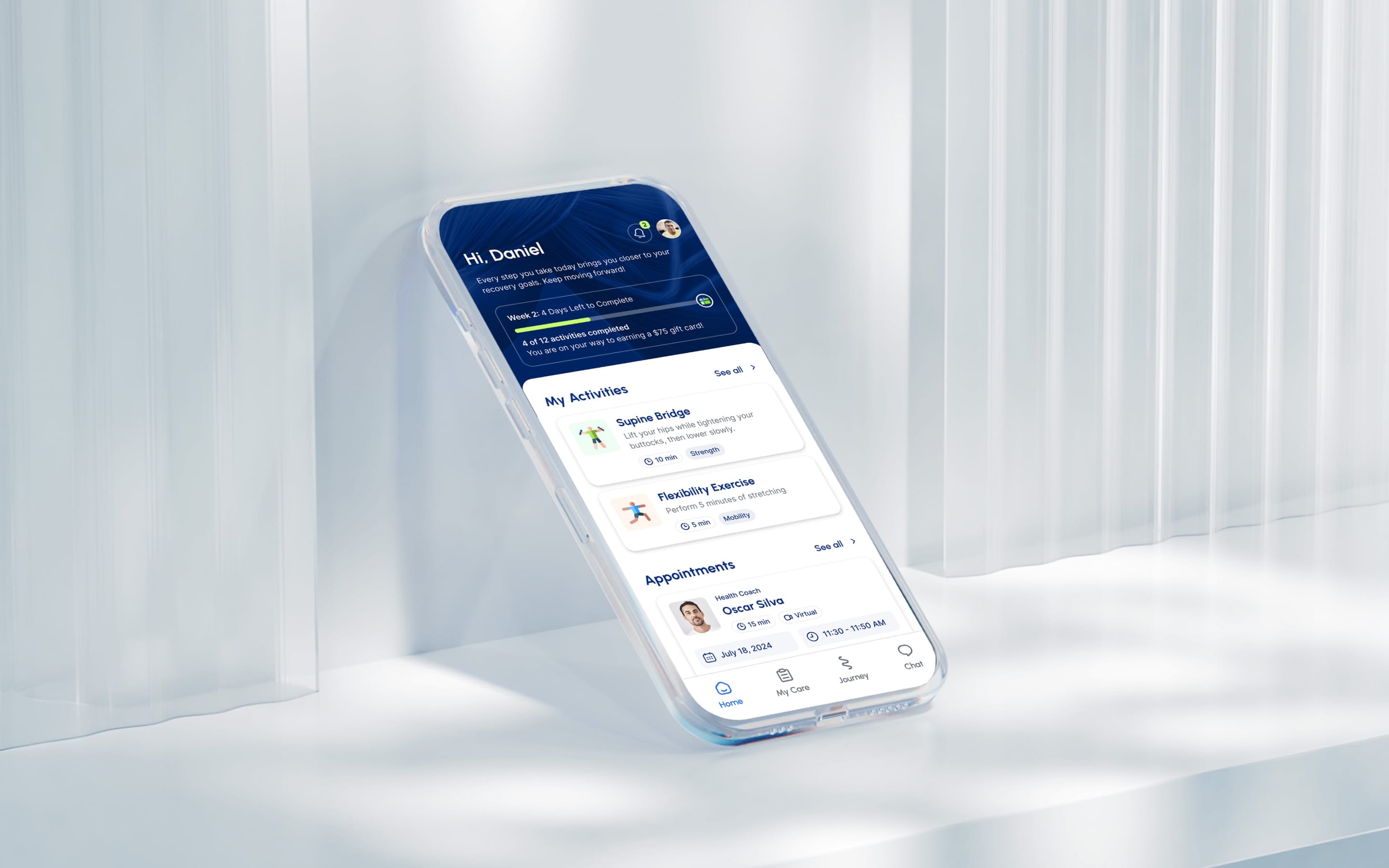 HealthMovidoA physio programme for the days between appointments.Product & Design / App
 Financial ServicesHalaliEvolution, not revolution. A new identity built on existing trust.Branding / Campaign
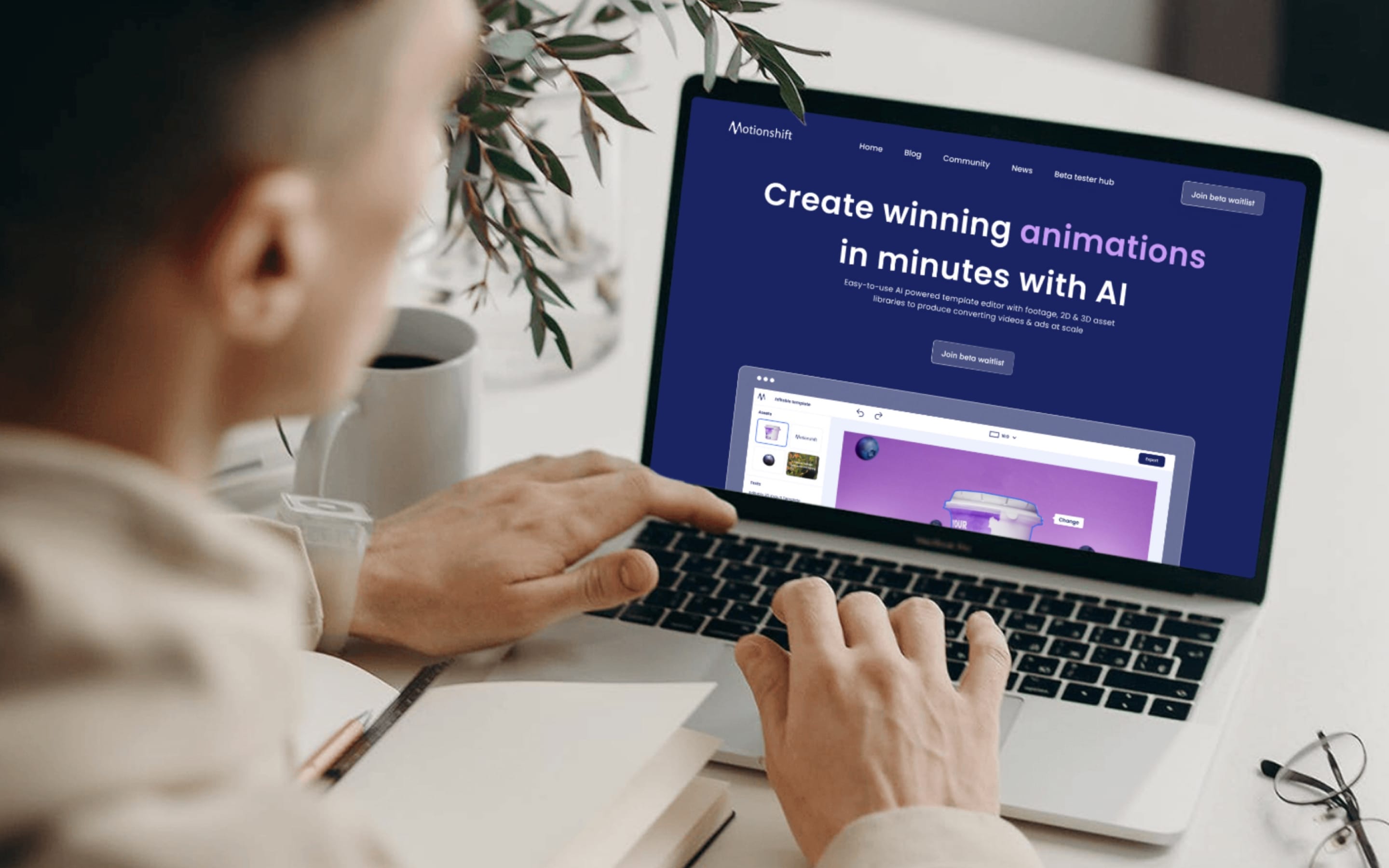 AIMotionshiftUnlocking AI-powered video & animation.Product & Design / Website / AI & Agentic
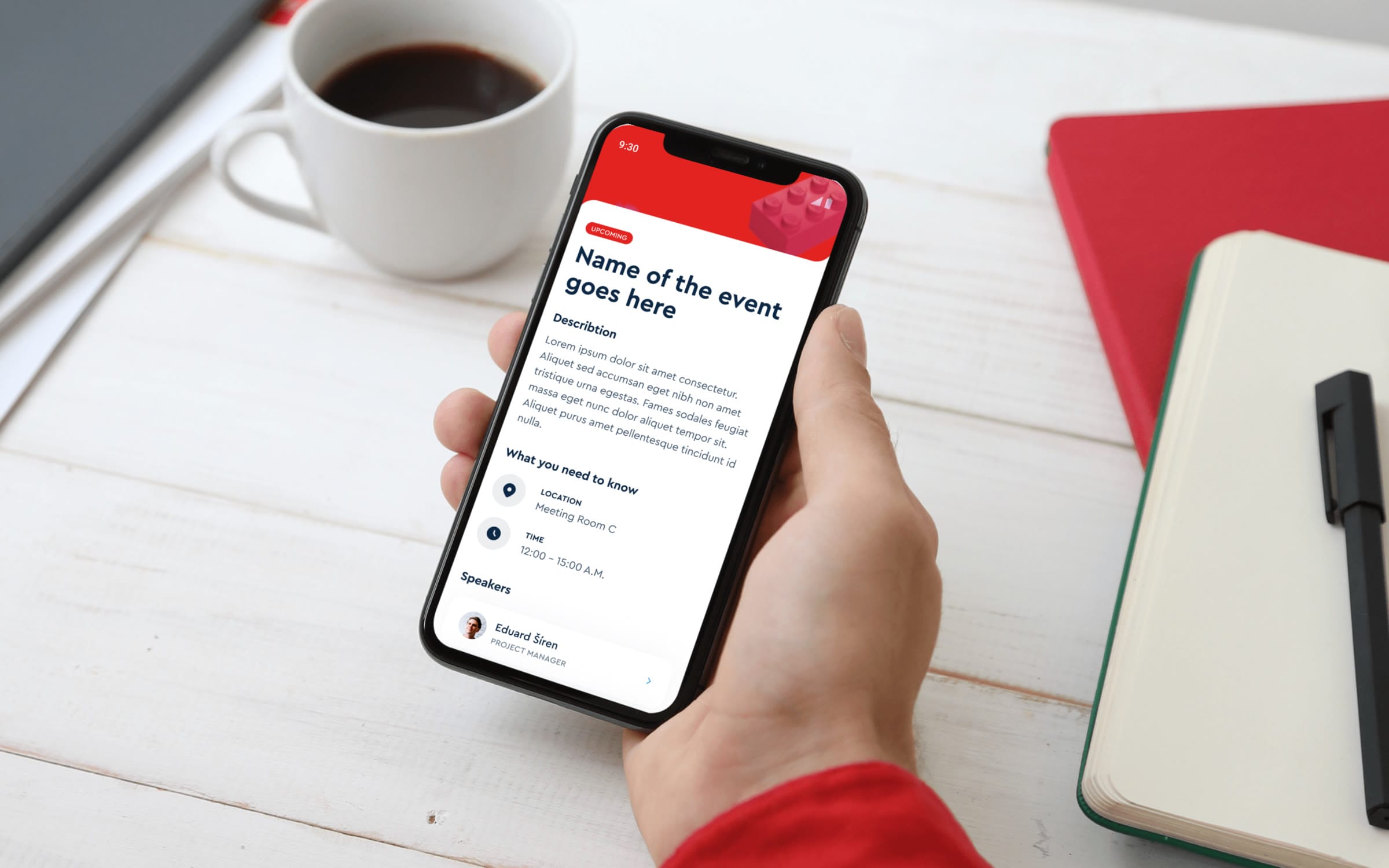 ConsumerLEGOAn event app for LEGO, mapped before anyone drew a screen.App / Strategy
 SportsLiga ženStep into the light of the game.Branding / Campaign