
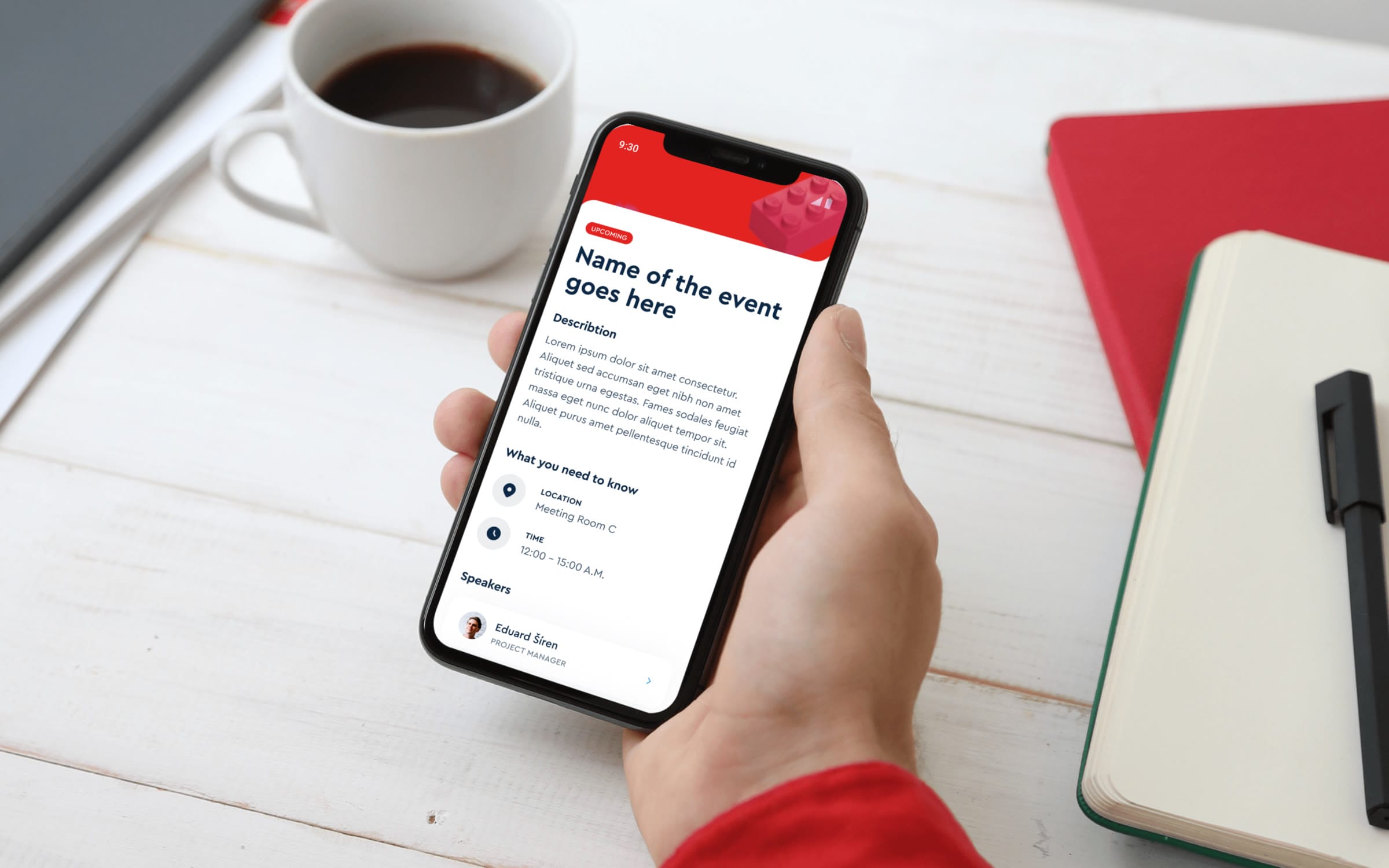
LEGOAn event app for LEGO, mapped before anyone drew a screen.
At a glance
- Design thinking
- Decide what the app is for before deciding how it looks. The dashboard followed the use case.
- Problem
- One conference, many kinds of information, and two groups adding to it: the event manager and every attendee.
- Approach
- Structure before screens: a sitemap first, then two dashboard options, then three visual directions for LEGO to review.
- Outcome
- Final designs for the whole app, from sign-in and the agenda to the Prague guide, questions for speakers and surveys.
- Role
- Lucie was the project manager, not the designer. She ran the project from the brief to the final screens.
- What we designed
- Project management
- Product strategy
- App structure and scope
- Platform
- Mobile app
The brief
Every piece of event information in one app, so the event runs smoothly.
LEGO organises annual events for all its employees. The app had to hold the agenda, the event details and the practical information around them, in a structure people could find their way through.
Two groups fill the app with content, so the structure had to serve both.
The event manager moderates one part of the app. The people attending create the other.
01Moderated content
Kept up to date by the event manager
- Agenda
- Event details
- Current event information
- Conference information
- A guide to places in Prague
- List of attendees
02Attendee content
Created by the people attending
- Sign-up for events and workshops
- Event ratings
- Overall feedback
- Social wall posts, likes and comments
The sitemap came first. It gave LEGO a clear view of how every screen connects.
The app structure is always the starting point. It makes the links between screens clear to the client, and it keeps navigation simple for the people using the app.
Seven sections under one menu, with the open questions left visible.
The sitemap runs from sign-in to a single menu. Items with a question mark were still open when it was drawn.
01Getting in
- Splash screen
- Log-in
- Forgotten password
- Sign-up
02Dashboard
- Hero image
- Conference information
- Event tiles
- Activity tiles
- Profile
03Events and activities
- Events listed as tiles
- Talk detail with speakers
- Reviews and attendees
- Sign-up for talksOpen
- Activity detail with sign-up
04Social wall
- Posts with comments and likes
- Caption and author
- Add a post
05Meet & Greet
- Attendee list
- Attendee profile
06Local guide
- MapOpen
- List of places
- Description and photo
- Directions to a place
07Q&A
- Live chat
- FAQOpen
08Profile
- SettingsOpen
- Basic information about the user
Open: marked with a question mark in the original sitemap.
Seven stages took the app from a brief to final screens.
Structure came first and the look came last.
- 01BriefOne app for all event information
- 02Sitemap and user flowSeven sections, open questions marked
- 03WireframesTwo dashboard versions, one per use case
- 04MoodboardsMinimalist, playful, event, structured
- 05Three visual directionsEach with its reasoning, for LEGO to review
- 06Client feedbackDashboard and Meet & Greet revised
- 07Final designThe whole flow, from sign-in to surveys
Four decisions that shaped what people see first.
- D01
What should the dashboard be?
- Context
- The right dashboard depends on how people use the app during the event.
- Options
- Decision
- Both were wireframed, to be chosen by the app’s use case. Both versions were still in the final design file.
- D02
What does the first tile show?
- Decision
- It changes with the event. It shows only the next keynote, or the one already running.
- Why
- The dashboard should carry the information attendees care about most.
- D03
In what order do the dashboard sections come?
- Decision
- The next keynote, then the agenda, then activities, then what to do in Prague, then the social wall.
- Why
- By the time people reach the Prague section, they know the important keynotes and activities. The guide then helps with their free time.
- D04
What should the app look like?
- Context
- The moodboard keywords were Minimalist, Playful, Event and Structured.
- Options
- Decision
- All three went to LEGO for review. The final design gives each section its own accent colour.
- Why
- The accent colour follows a section into its own screens, and the playful tone connects the app to LEGO’s identity.
The risk
A social wall is empty on the first morning of an event.
The recommendation was to add photos from the previous year, so the wall has something to show from the start.
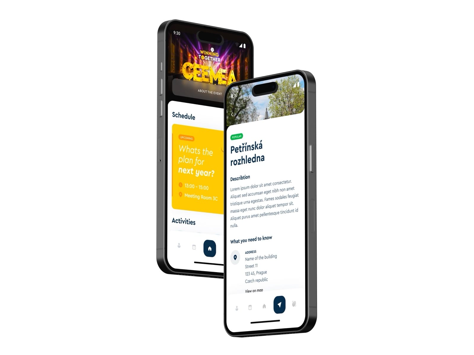
The final app wears the conference’s own look, from the dashboard to the Prague guide.
The last round covered the whole flow: sign-in, the agenda, activities, the Prague guide, Meet & Greet, questions for speakers and surveys.
The project in four numbers.
- 7
- app sections mapped under one menu
- 4
- open questions marked in the sitemap
- 2
- dashboard versions, one per use case
- 3
- visual directions for LEGO to review
More work
All projects SportsFK JablonecJablonec never falls far from the tree.Branding / Campaign / Website
 HealthMovidoA physio programme for the days between appointments.Product & Design / App
 AIINITEngineering intelligence for the industries that build the world.Branding / Website
 Real EstatePenta Real EstateAutomating apartment specification sheets.Engineering / Product & Design
 Financial ServicesHalaliEvolution, not revolution. A new identity built on existing trust.Branding / Campaign
 AIMotionshiftUnlocking AI-powered video & animation.Product & Design / Website / AI & Agentic