

iO PartnersOne property platform for four countries.
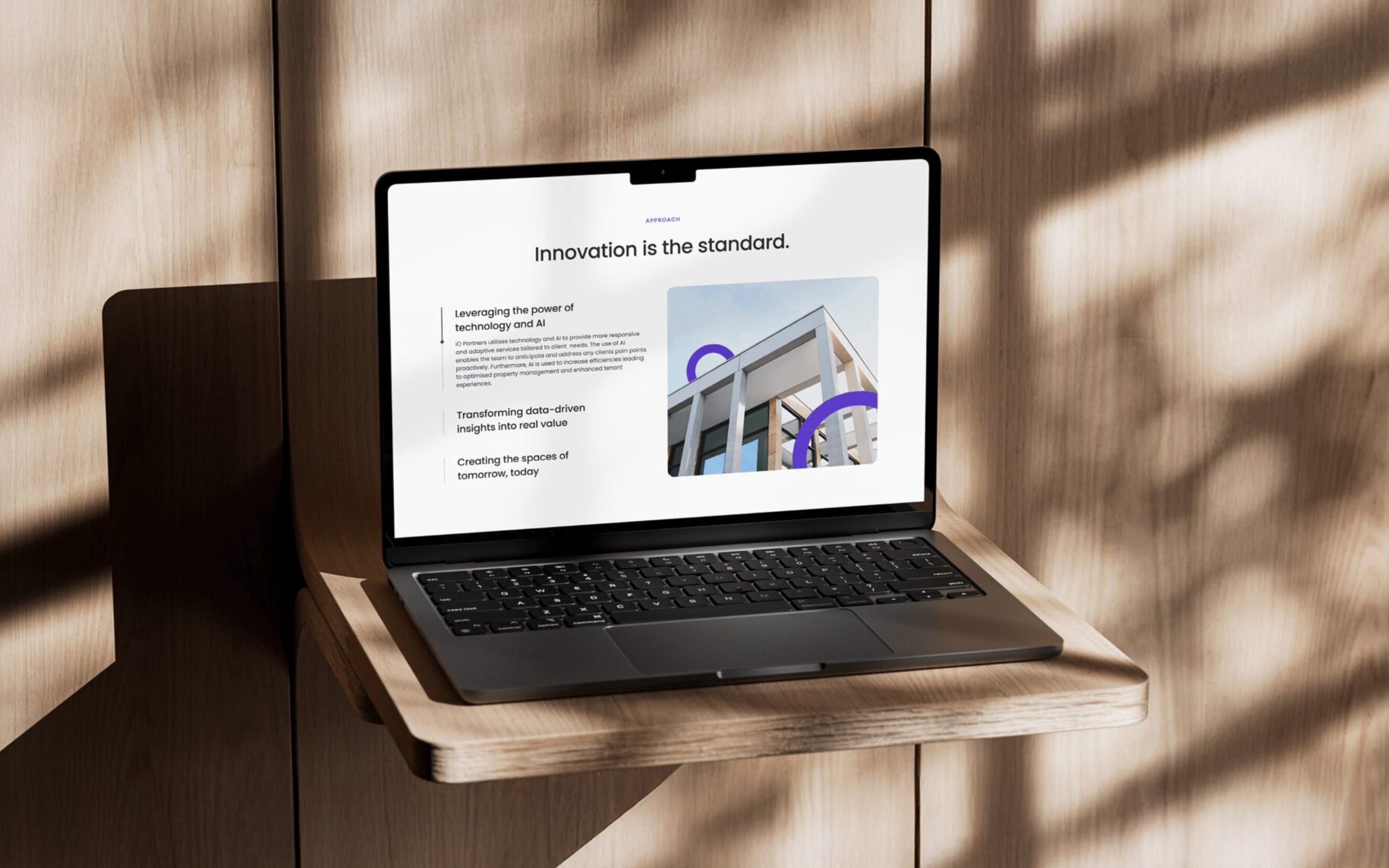
At a glance
- Design thinking
- Bring every listing into one format first, so clients get the same search in every country.
- Problem
- Each market had its own website and listing data differed by country, while the team was small and the deadline tight.
- Approach
- We planned the delivery in phases and built every page from one set of numbered modules.
- Outcome
- One platform links the corporate and property websites, with cross-border search and a custom CMS for agents.
- Role
- Lucie as design and project lead, running the plan, SEO and integrations. The visual identity is by the client’s brand designer.
- What we designed
- Roadmapping
- CMS
- Integration
- SEO
- Technical specifications
- Platforms
- Corporate website
- Cross-border property search
- Custom CMS for agents
- Mobile web
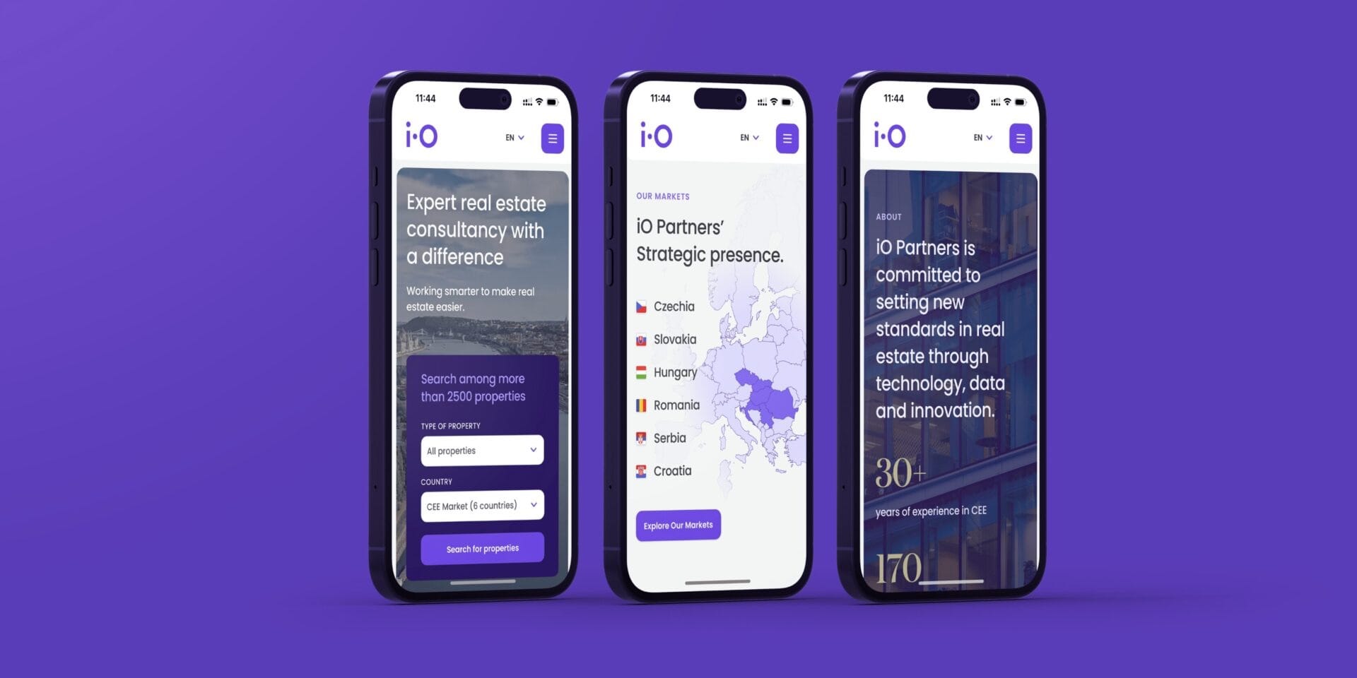
The homepage leads straight into property search.
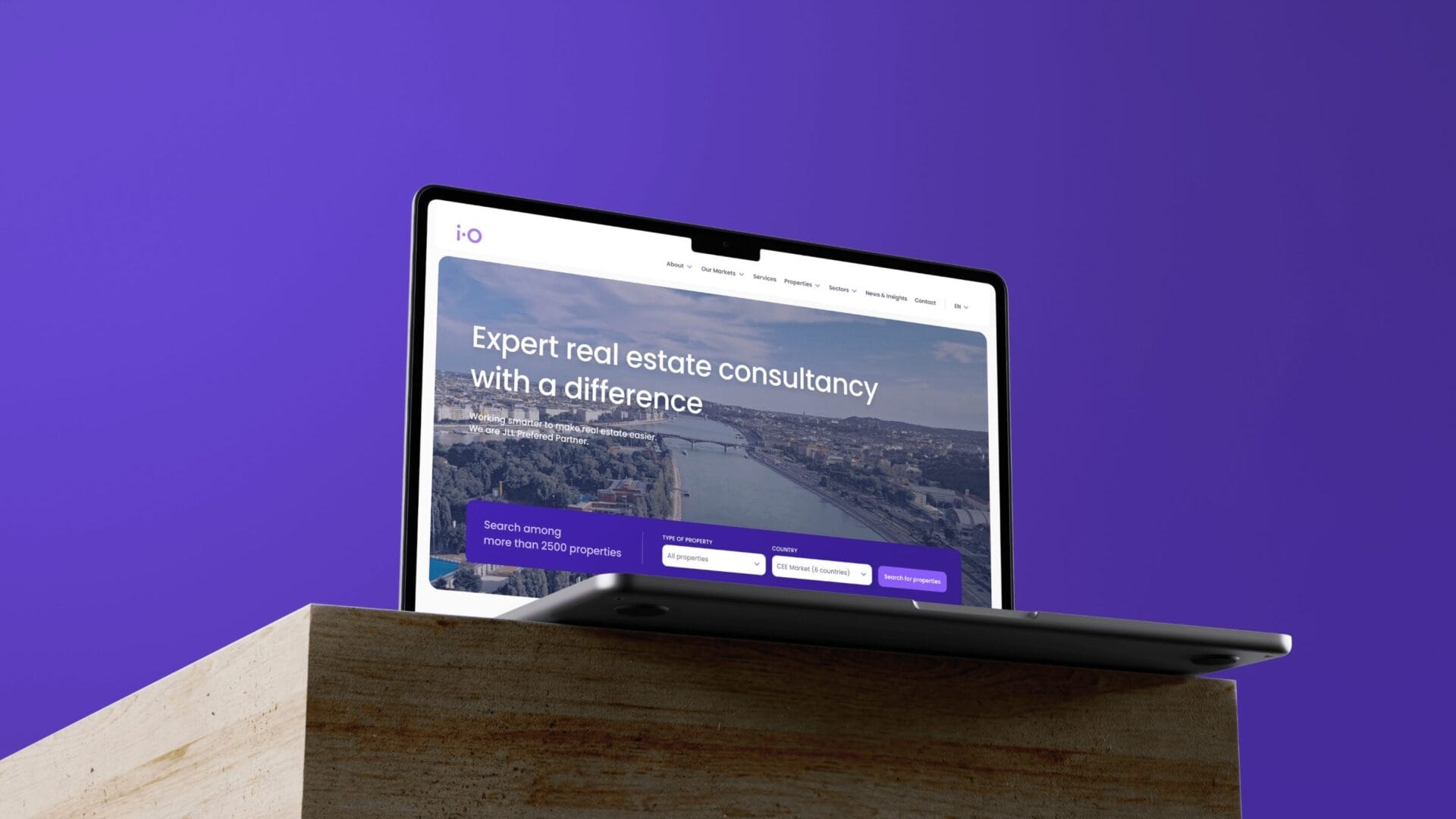
A young alliance had to read as one company, and still feel local.
Local leadership stayed in place for continuity and trust, so visitors had to move easily between the corporate story, each market and live listings.
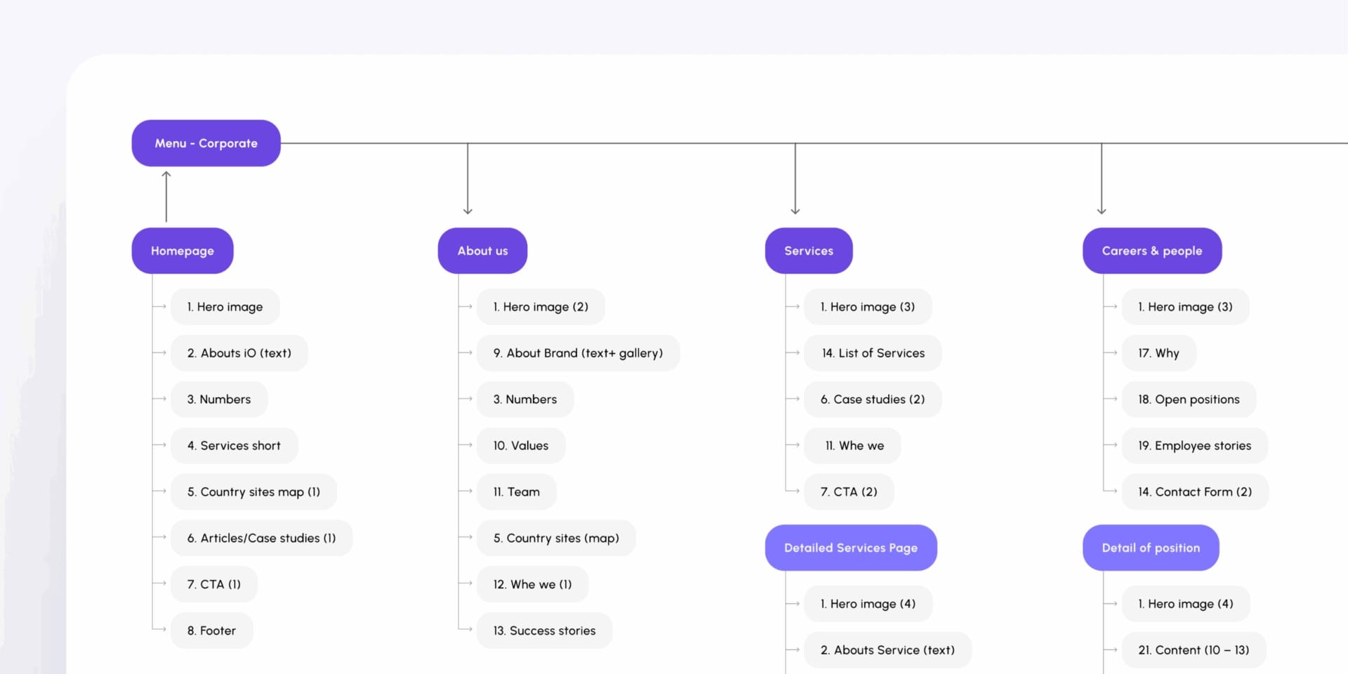
Every page built from one set of modules.
The sitemap stacks each page from numbered section types. The numbers band and the country map return wherever they are needed, so no page starts from scratch.
The decision
One listing format, whichever country it comes from.
Regional practice meant listings differed from market to market. Showing them as they arrived would have given clients a different experience in every country.
We brought every listing into one format, and gave agents a custom CMS. More work up front; one search in return.
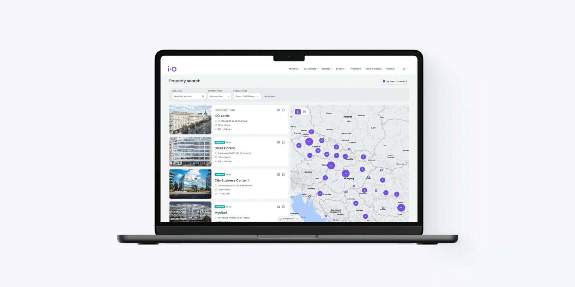
One shared map and list for every market, so clients search across borders.
Location, type and size filter one shared list. The map clusters results across Central Europe, and every building is shown on the same card.
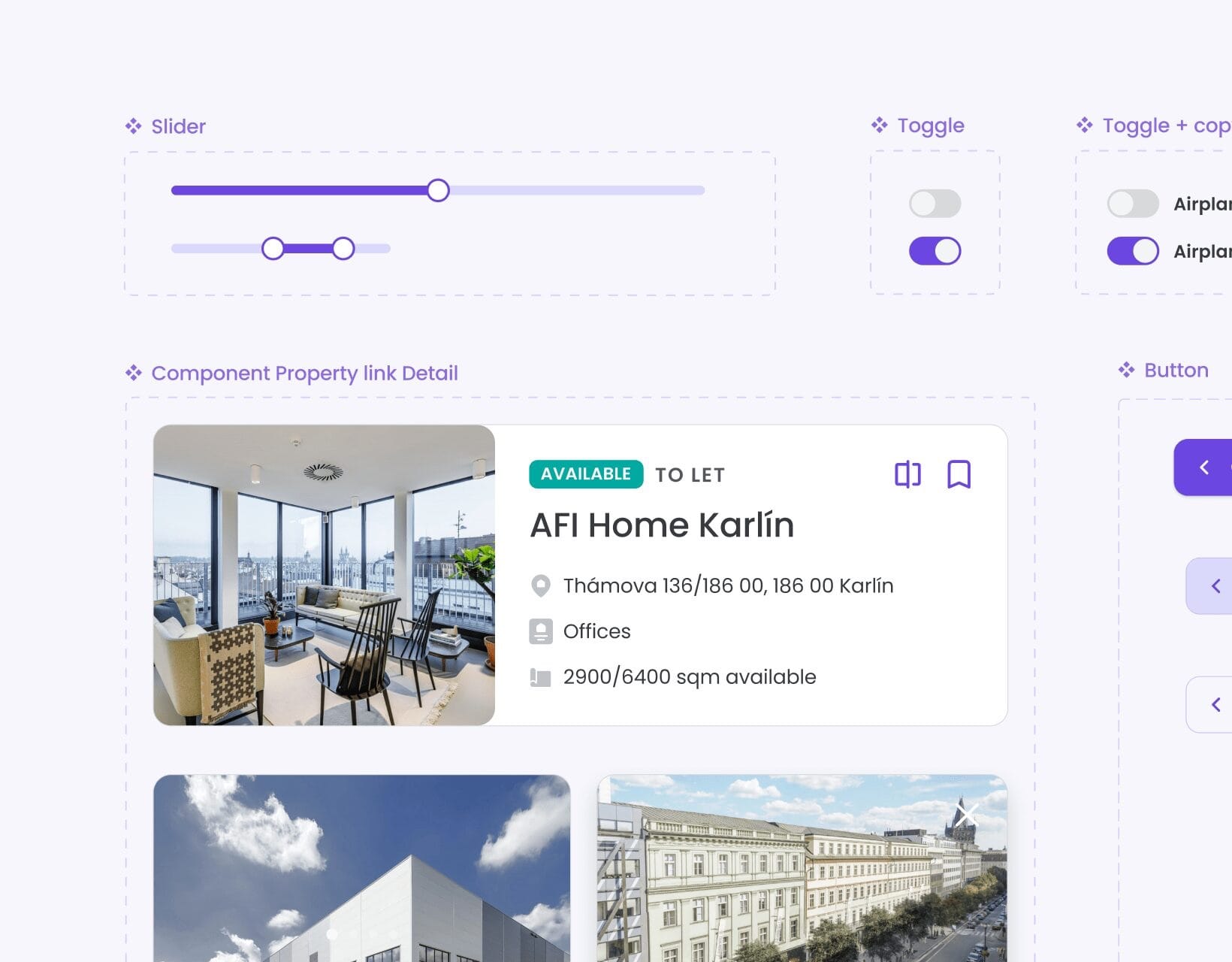
A brand turned into a system developers can build with.
Colour and type became named values in code. The property card carries the unified listing fields, so a building looks the same in every market.
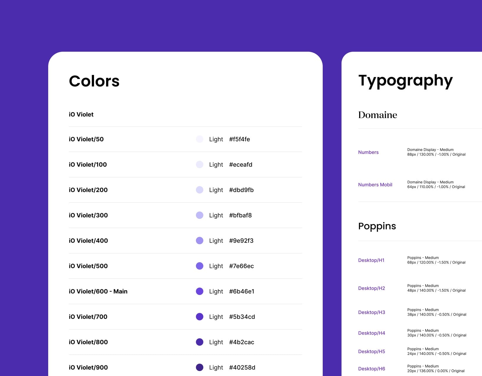
- iO Violet/50#F5F4FE
- iO Violet/100#ECEAFD
- iO Violet/200#DBD9FB
- iO Violet/300#BFBAF8
- iO Violet/400#9E92F3
- iO Violet/500#7E66EC
- iO Violet/600 - Main#6B46E1
- iO Violet/700#5B34CD
- iO Violet/800#4B2CAC
- iO Violet/900#40258D
The markets map stays on mobile, because the cross-border offer depends on it.
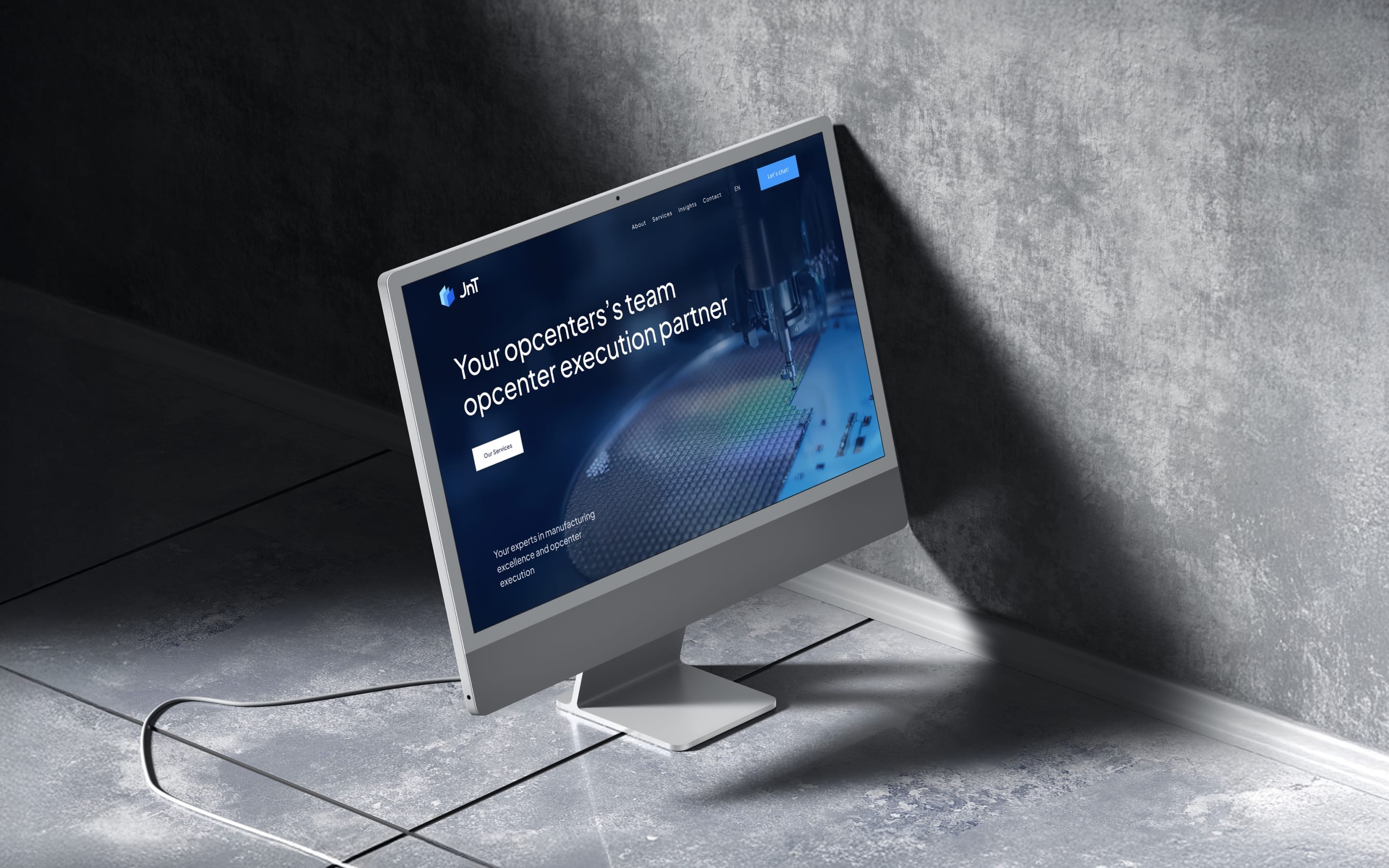
More work
All projects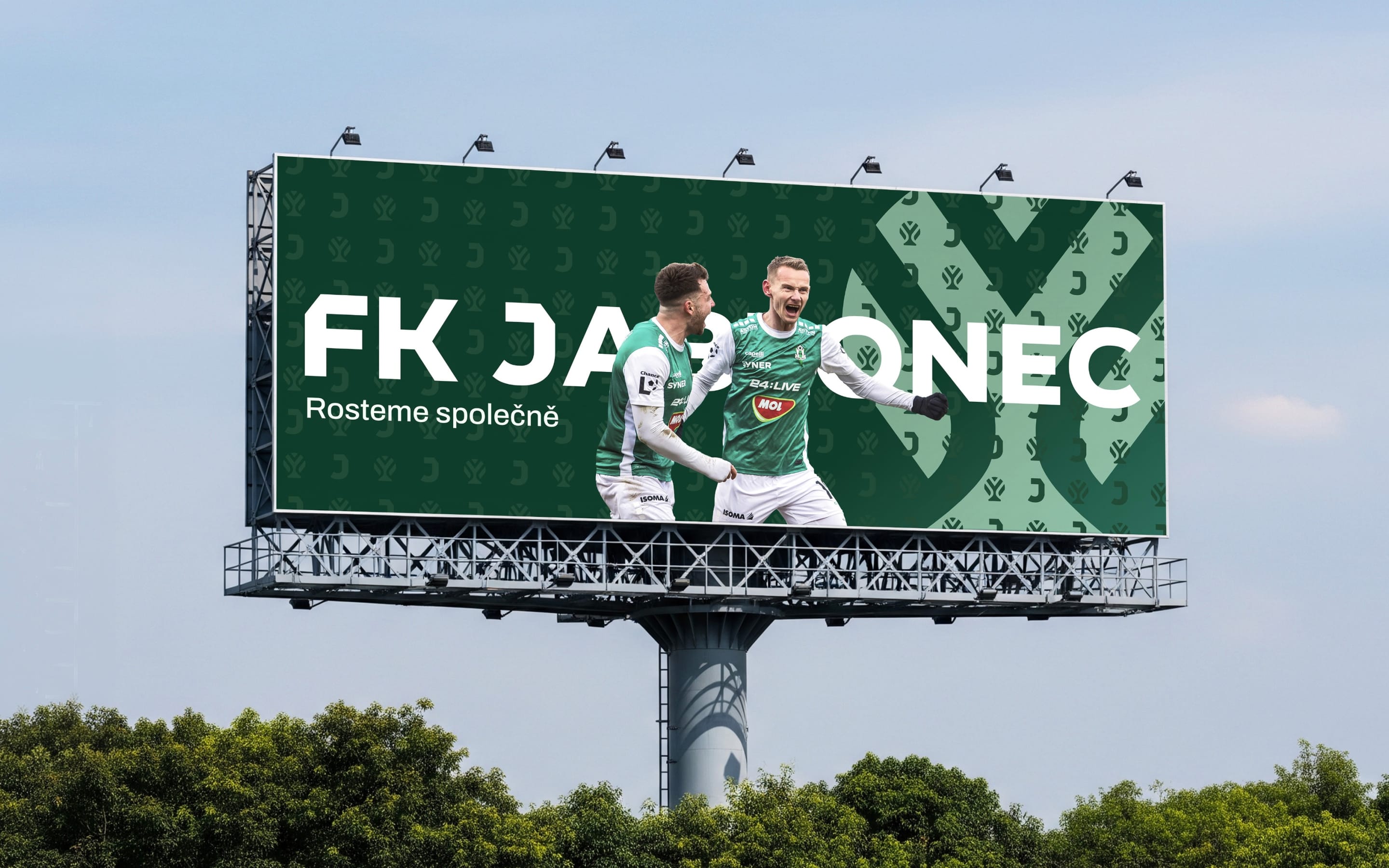 SportsFK JablonecJablonec never falls far from the tree.Branding / Campaign / Website
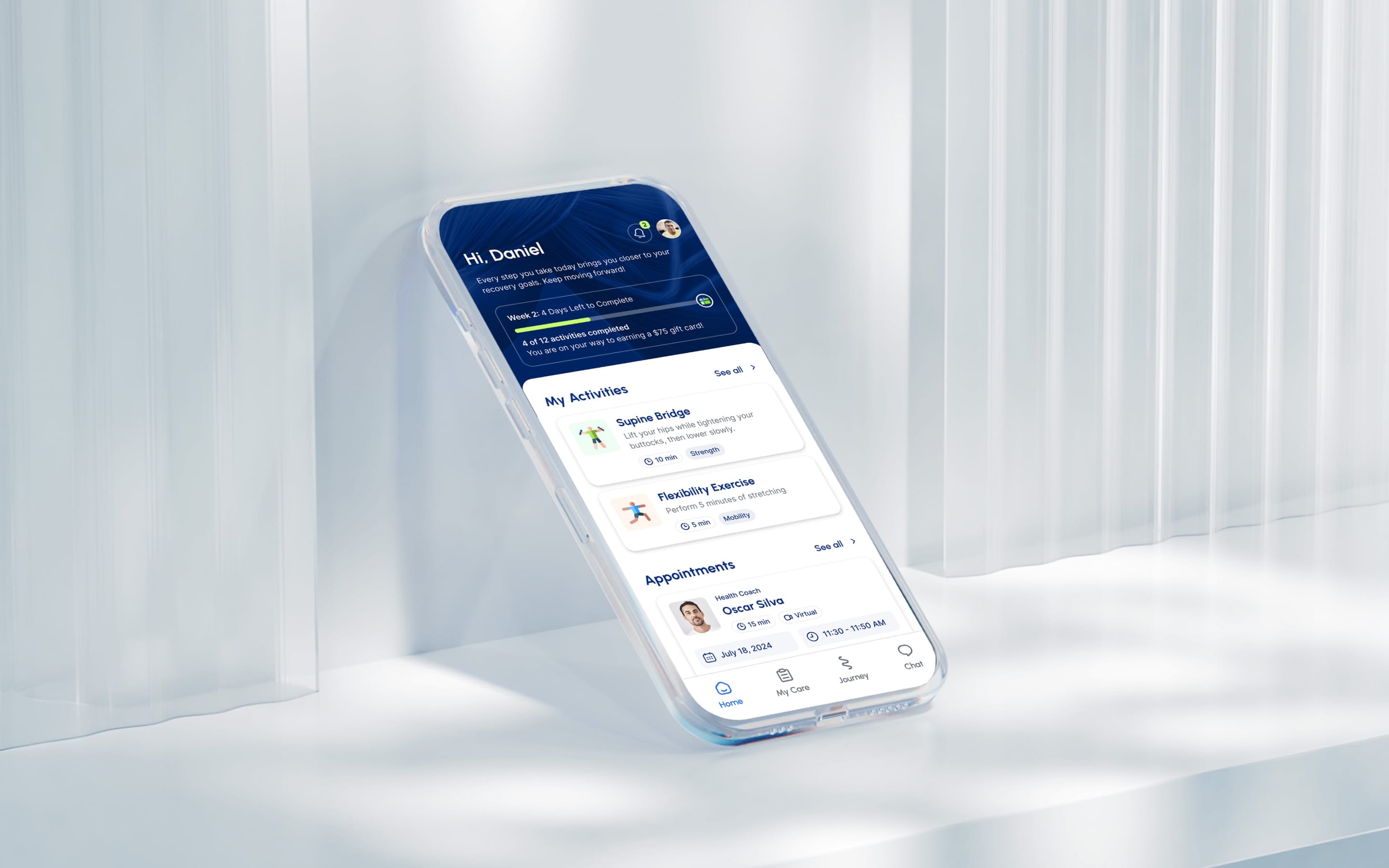 HealthMovidoA physio programme for the days between appointments.Product & Design / App
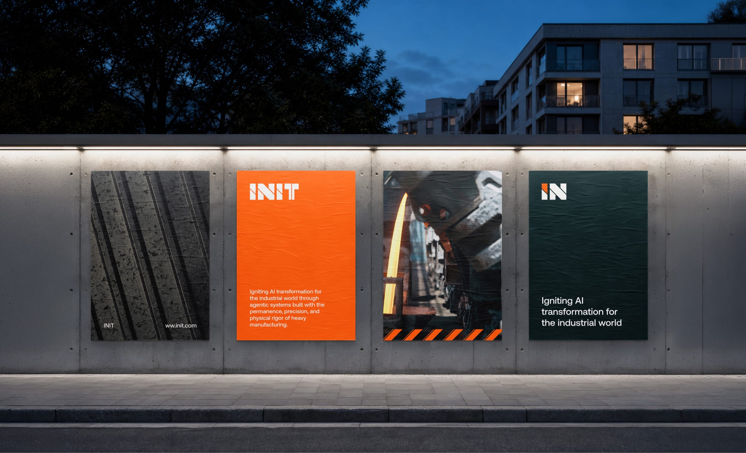 AIINITEngineering intelligence for the industries that build the world.Branding / Website
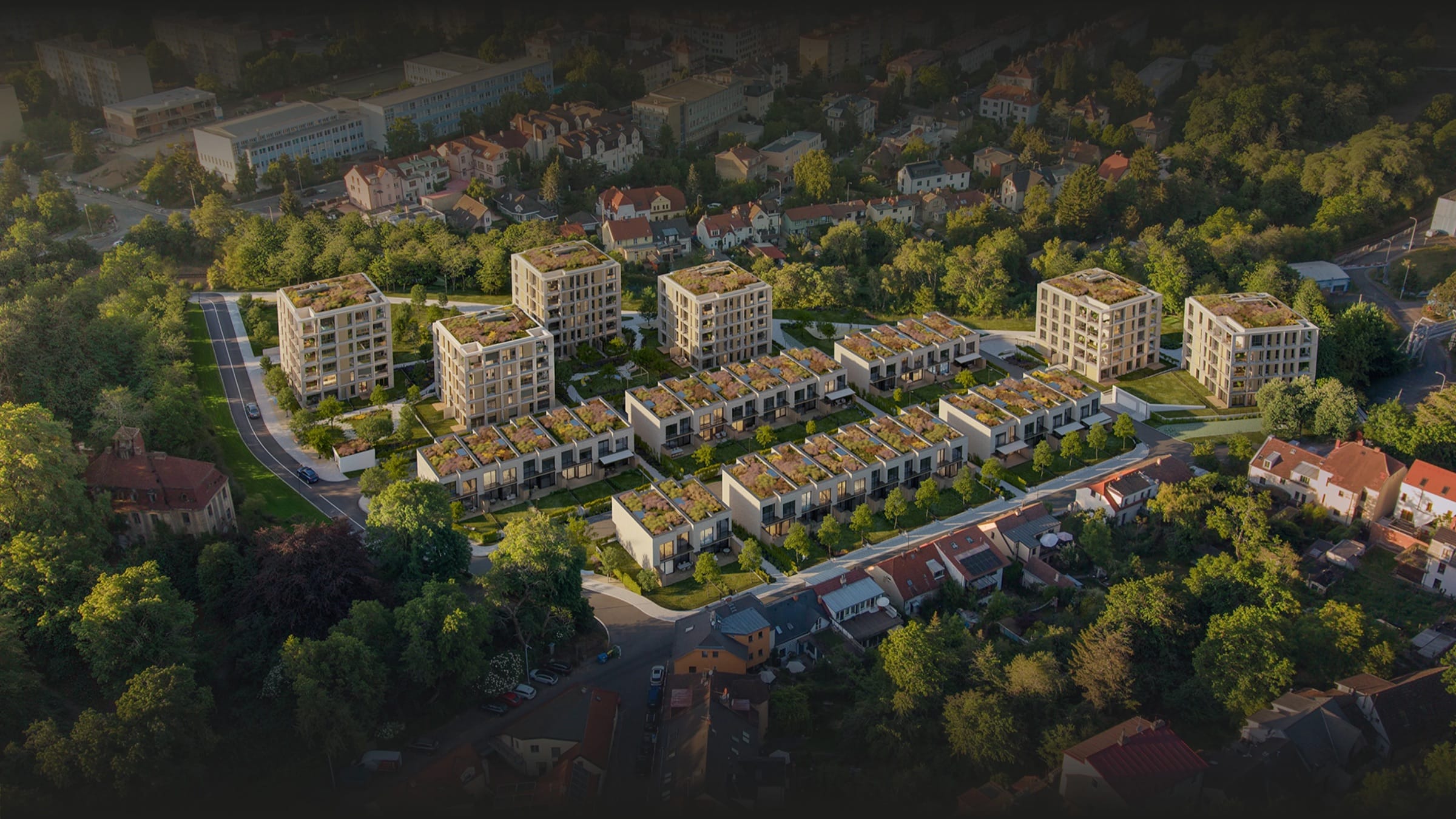 Real EstatePenta Real EstateAutomating apartment specification sheets.Engineering / Product & Design
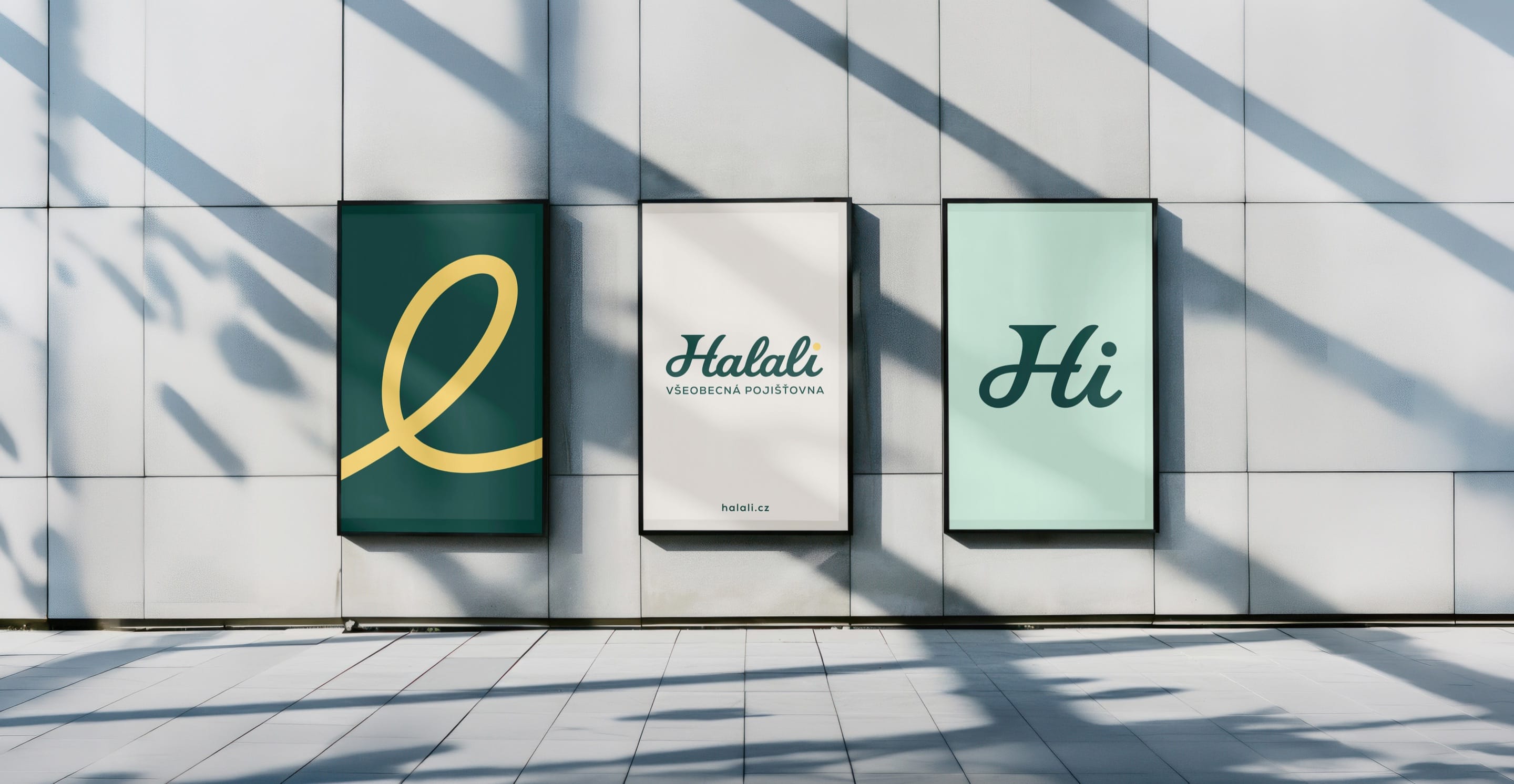 Financial ServicesHalaliEvolution, not revolution. A new identity built on existing trust.Branding / Campaign
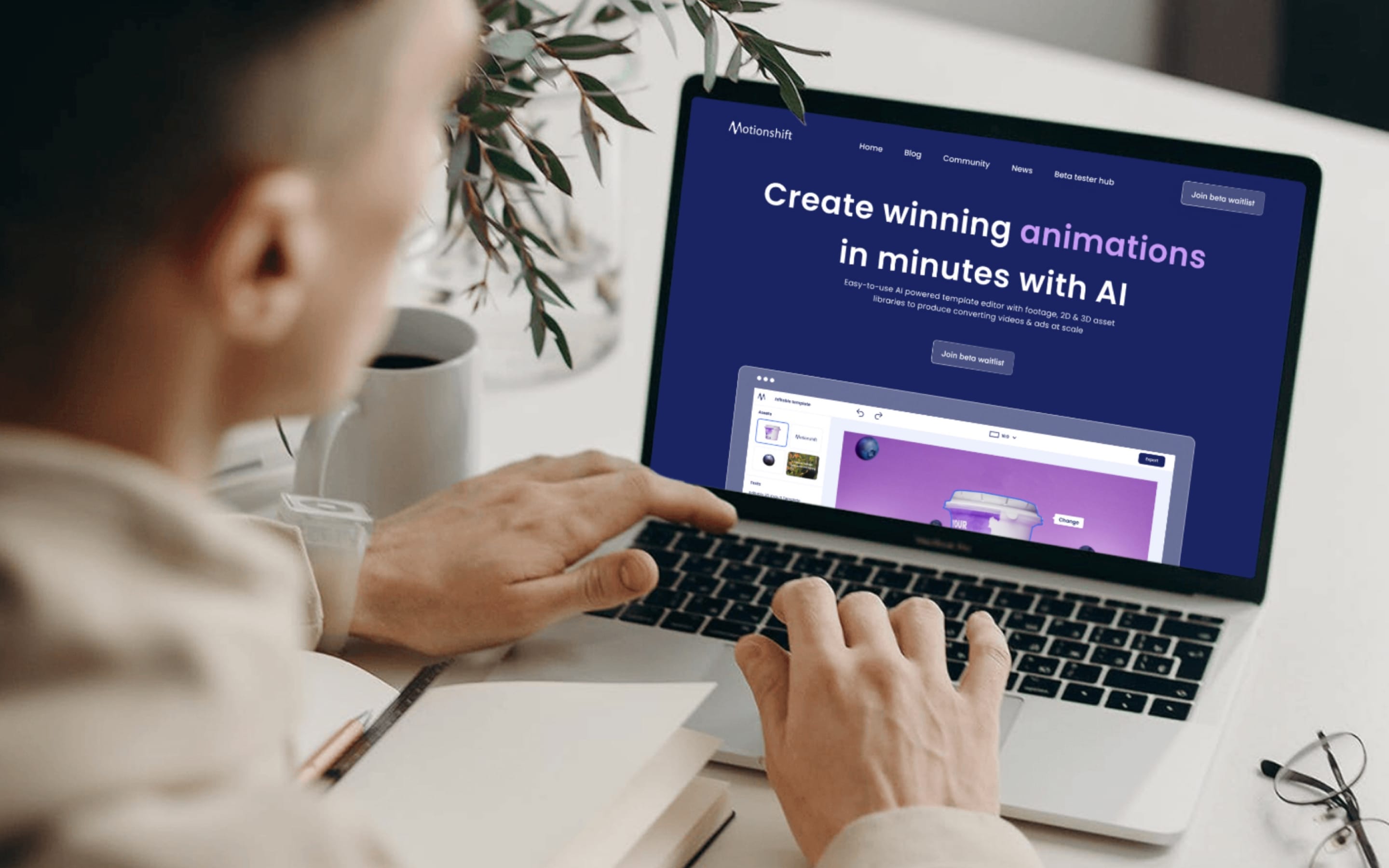 AIMotionshiftUnlocking AI-powered video & animation.Product & Design / Website / AI & Agentic