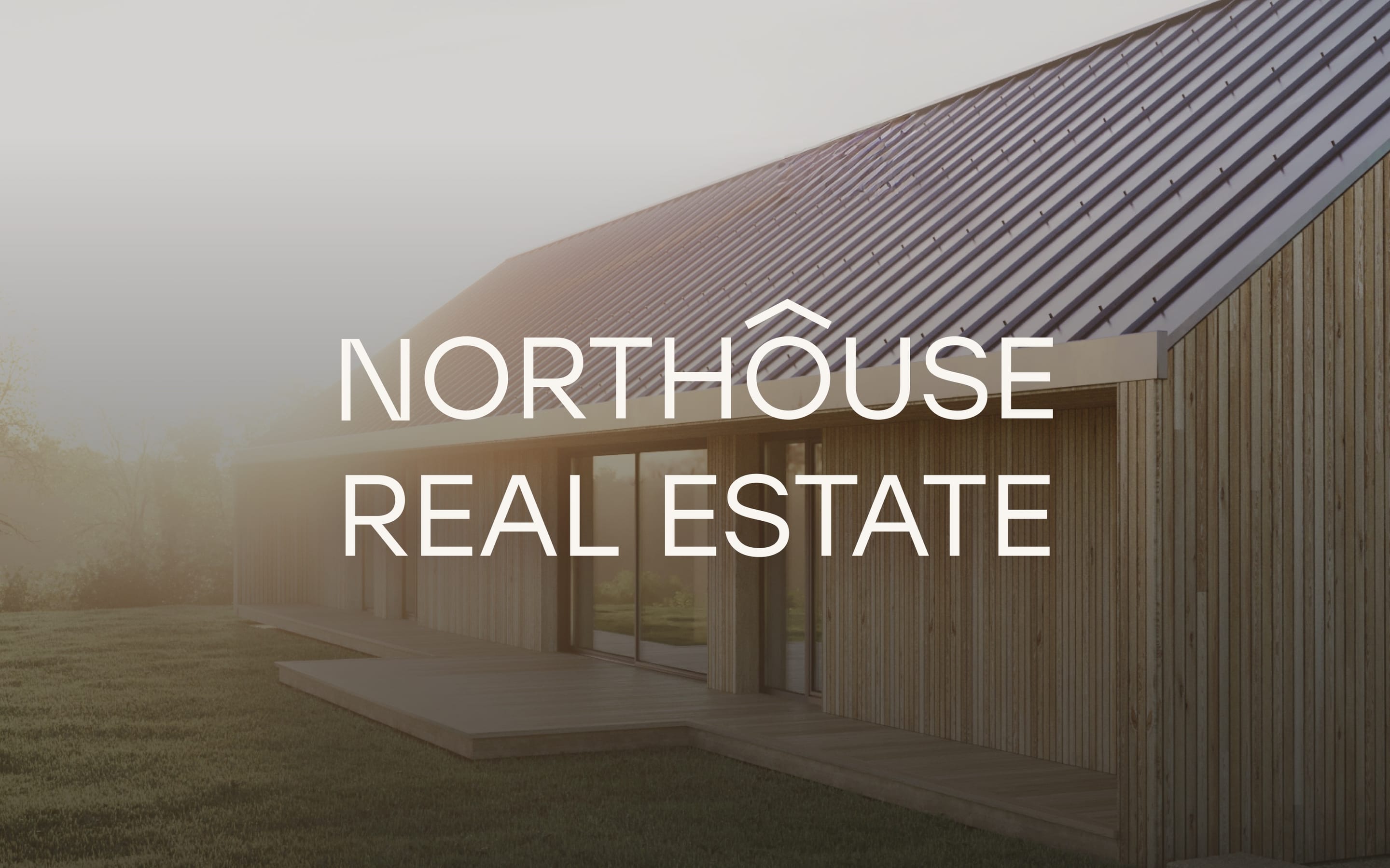
NorthouseReal estate for multigenerational living.
At a glance
- Design thinking
- The houses are minimal, so the brand stays in the background and lets the architecture lead.
- Problem
- One website had to prove 23 years of completed homes and sell 17 new ones to buyers at very different life stages.
- Approach
- Persona analysis defined the realistic buyers first, and the site answers what each needs to see before getting in touch.
- Outcome
- The brand and website are live, with a project page, price list and five-step buying guide.
- Role
- Lucie as the only design and project lead, who also built the site in Webflow.
- What we designed
- Brand workshop
- Logo design
- Visual identity
- Website design
- Website development (Webflow)
- Platforms
- Brand identity
- Website
- Project brand
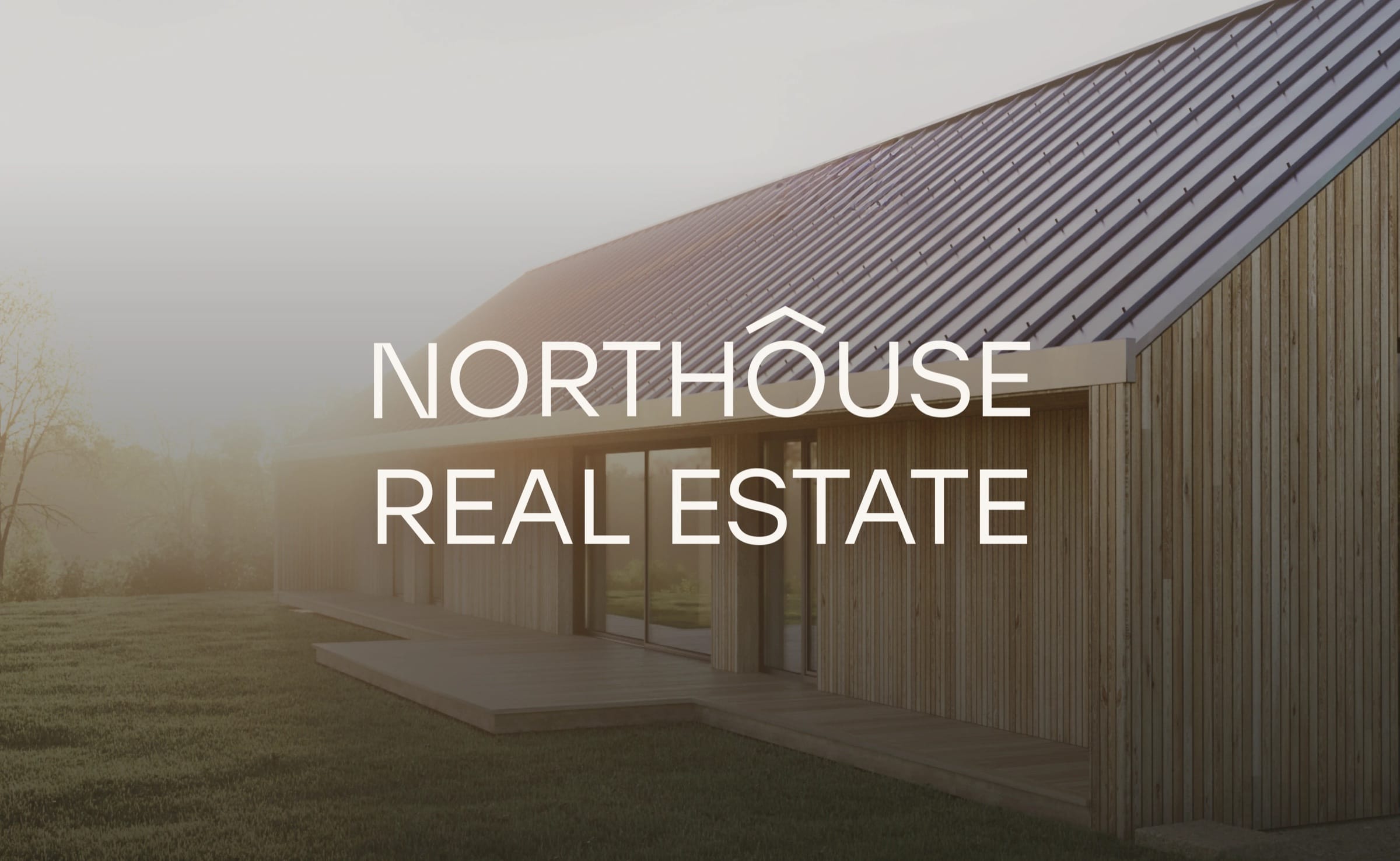
Calm, comfort and reliability set the direction.
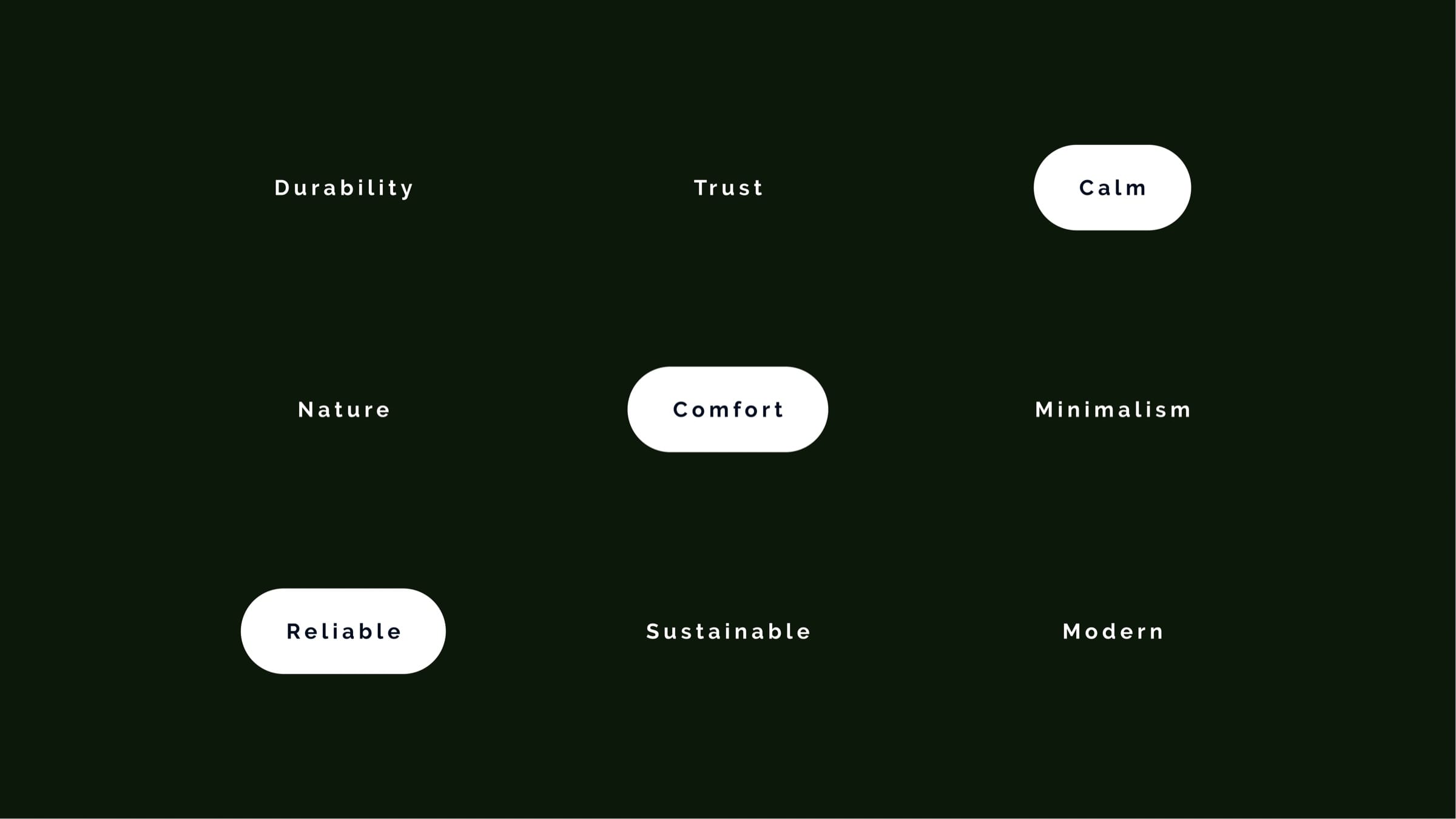
The client asked for a design as minimal and modern as its homes. Of nine agreed keywords, calm, comfort and reliable came first, so every later choice had something concrete to answer to.
Different generations, different reasons to move.
Persona analysis · three buyer groups, defined before design began
Families aged 40–55 want nature without losing schools and services.
The project page makes the case for the location with facts: a map, the drive to the metro and each plot’s size.
Evidence
A higher-income group that values modern technology, low running costs and schools within reach.
Couples aged 55–70, near or in retirement, want a quiet final home.
The floor plan is shown room by room, and buying is explained in five steps.
Evidence
Barrier-free design lets them stay without changes, and selling a larger home often means no mortgage.
The decision
The mark comes straight from the name.
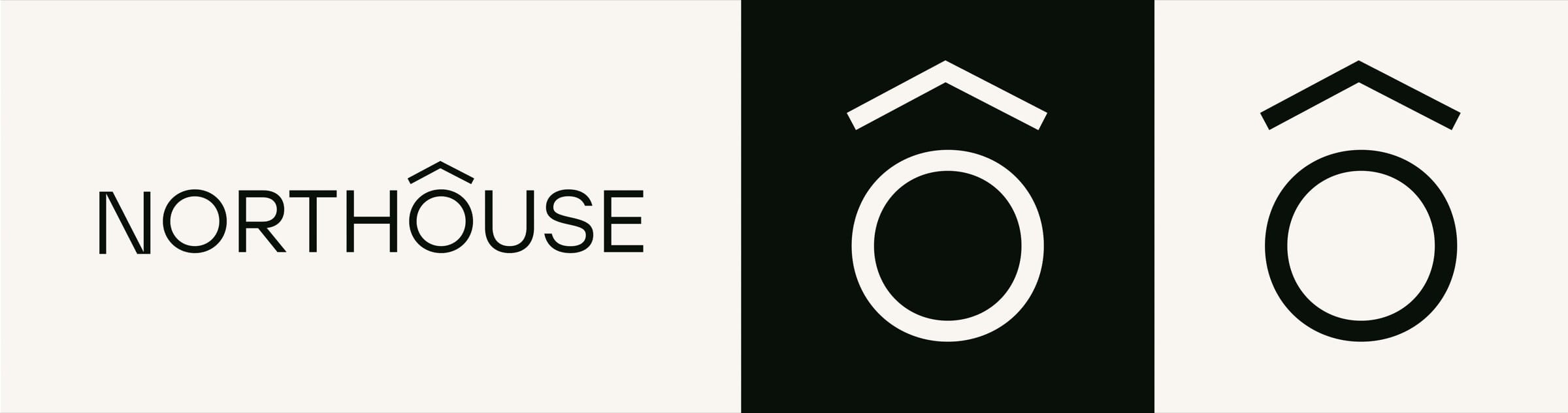
The logo combines a direction symbol with the shape of a building, so it reads as a house pointing north.
Like the architecture, it stays minimal. A perfect circle holds the balance, one raised accent adds the movement, and the Ô works on its own as a symbol.
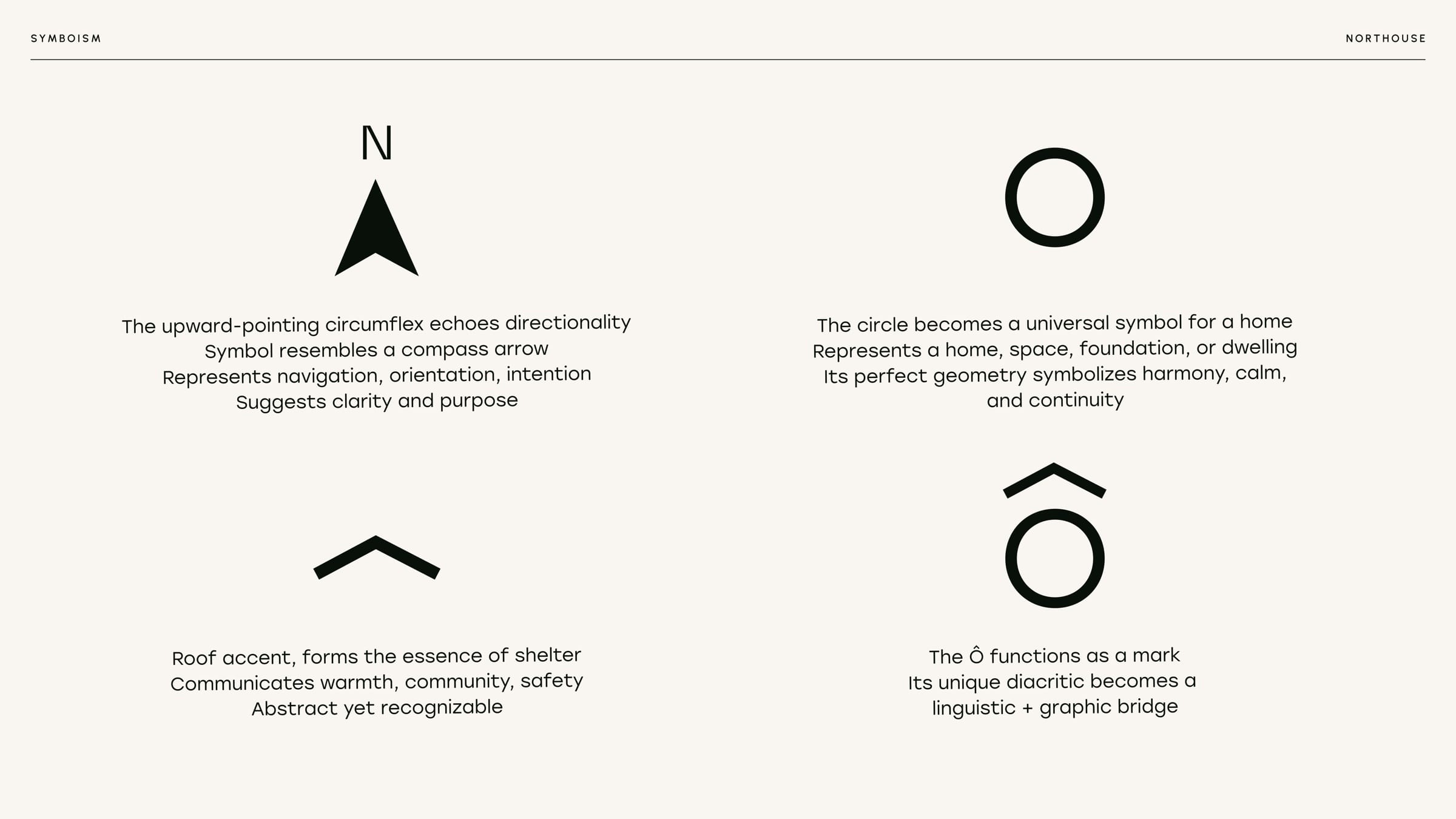
The accent is a compass arrow and a roof at once.
The upward circumflex recalls a compass arrow and doubles as a roof. The circle stands for a home and its foundation.
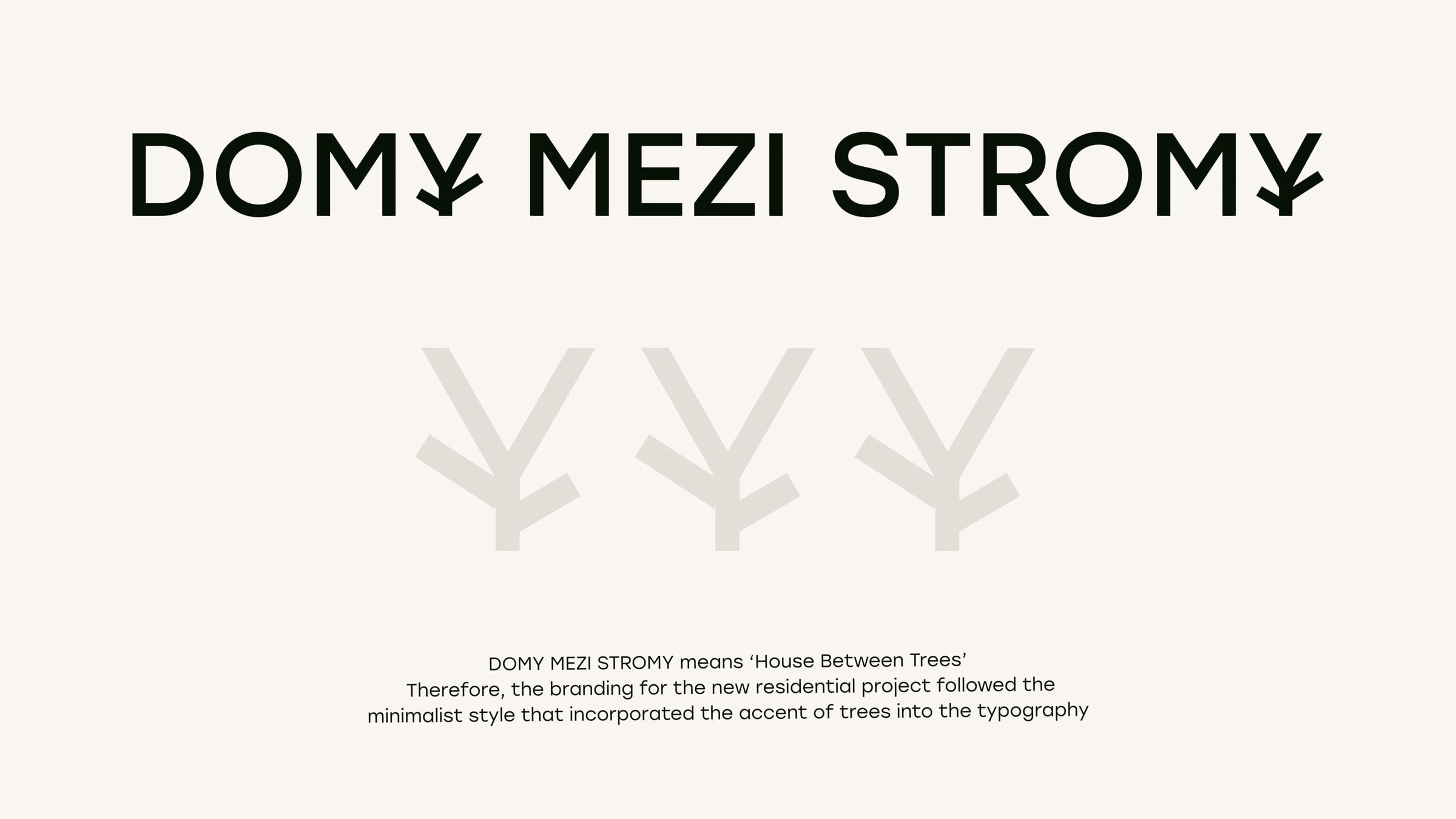
A project wordmark with a tree for the Y.
Domy mezi stromy means “houses between trees”. Its wordmark shares Northouse’s minimalism, so the project has its own identity but clearly belongs to Northouse.
A palette taken from the forest.
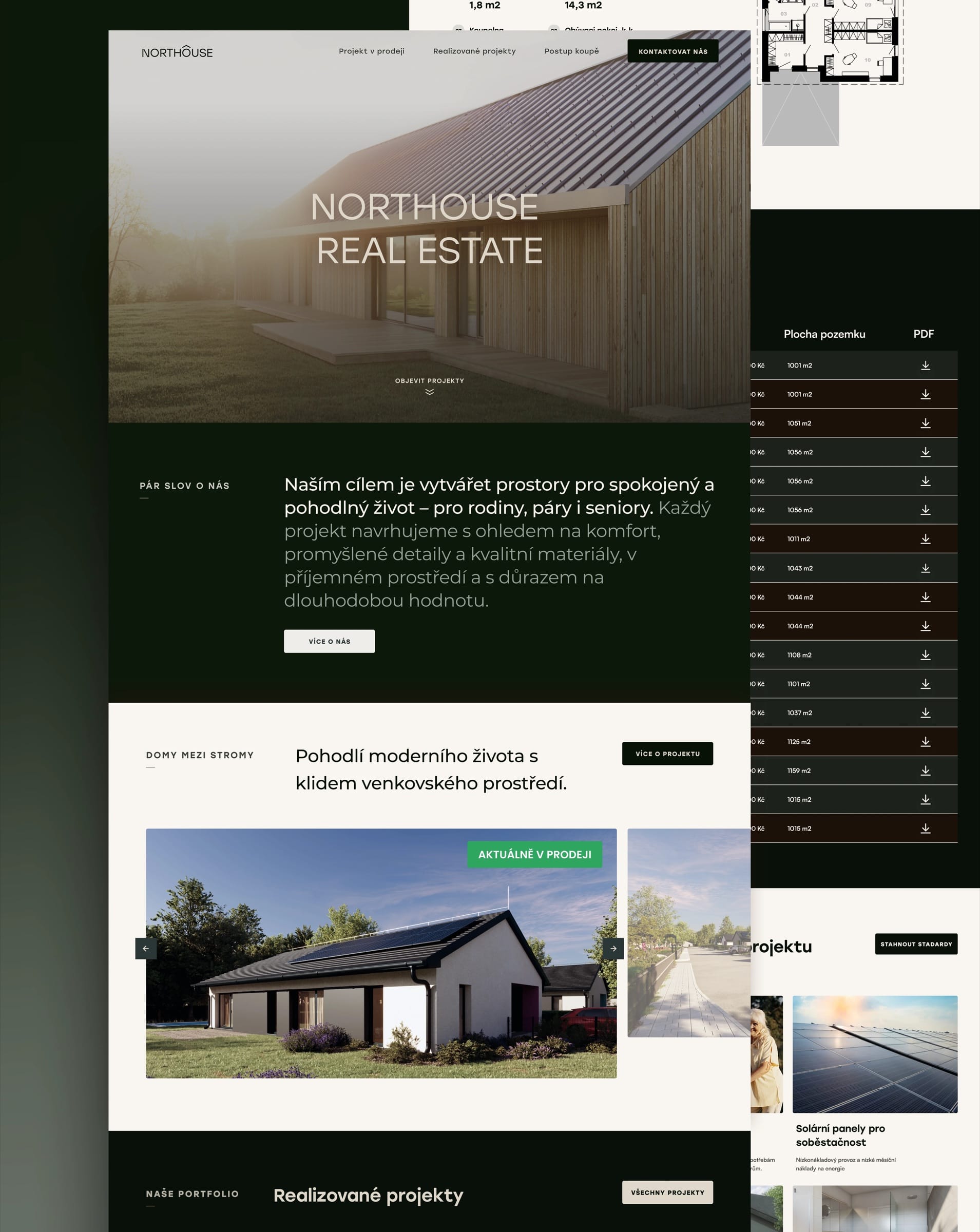
Forest greens carry the dark sections and the neutrals carry the light ones. They alternate down the page, so photography, maps and price tables each get a quiet frame.
- Dark Forrest#0D1709
- Alabaster#F9F5F0
- Moss#B7C6BD
- Juniper#273D3C
- Creme Brulee#906C4D
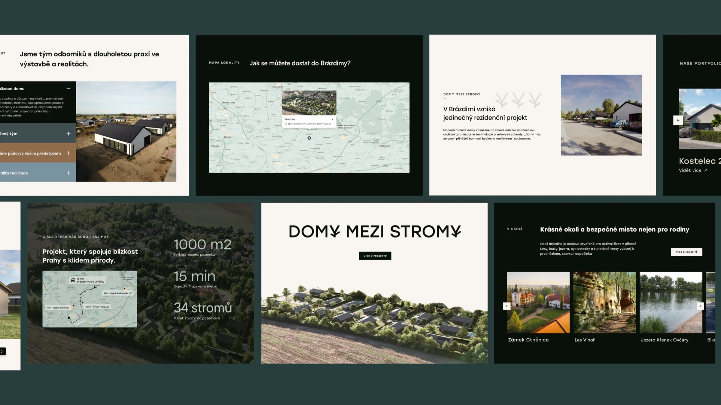
The project page is built for the practical questions.
Photography carries the mood and the project page does the work. Room areas on the floor plan, then the standards each house comes with, then one table covering all 17 plots.
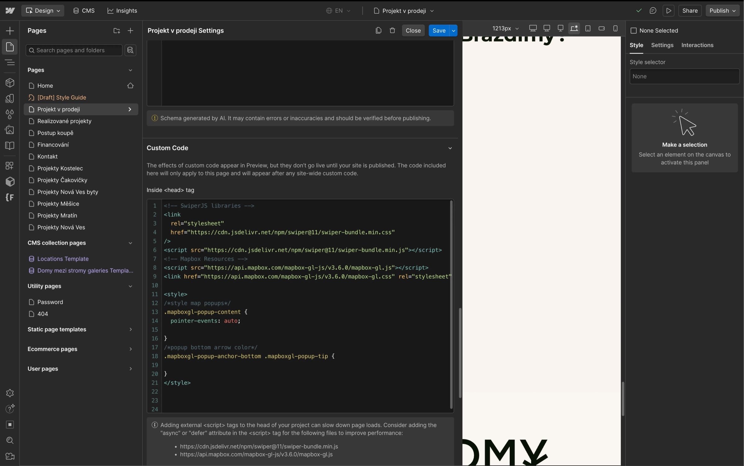
Location maps matter to buyers, so the Webflow build adds Mapbox.
We built the site end to end in Webflow, with an organised page and CMS structure and custom code for the maps and animations.
More work
All projects SportsFK JablonecJablonec never falls far from the tree.Branding / Campaign / Website
 HealthMovidoA physio programme for the days between appointments.Product & Design / App
 AIINITEngineering intelligence for the industries that build the world.Branding / Website
 Real EstatePenta Real EstateAutomating apartment specification sheets.Engineering / Product & Design
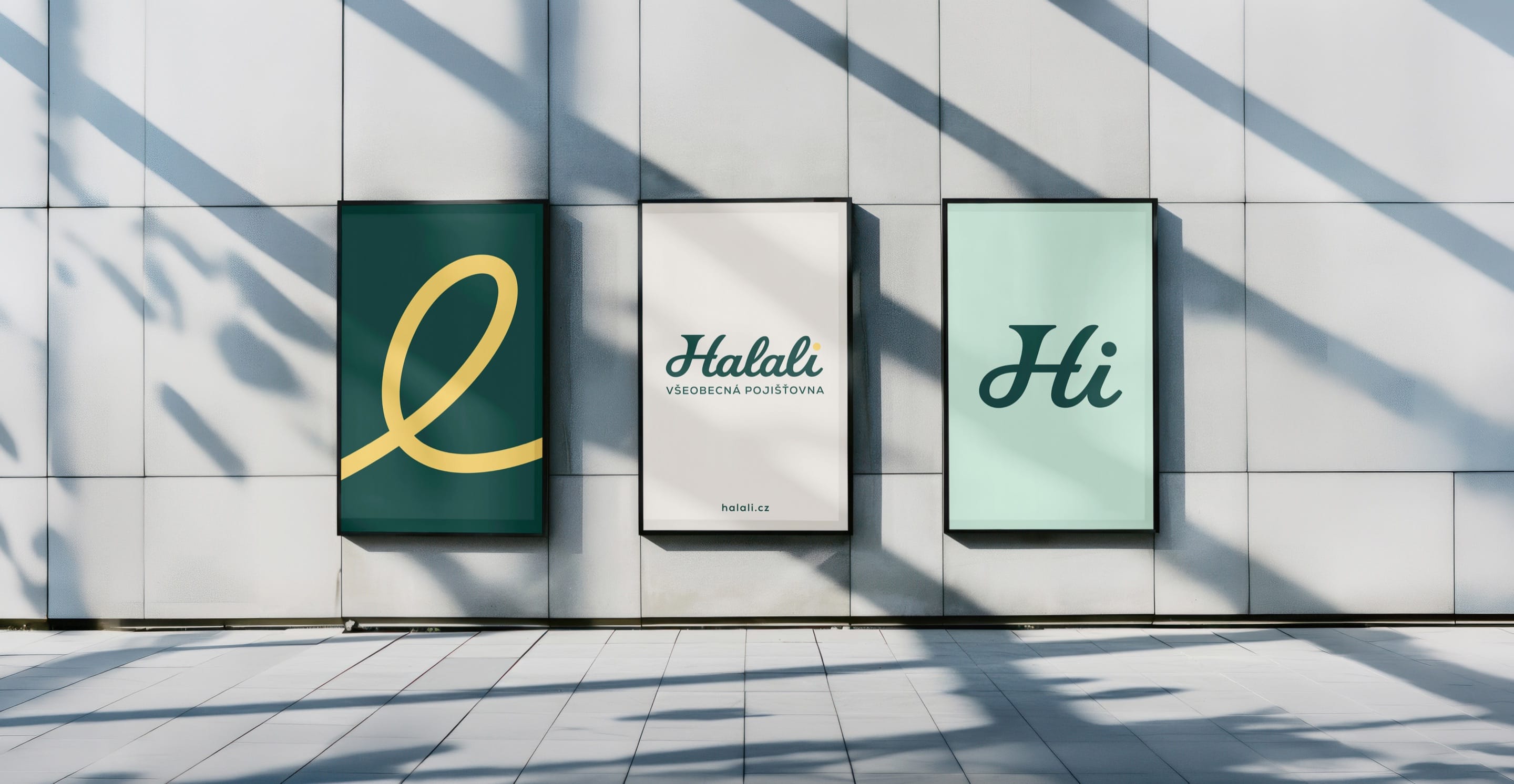 Financial ServicesHalaliEvolution, not revolution. A new identity built on existing trust.Branding / Campaign
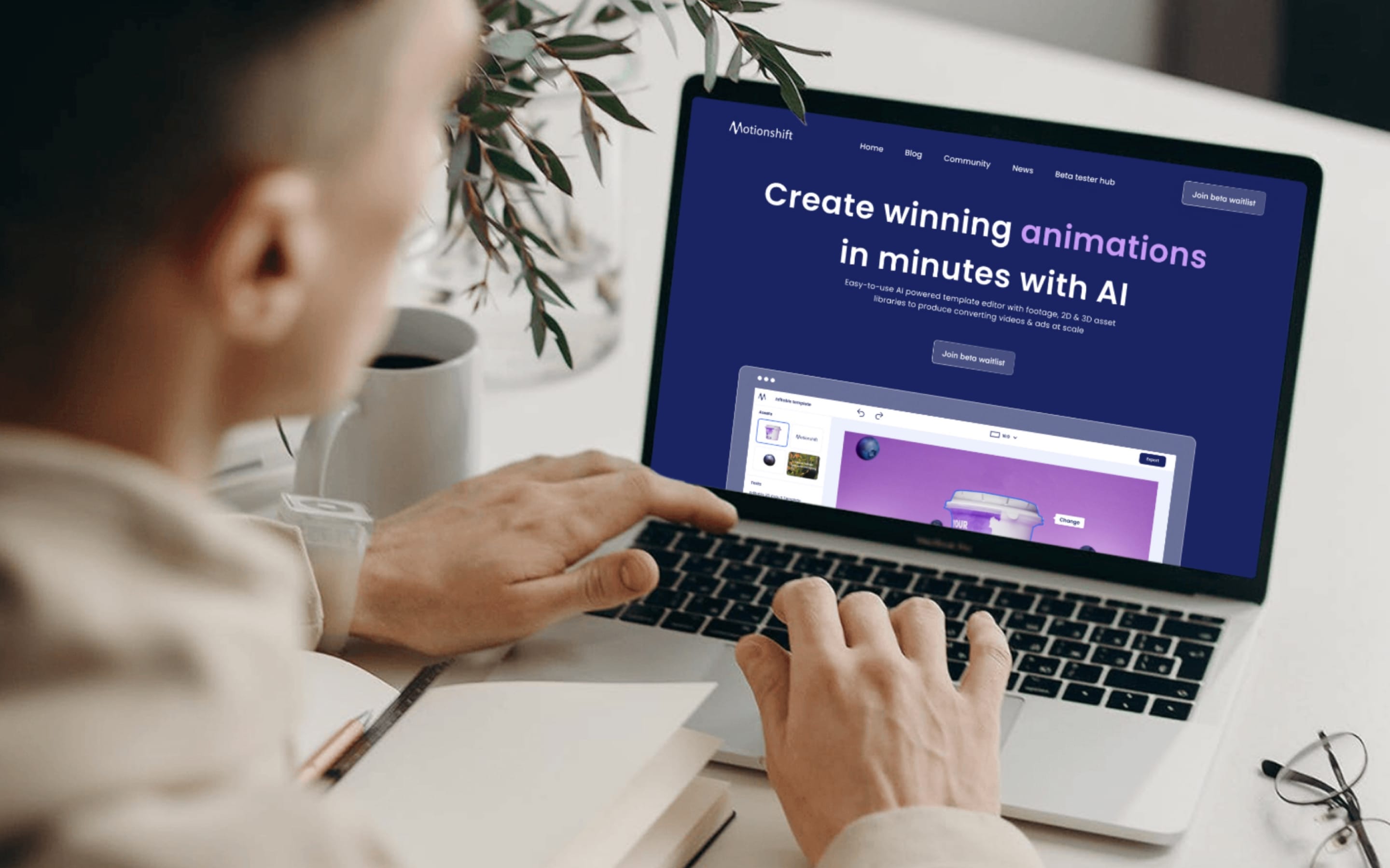 AIMotionshiftUnlocking AI-powered video & animation.Product & Design / Website / AI & Agentic