
Flygen
EnglishČeštinaDanskFrançais
Let’s talk

Eyra CopenhagenMade to order, printed in advance.
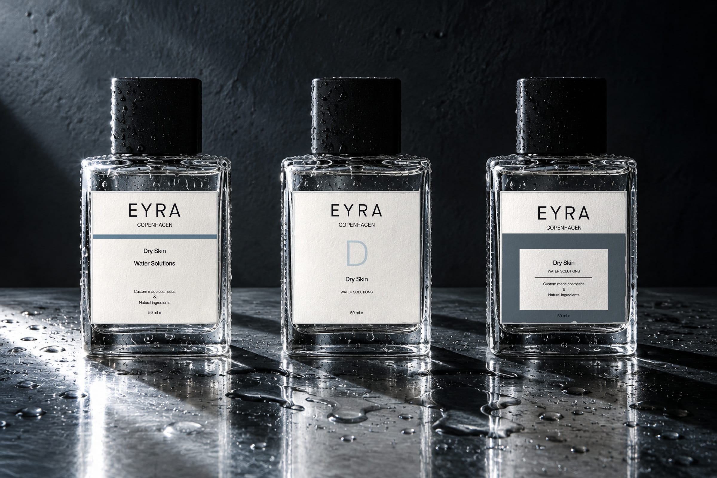
AI-generated visual: three identical flat glass bottles with square matte black caps standing on a wet brushed steel bench against a near-black wall, one hard shaft of cold daylight raking in from the left across the water and throwing three long shadows. The bottles, the bench and the light are generated; the label artwork on them is Lucie Krulich’s 2020 Eyra design, rendered from vector and composited onto faces that were generated blank — a blue rule on the first, a pale blue initial D on the second, and a slate field with a white type panel inset on the third.

At a glance

Design thinking
Pre-print everything that has to look like a brand; overprint only what the customer decided.
Problem
A made-to-order cosmetic has no fixed SKU, so the label carries a formula nobody knew about an hour ago.
Approach
Measure the 2020 artwork, redraw it, and take the packaging to dimensions a label printer can quote.
Outcome
A delivered 2020 identity, redrawn and refined, and a 2026 packaging system drawn to dimensions.
Role
Client work for Eyra Copenhagen, 2020. The refined mark and the packaging system are Flygen’s own, drawn in 2026.
What we designed
  • A logotype built from one circle and one arc
  • Three label architectures, eight colourways
  • A fixed shell and a variable formula strip
  • The counter where the formula is mixed
Duration
Two weekends, 2020

One circle, one arc, three arms.

A circle, a semicircle and an E. The arc’s ends land on the outer edges of the top and bottom arms, and its crown passes through the circle’s centre.
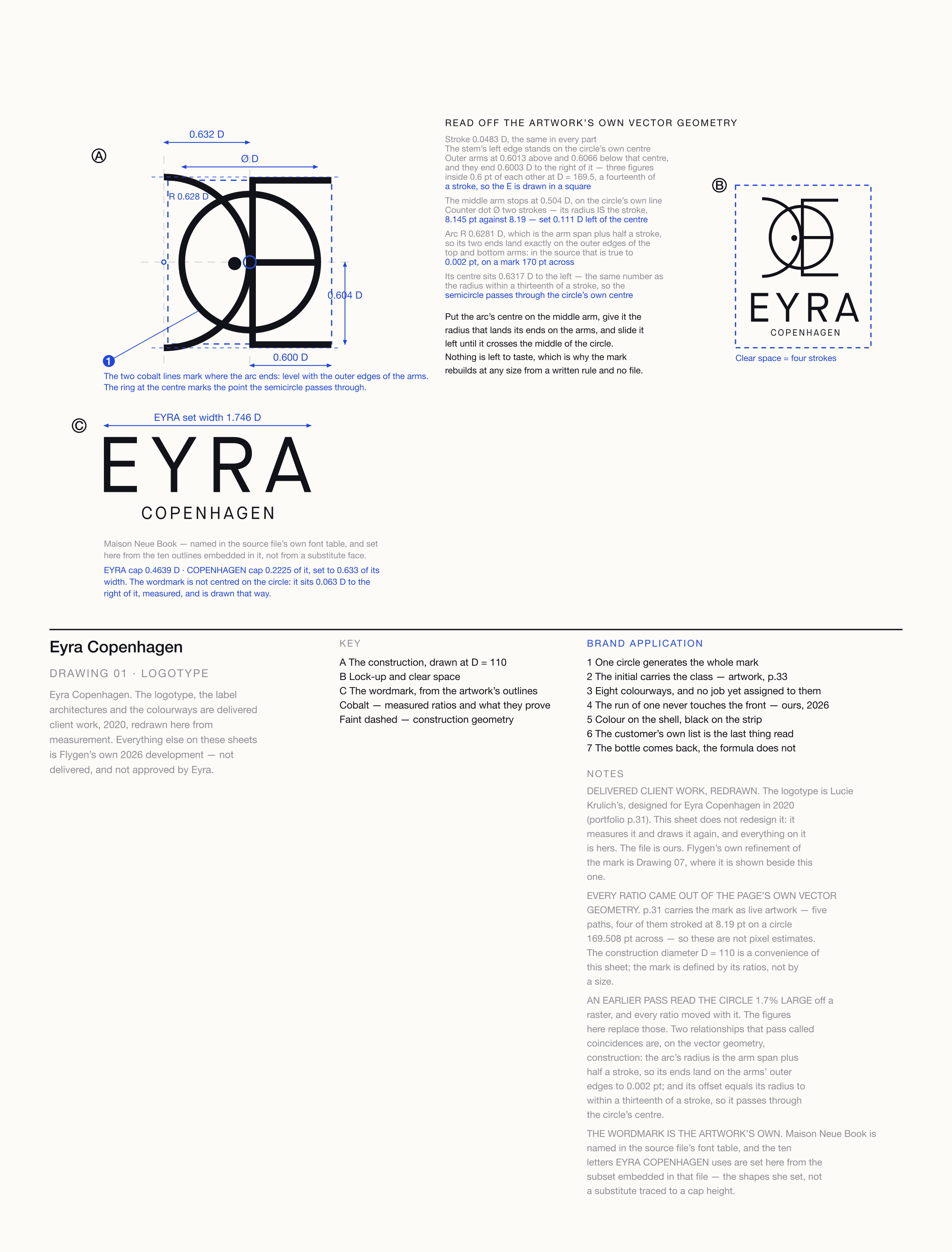
A technical sheet titled Eyra Copenhagen, Drawing 01, Logotype: the mark drawn large as a construction inside a dashed square with its measured ratios dimensioned in blue, markers where the arc ends level with the arms and where it crosses the circle’s centre, the lock-up inside its clear-space box, and the wordmark set at size from the artwork’s own outlines.

Three labels, eight colourways.

Three ways of carrying the colour: a rule under the lock-up, the skin-type initial itself, a field with a white panel inset. Each is redrawn from the 2020 sheets and set at a size where the type can be read.
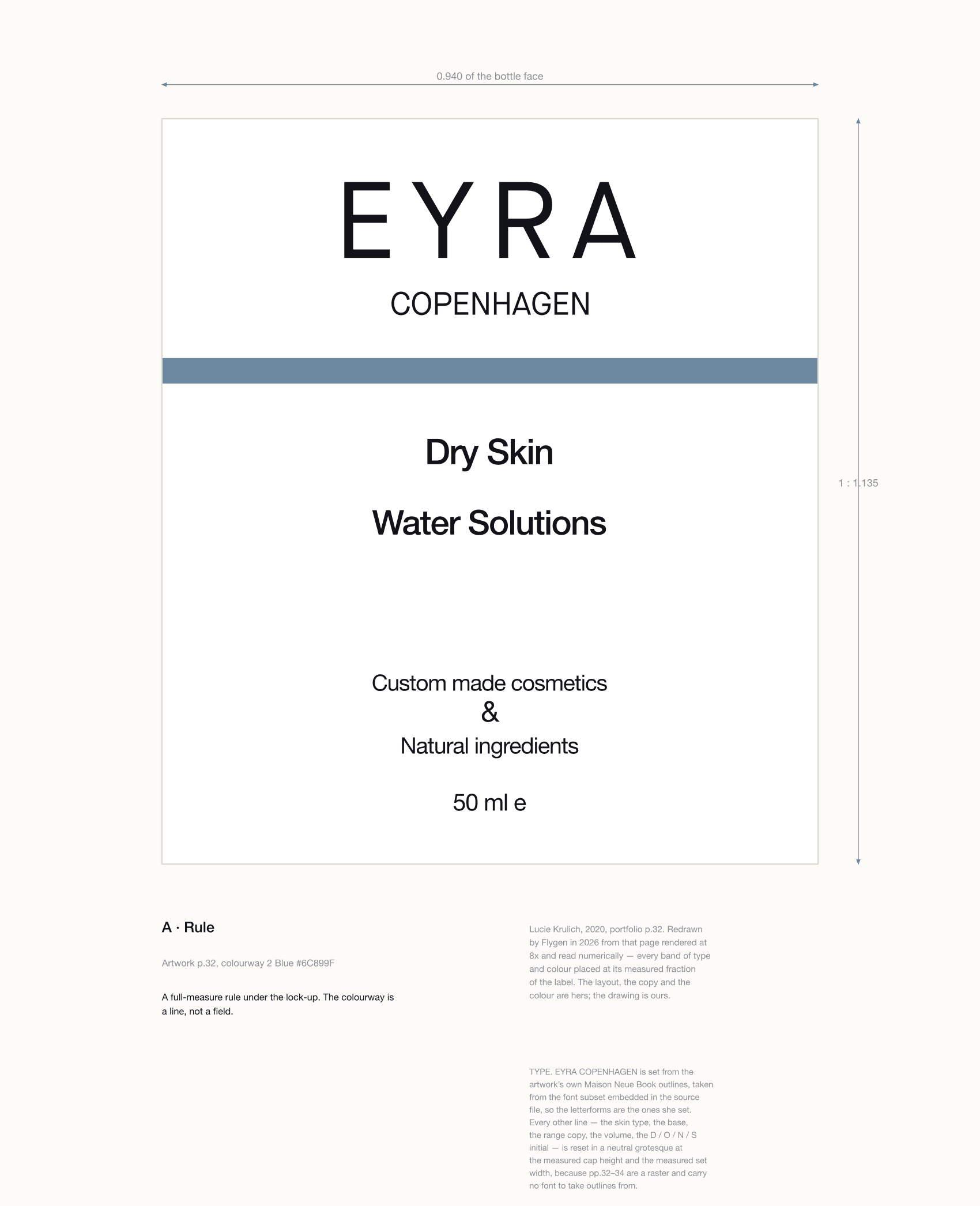
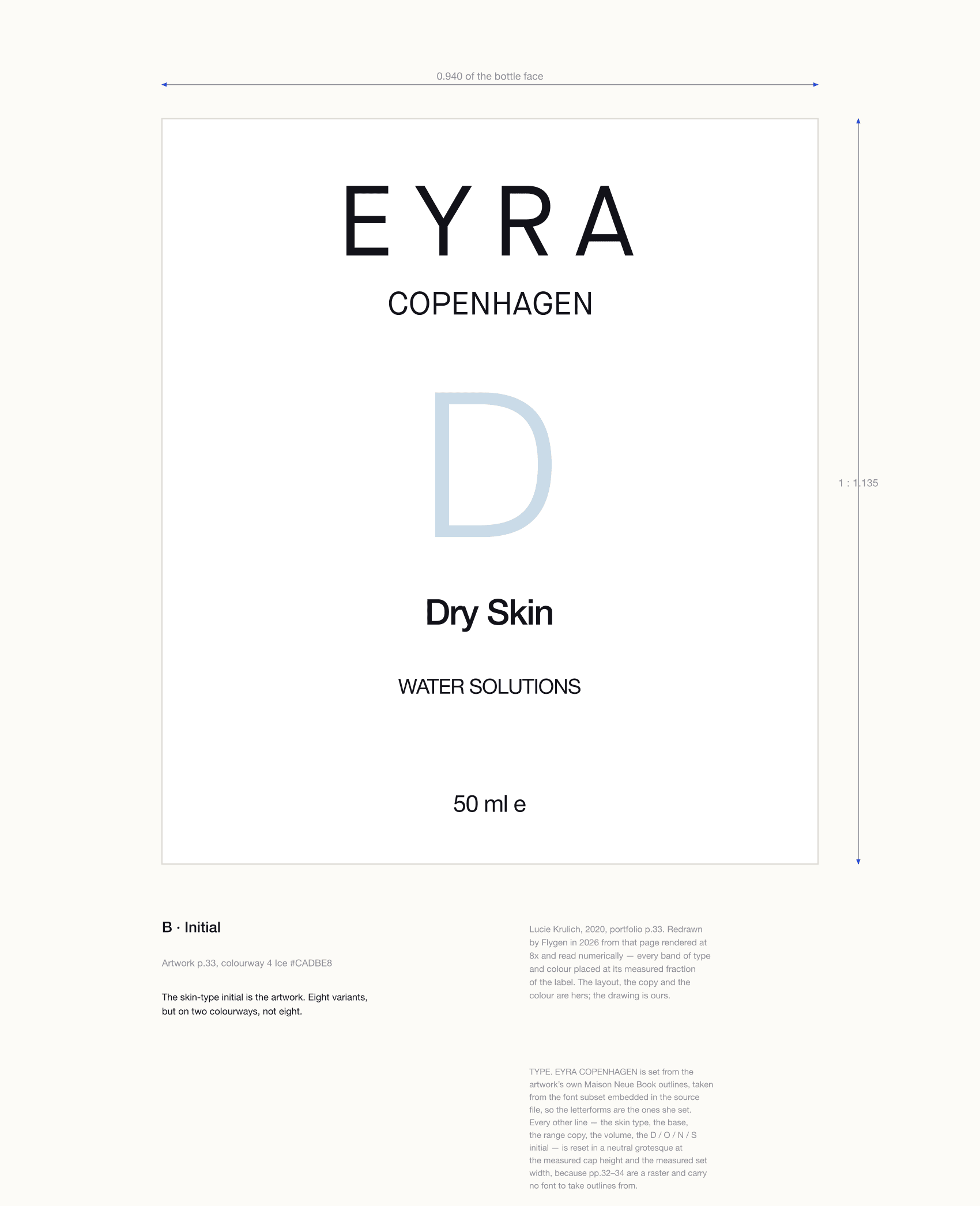
A drawn label plate: the EYRA COPENHAGEN wordmark at the top of a white label, a full-width blue-grey rule beneath it, then Dry Skin, Water Solutions, Custom made cosmetics & Natural ingredients, and 50 ml e.
01A · RuleThe colourway is a line, not a field. Artwork p.32, redrawn.
A drawn label plate: the EYRA COPENHAGEN wordmark at the top of a white label, a large pale blue letter D below it, then Dry Skin, WATER SOLUTIONS and 50 ml e.
02B · InitialThe skin-type initial does the work. Artwork p.33, redrawn.
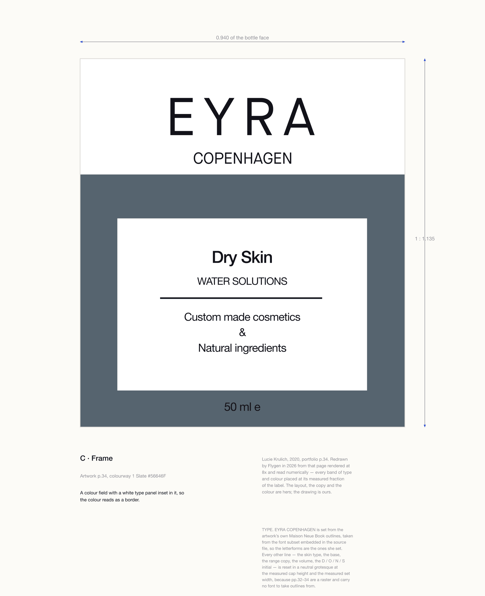
A drawn label plate: the EYRA COPENHAGEN wordmark on white at the top of the label, then a slate field filling the lower two thirds with a white type panel inset in it carrying Dry Skin, WATER SOLUTIONS, a rule and the range copy, with 50 ml e on the slate below.
03C · FrameThe colourway is the ground, with the type in a window cut out of it. Artwork p.34, redrawn.
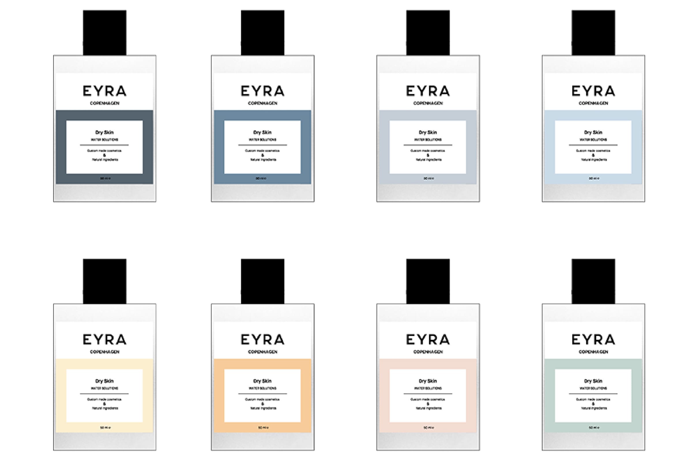
Eight bottle mockups in two rows of four, each with a solid colour field filling the lower two-thirds of the label and a white type panel inset within it, in dark slate, blue, pale grey-blue, light blue, cream, amber, blush and sage.
04Portfolio p.34The source, as handed over: the sheet the eight colours were sampled from.
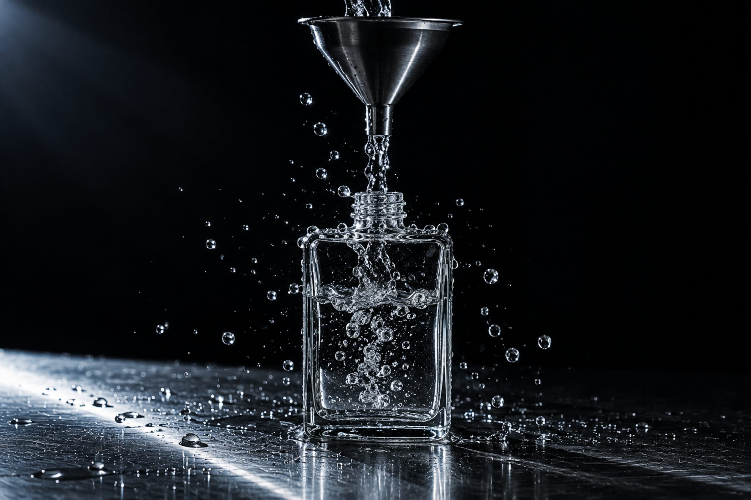
AI-generated visual: a bare glass bottle on wet steel, almost black around it, being filled from a steel funnel — a clear column of water falling into it and droplets scattering, lit by one hard cold light.
Made to order means filled to order.

Redrawn at the weight of its own name.

The stem steps clear of the arc. The counter dot goes. The circle is drawn at the weight of the E’s own stem.

Every letterform is hers. The changes are ours.
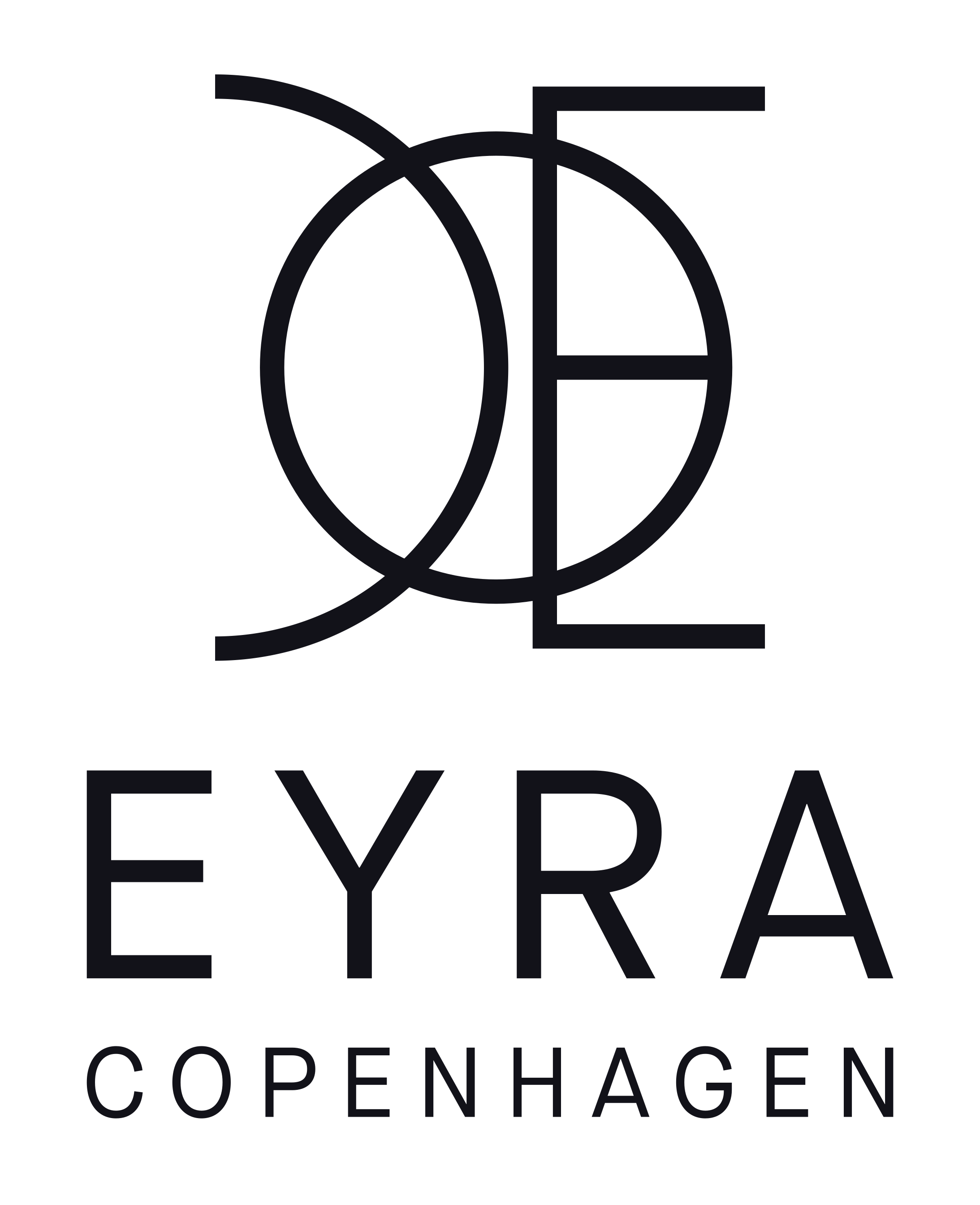
The refined Eyra Copenhagen logotype drawn as clean vector: a circle crossed by a vertical stem and three horizontal arms forming an E, with a channel of light between the stem and the arc that sweeps through the circle, and beneath it the wordmark EYRA above COPENHAGEN, the second line a third of the first’s height and tracked to its width.

Eight colours, respaced to a ladder.

Her eight colours sit inside eleven points of lightness, so the set has no top and no bottom. Respaced to a ladder, keeping every hue and chroma.
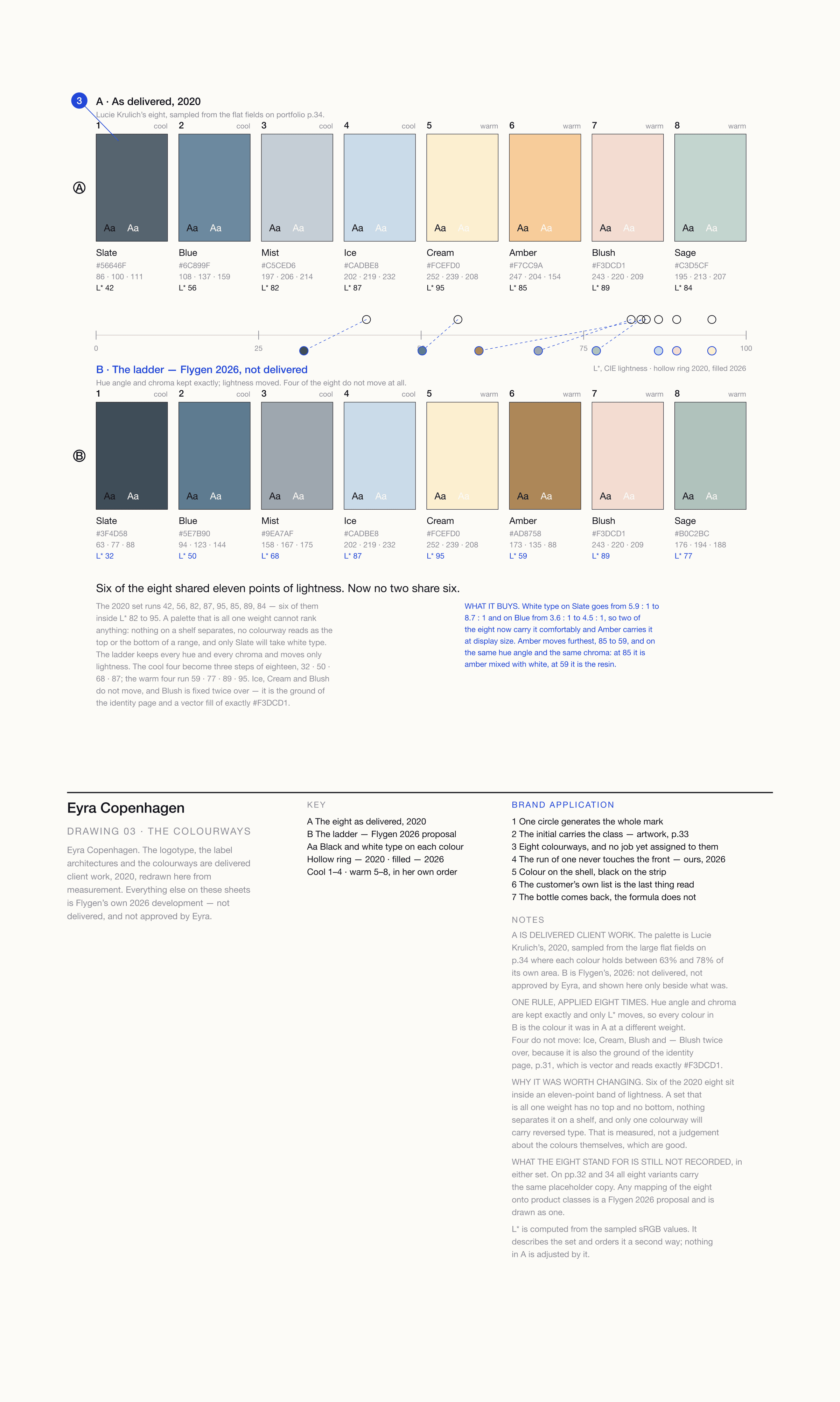
A technical sheet titled Eyra Copenhagen, Drawing 03, The colourways: the eight colours as delivered in 2020 along the top with their hex, RGB and CIE lightness values, the adjusted 2026 ladder along the bottom with the same values, and between them a single lightness axis from 0 to 100 on which the 2020 set is plotted as hollow rings bunched at the light end and the 2026 set as filled circles spread along it, joined by dashed leaders.

A fixed shell, and a strip that changes.

A 45 × 51 mm shell, printed offset ahead of any order. Only the formula strip is overprinted, at the counter, for one person.
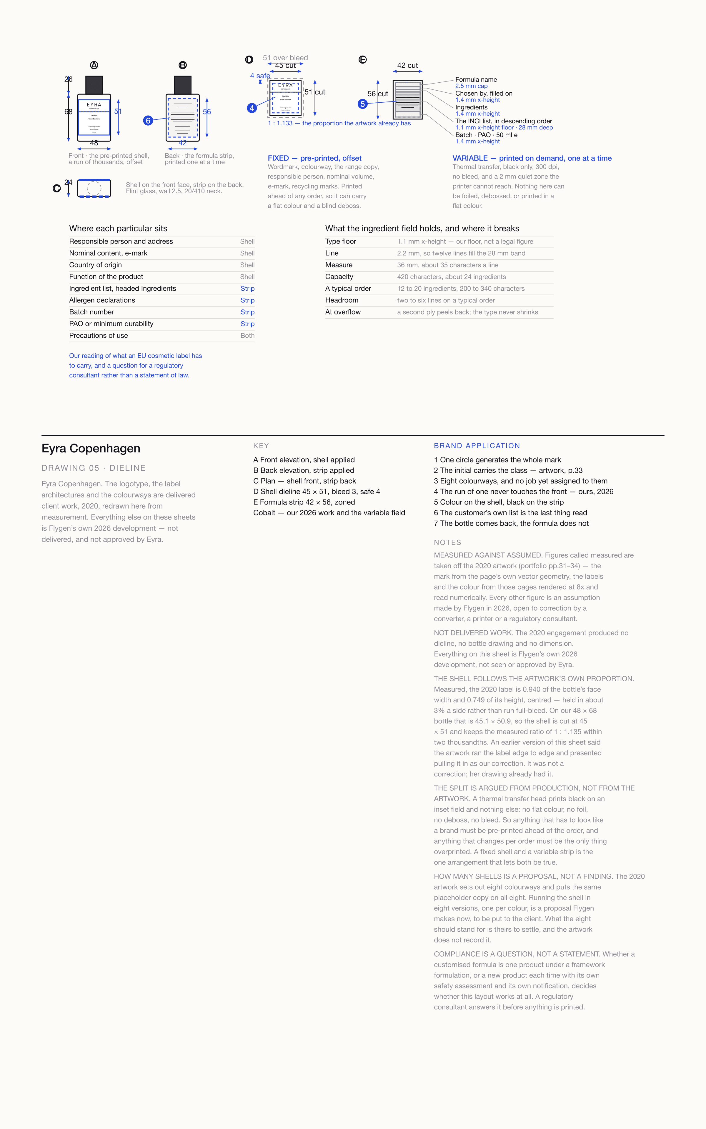
A technical sheet titled Eyra Copenhagen, Drawing 05, Dieline: the bottle in front and back elevation and in plan with the shell and strip applied, the shell dieline with its bleed and safe margin, the formula strip broken into its five zones with the type size against each, a table of what the ingredient field holds, and a table of where each labelling particular sits.

Next project

TambourAn event identity that cannot peel off.

Tambour case study cover