

La-BohèmeConferences, events and travel with a touch of magic.
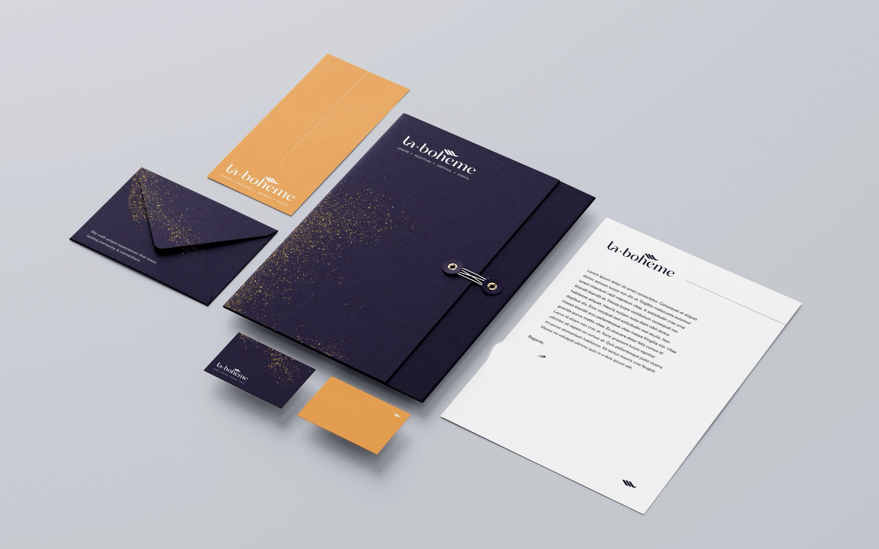
At a glance
- Design thinking
- Show the experience before naming a single service, then prove the logistics will hold.
- Problem
- The brand had gone fifteen years unchanged. It had to become playful without losing the sophistication high-end travel depends on.
- Approach
- A brand workshop set the direction, and the website moves visitors from anticipation to discovery to reassurance.
- Outcome
- The identity is documented in two manuals and the website is live. The wider programme continues.
- Role
- Lucie as the only design and project lead, working directly with the client.
- What we designed
- Brand workshop
- Logo design
- Visual identity
- Brand manual
- Website design
- Platforms
- Website
- Stationery
- Brand manual
- Communication manual
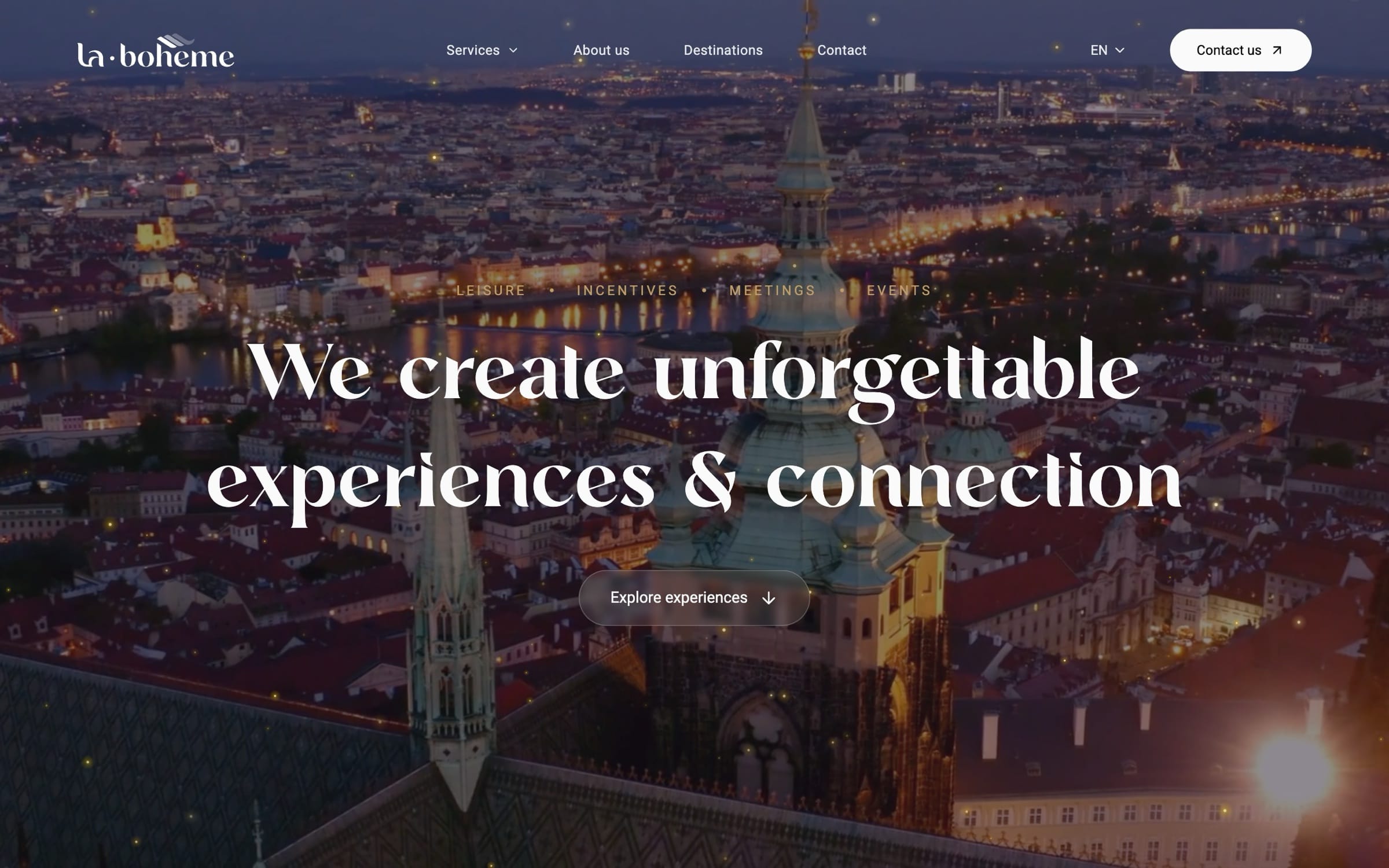
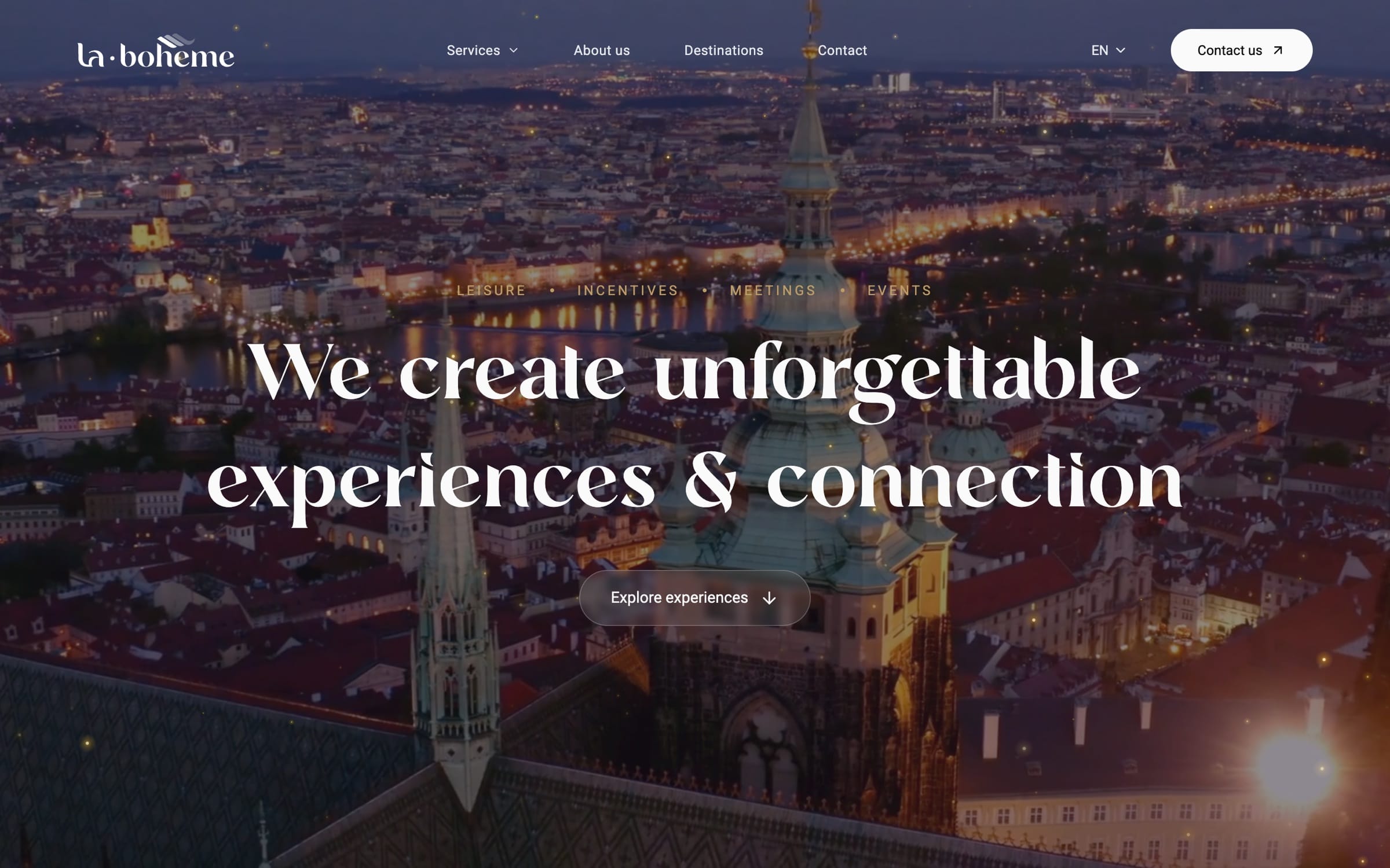
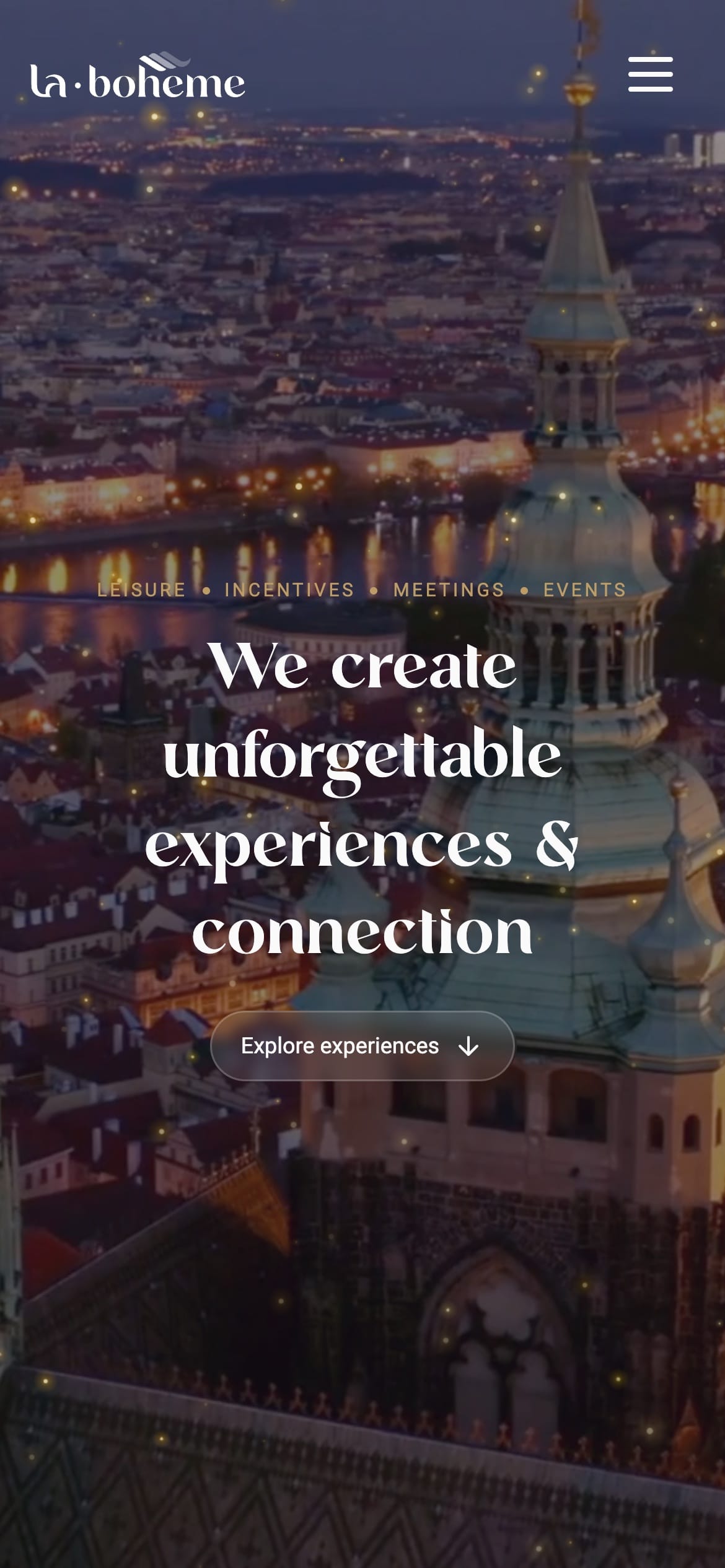
The first screen shows an evening before it names a service.
Full-screen footage cuts between destinations and the people in them. One serif headline holds still over it, and there is one thing to do, “Explore experiences”.
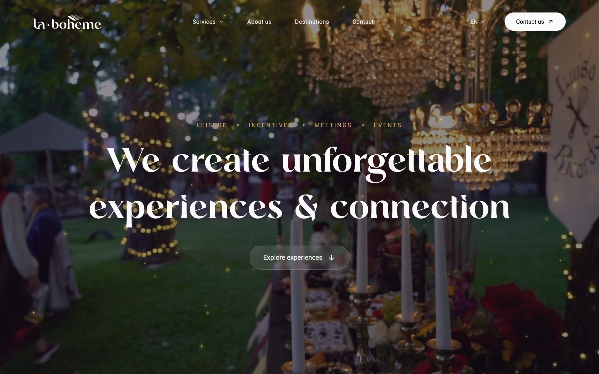
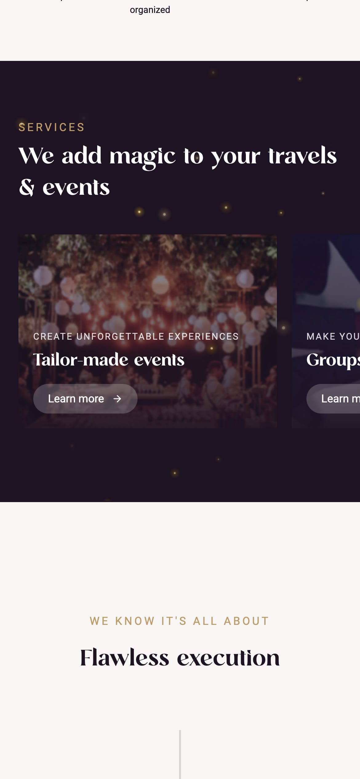
One service at a time, so none competes with the next.
Scrolling down moves the gallery sideways. Each card is one large photograph and one short line, a preview rather than a description.
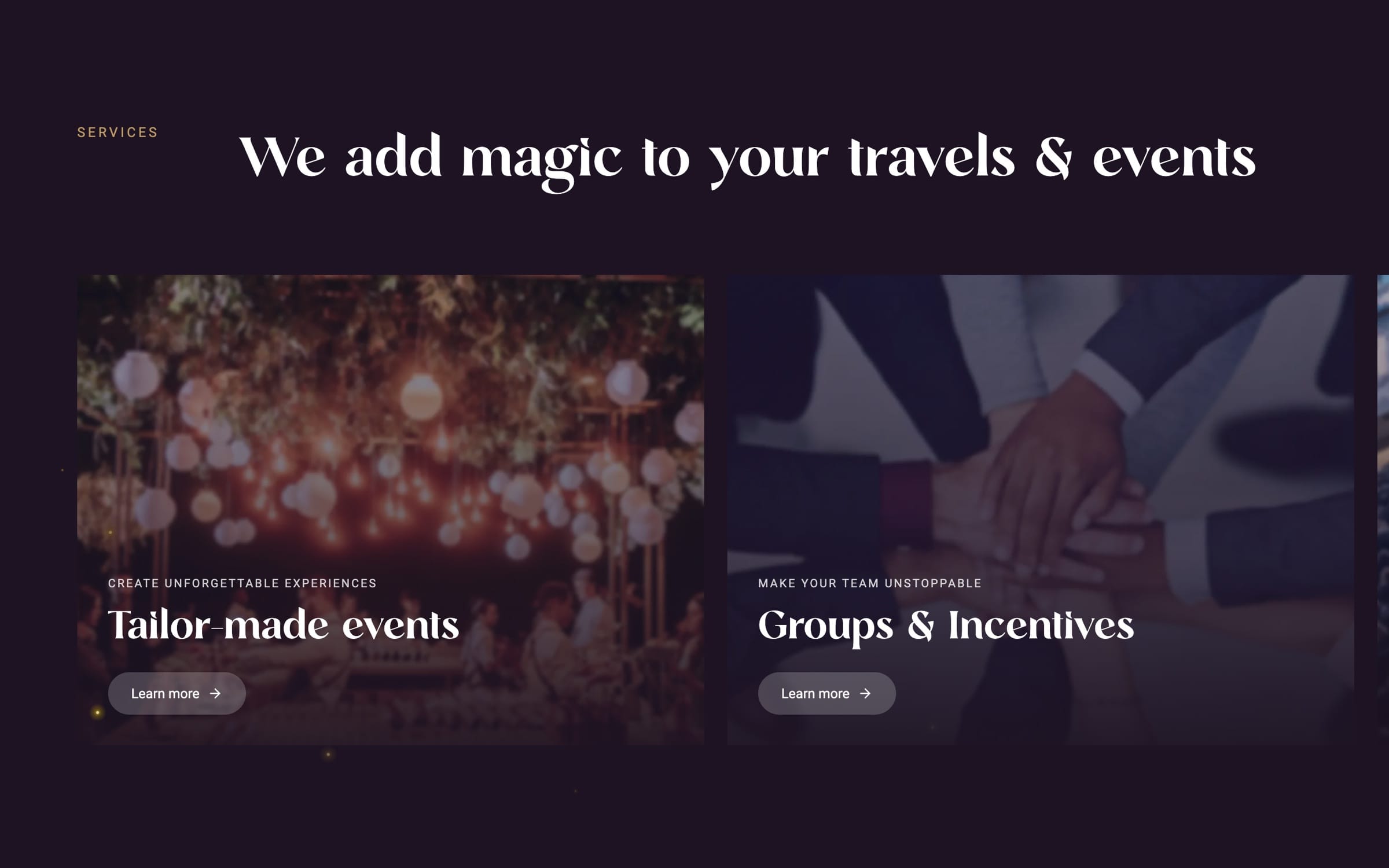
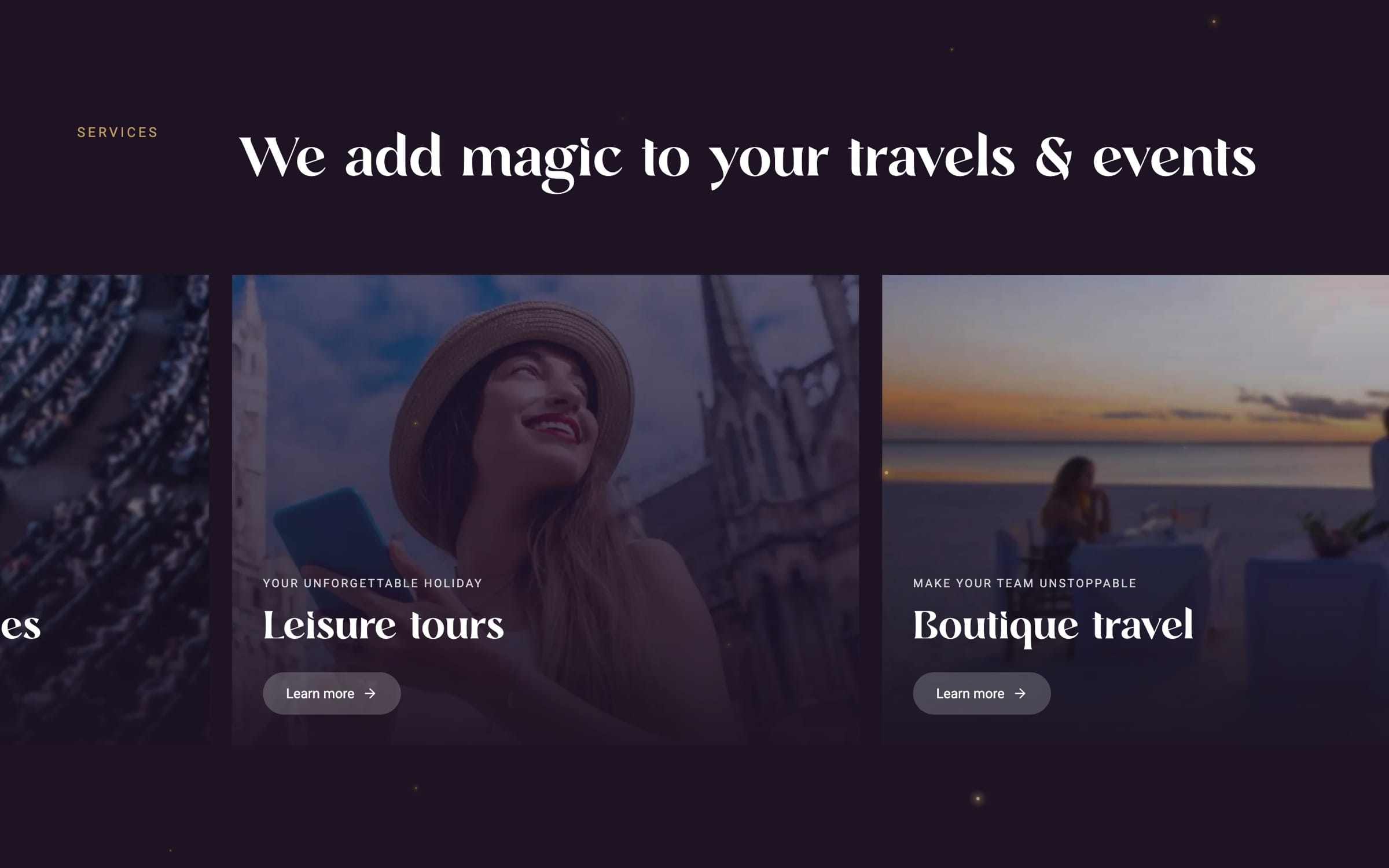
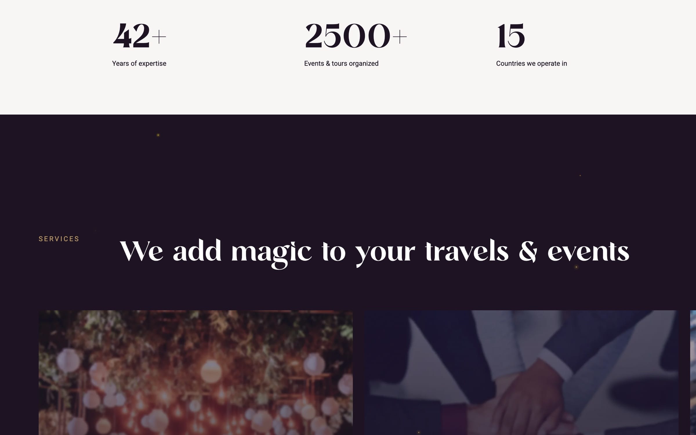
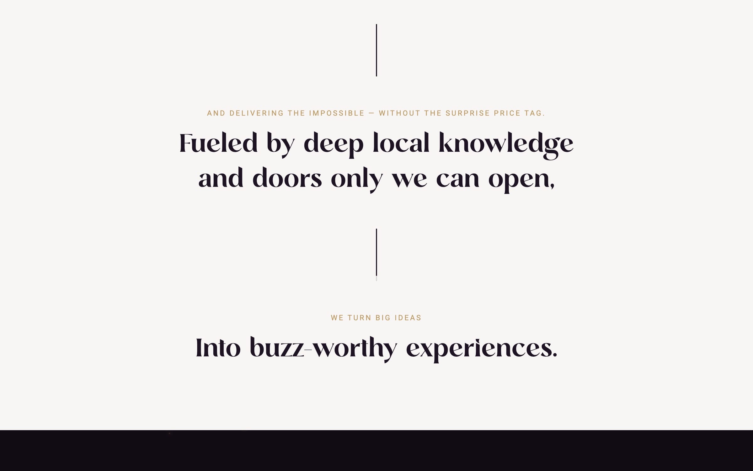
Dark sections carry the mood, and ivory ones carry the facts.
Specks of warm light recur on every dark section, so the magic is a detail you notice and never a claim. The figures sit in the ivory bands between them.
The decision
Runalto carries every headline, because this kind of travel is sold on taste.
It is a refined serif that feels timeless and new at once. Nunito Sans does the quiet work underneath.
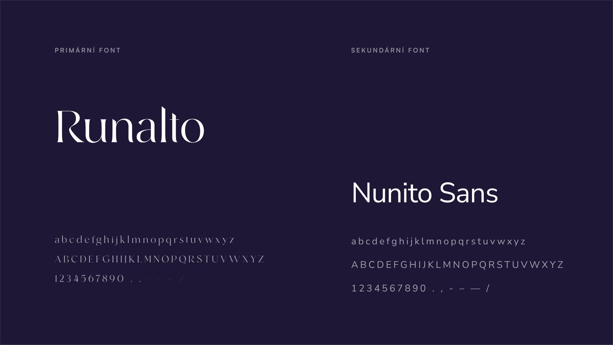
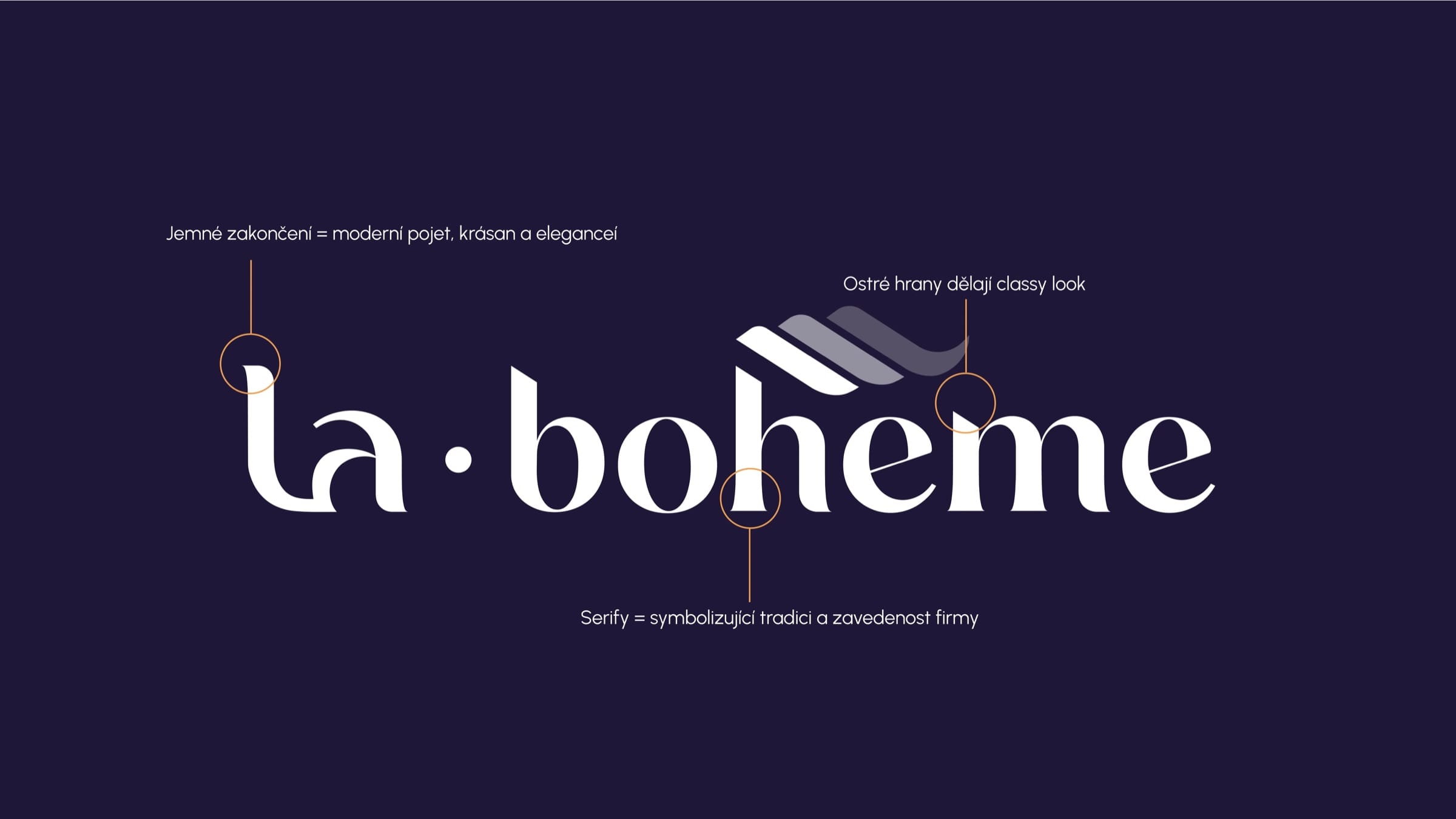
Classic serifs, with a modern edge.
Serifs give a company with decades behind it the weight it has earned. Gentle terminals and sharp edges keep it from looking dated, and the fan above the h adds the movement.
A composed palette with a spark of gold.
Midnight Velvet and Vltava After Dark keep the brand composed. Gatsby Gold brings the glamour of the era, and Ballroom Ivory gives the layouts somewhere to rest.
- Midnight Velvet#1D1322
- Vltava After Dark#1F1736
- Gatsby Gold#BE9C66
- Ballroom Ivory#F7F6F5
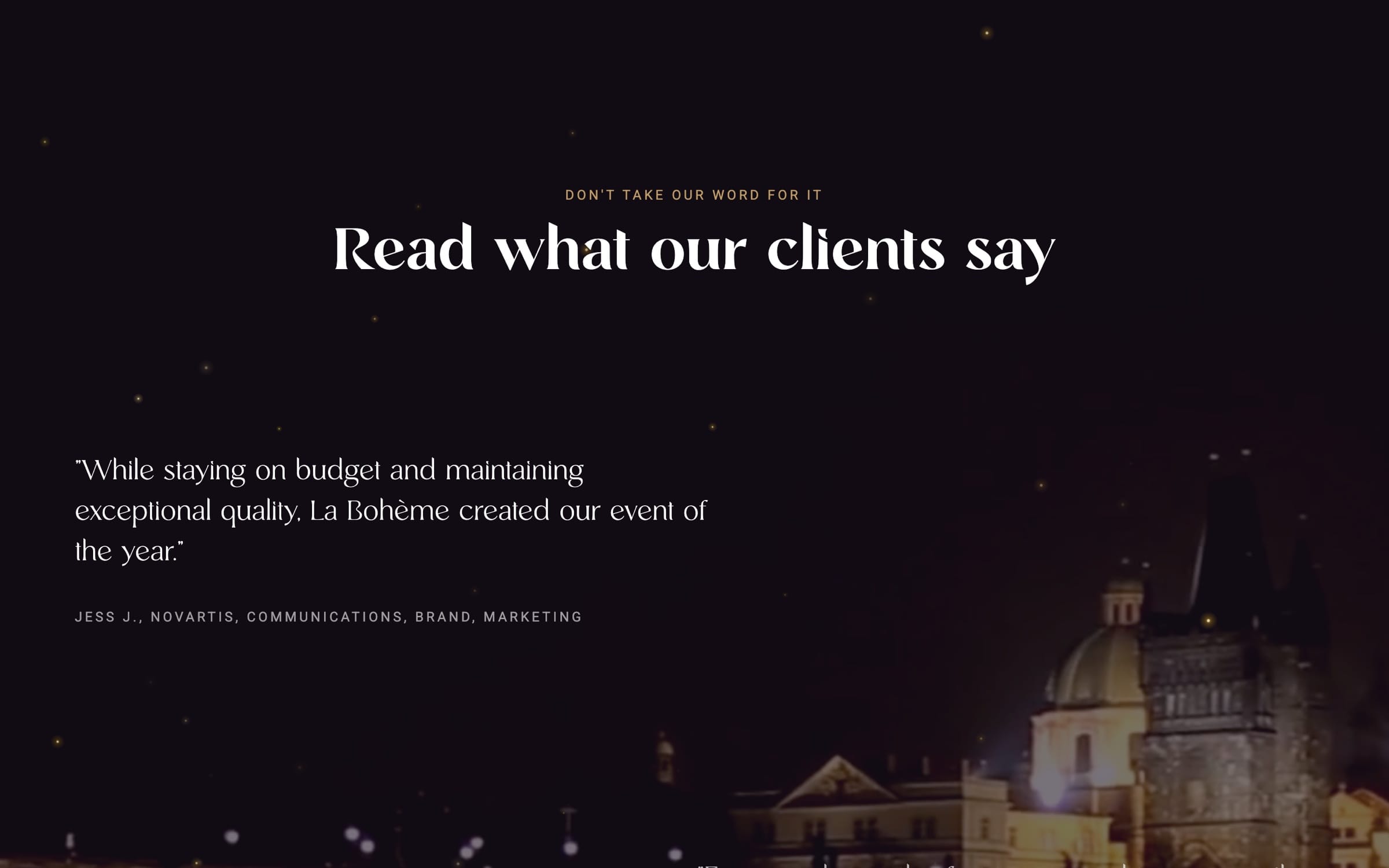
After the feeling, the proof.
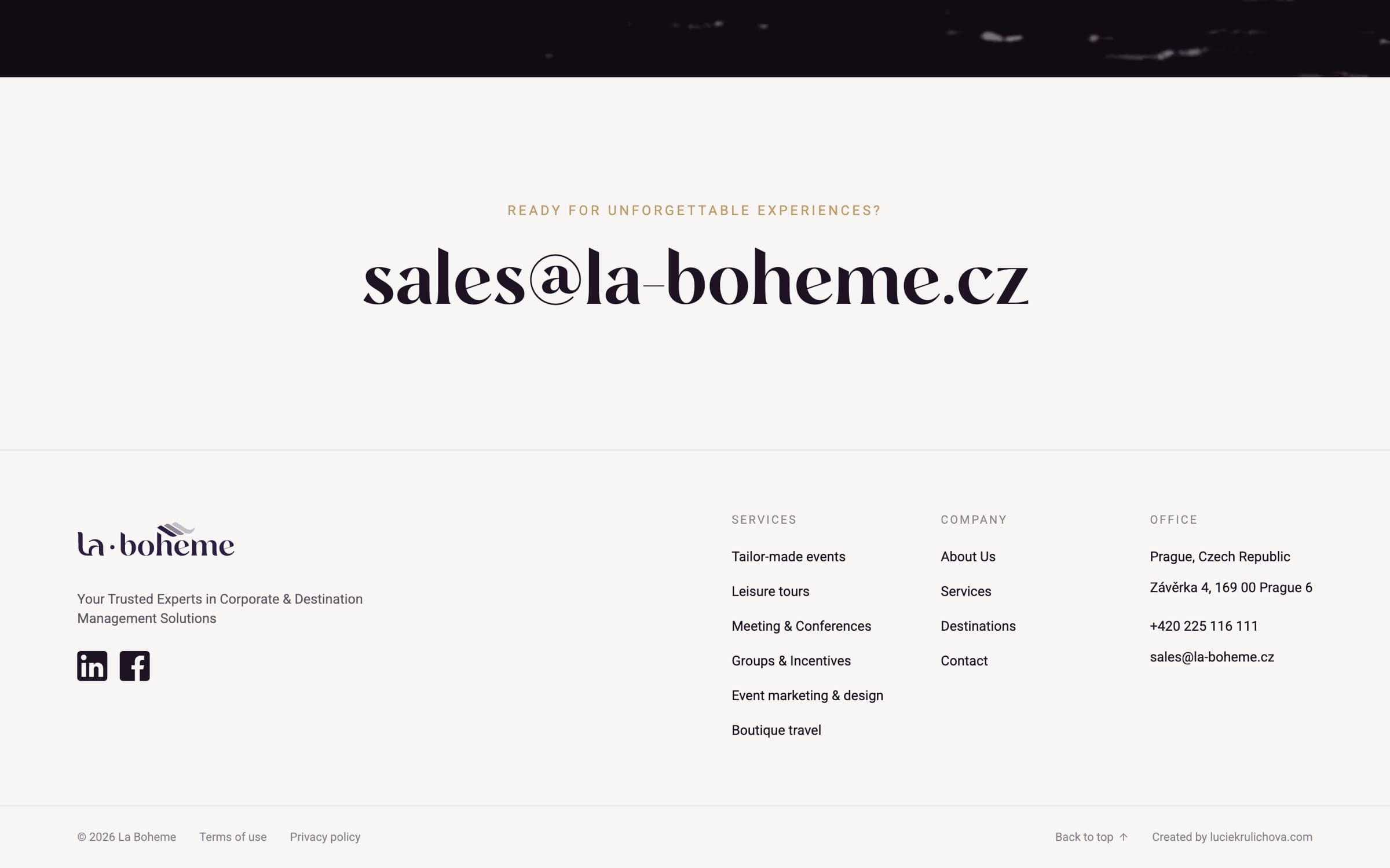
Footage makes people want it. It does not tell them the logistics will hold. So the lower half of the page hands over client logos, the company’s figures and what clients say about execution.
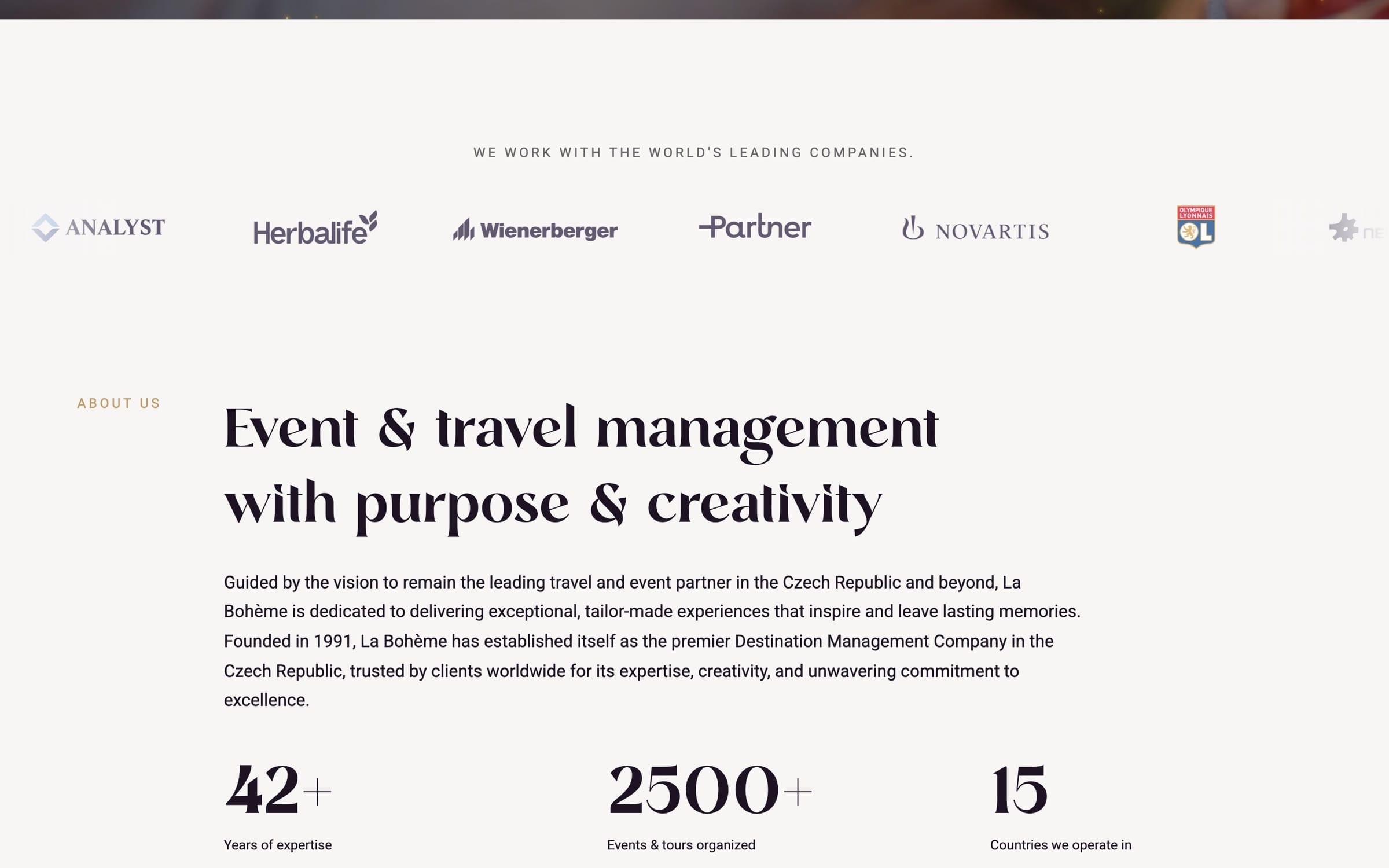
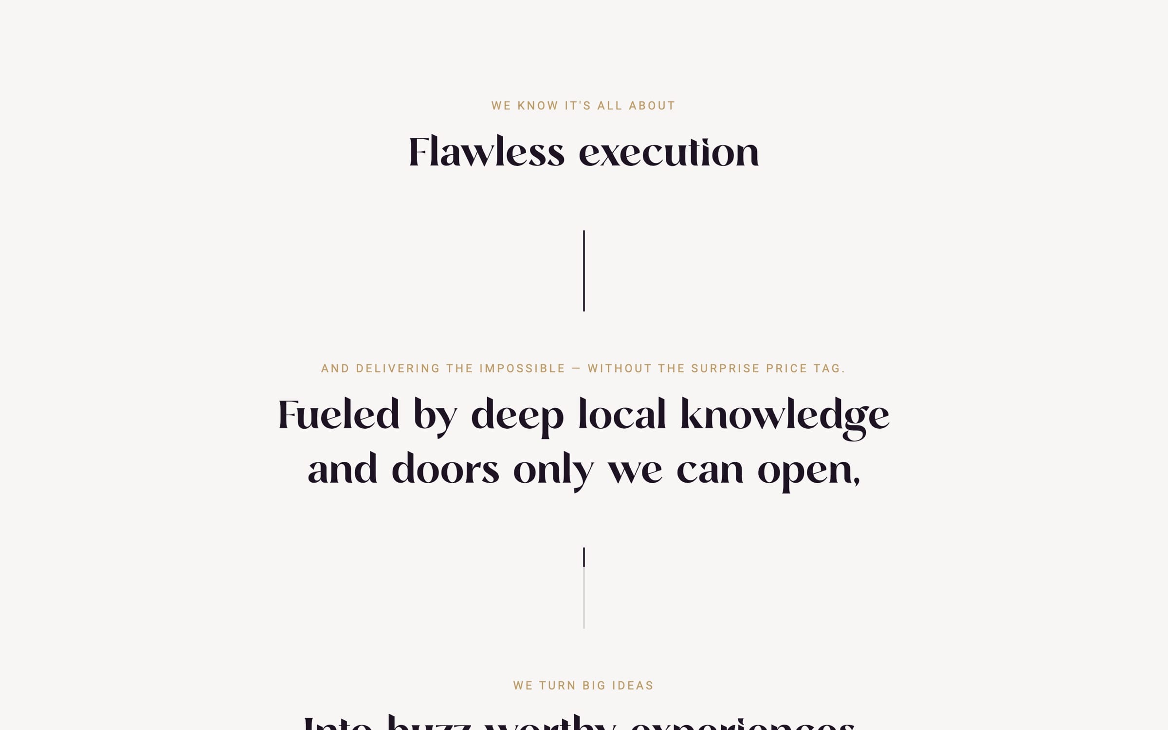
On a phone, the sideways gallery becomes a swipe.
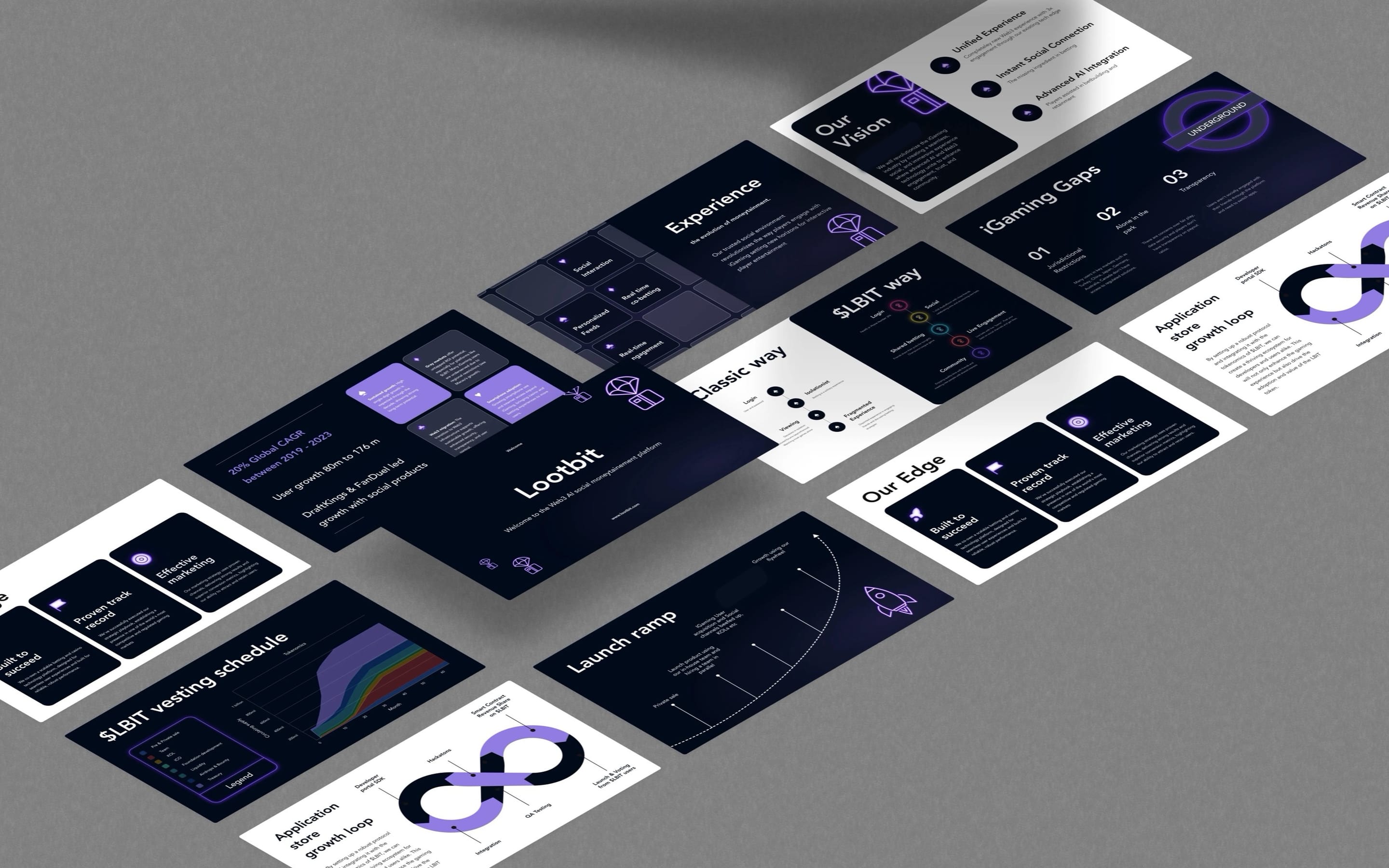
More work
All projects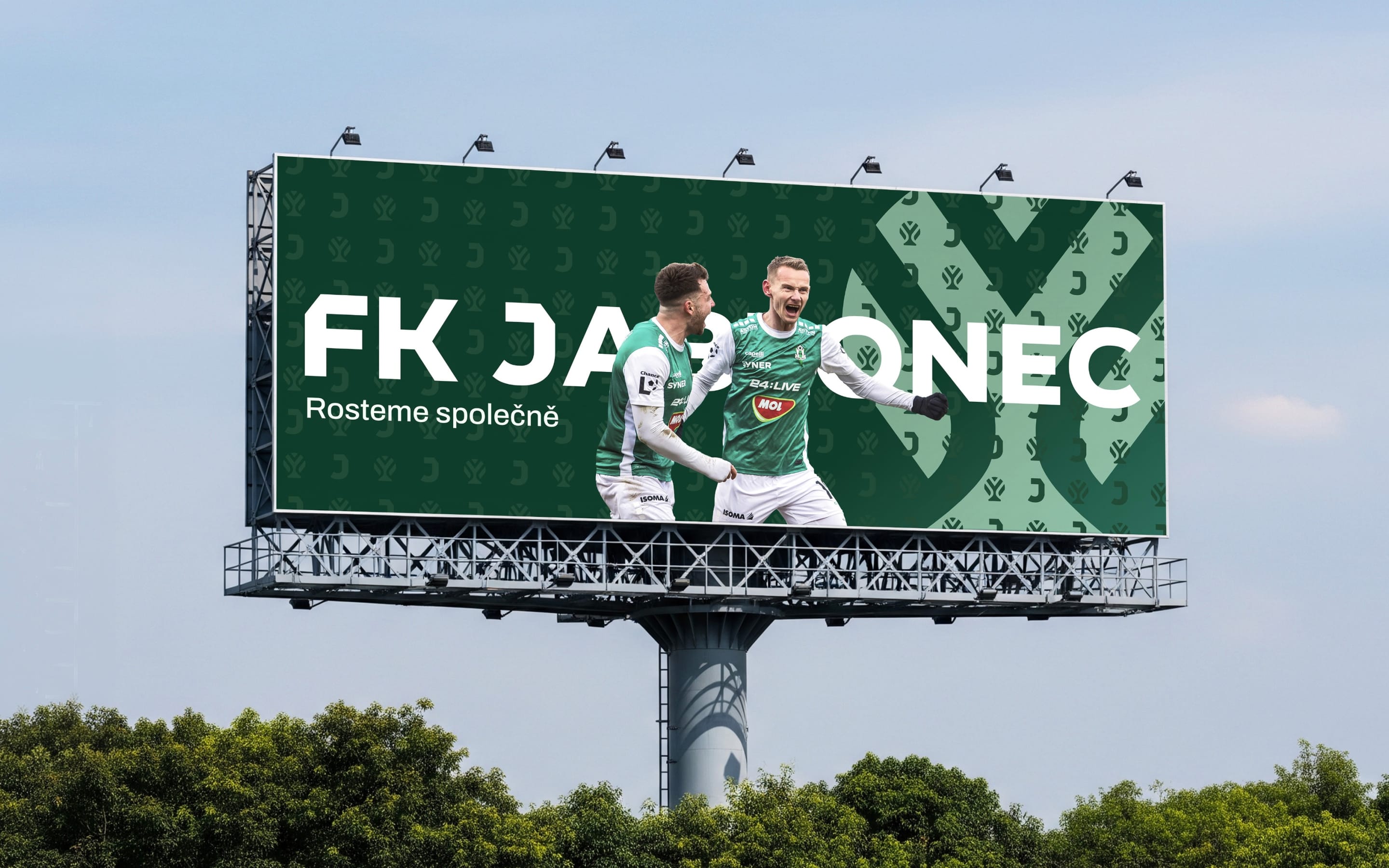 SportsFK JablonecJablonec never falls far from the tree.Branding / Campaign / Website
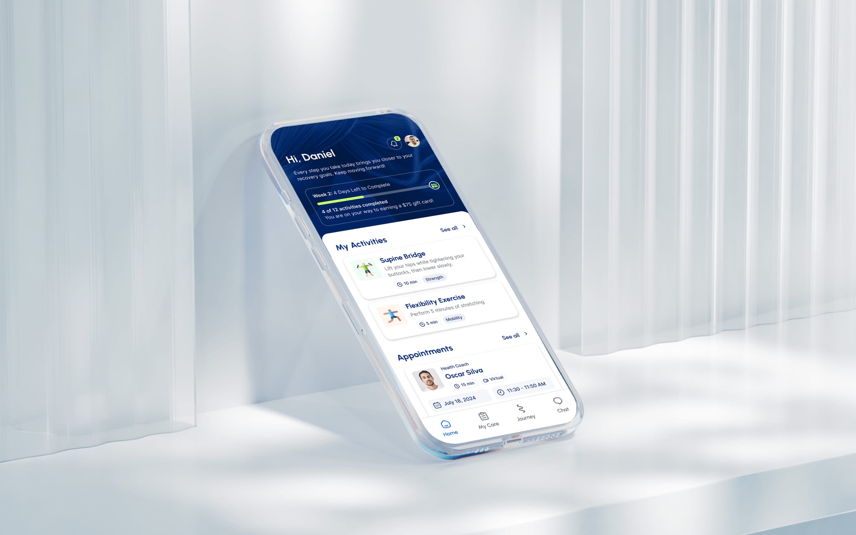 HealthMovidoA physio programme for the days between appointments.Product & Design / App
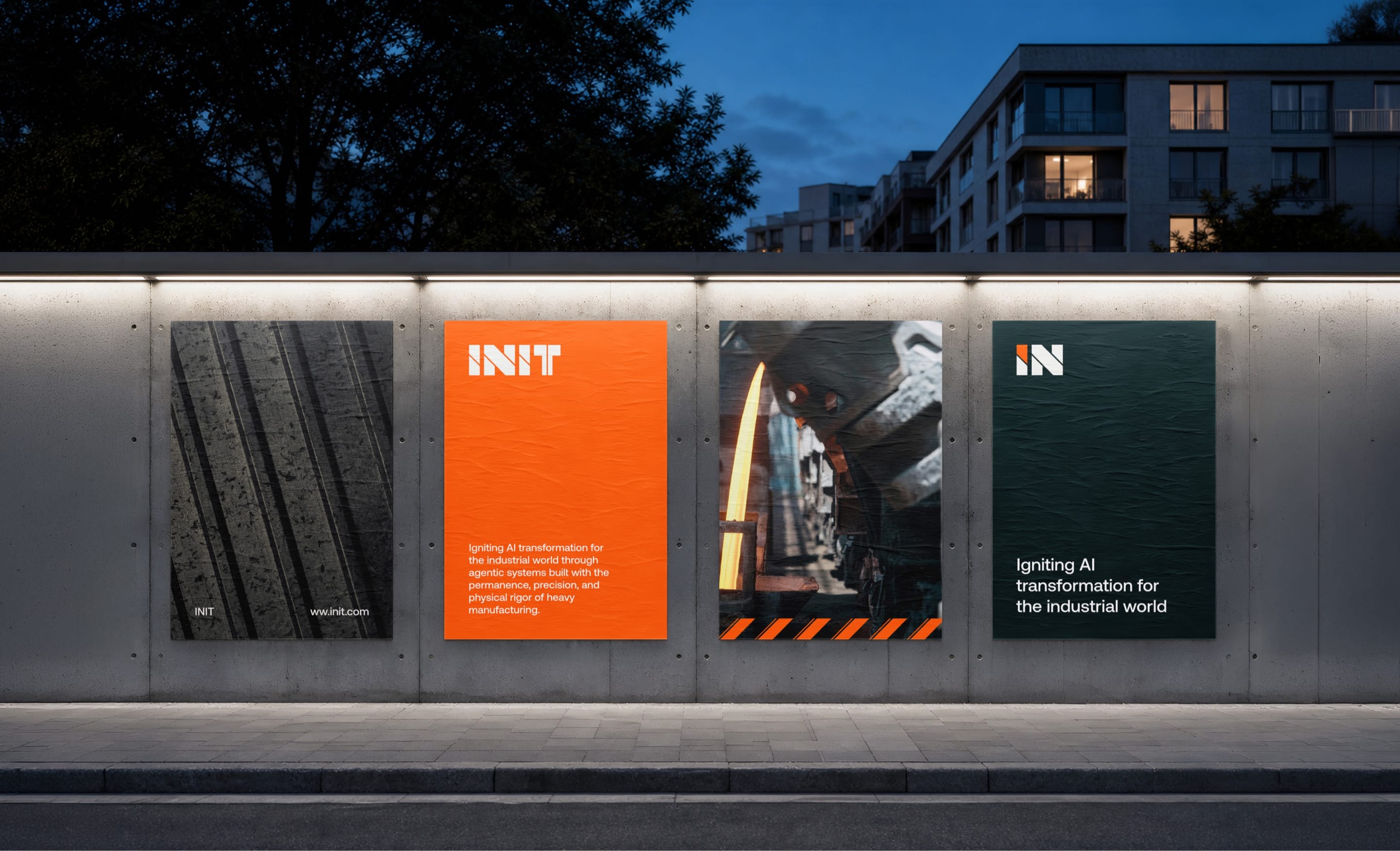 AIINITEngineering intelligence for the industries that build the world.Branding / Website
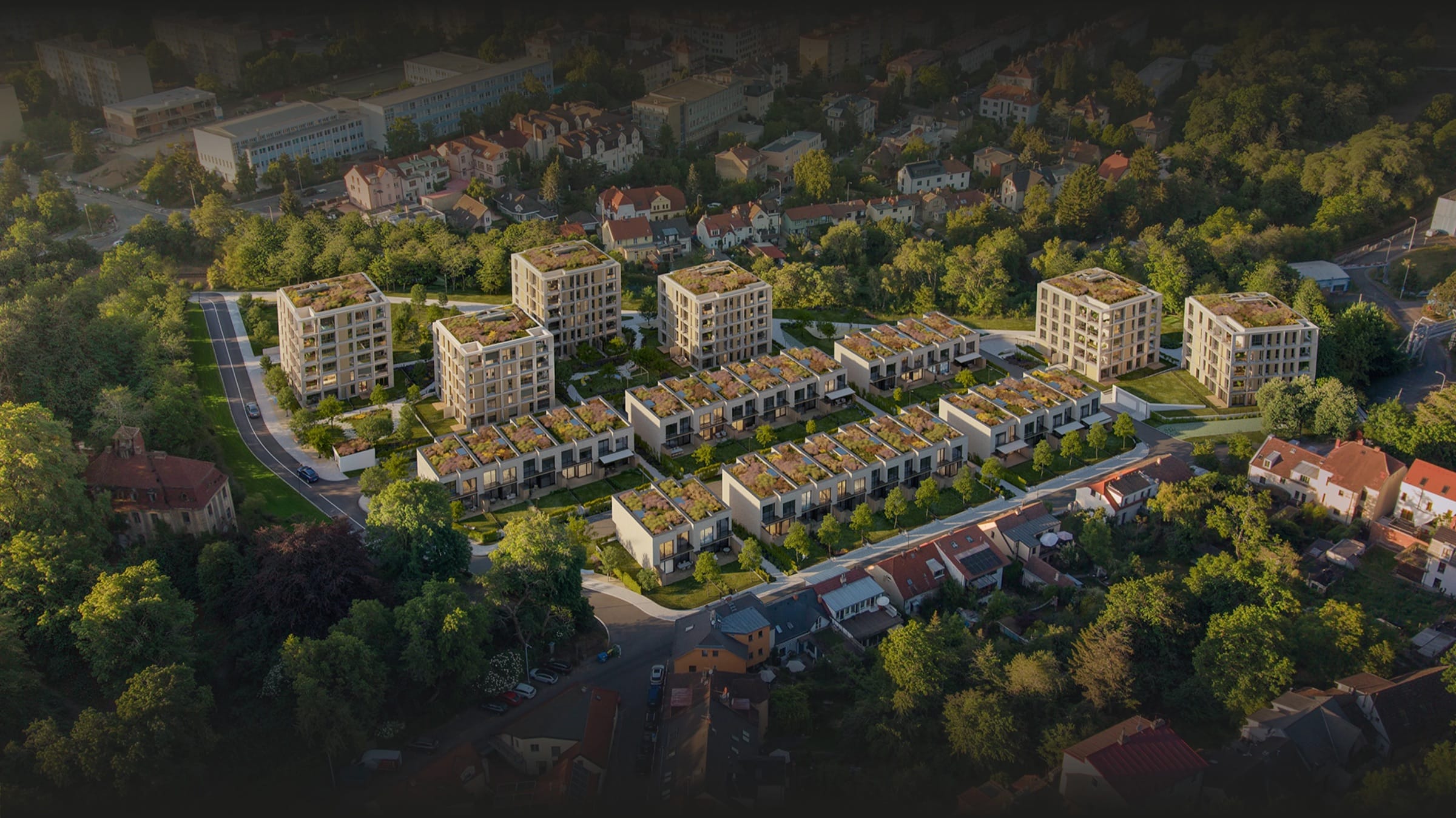 Real EstatePenta Real EstateAutomating apartment specification sheets.Engineering / Product & Design
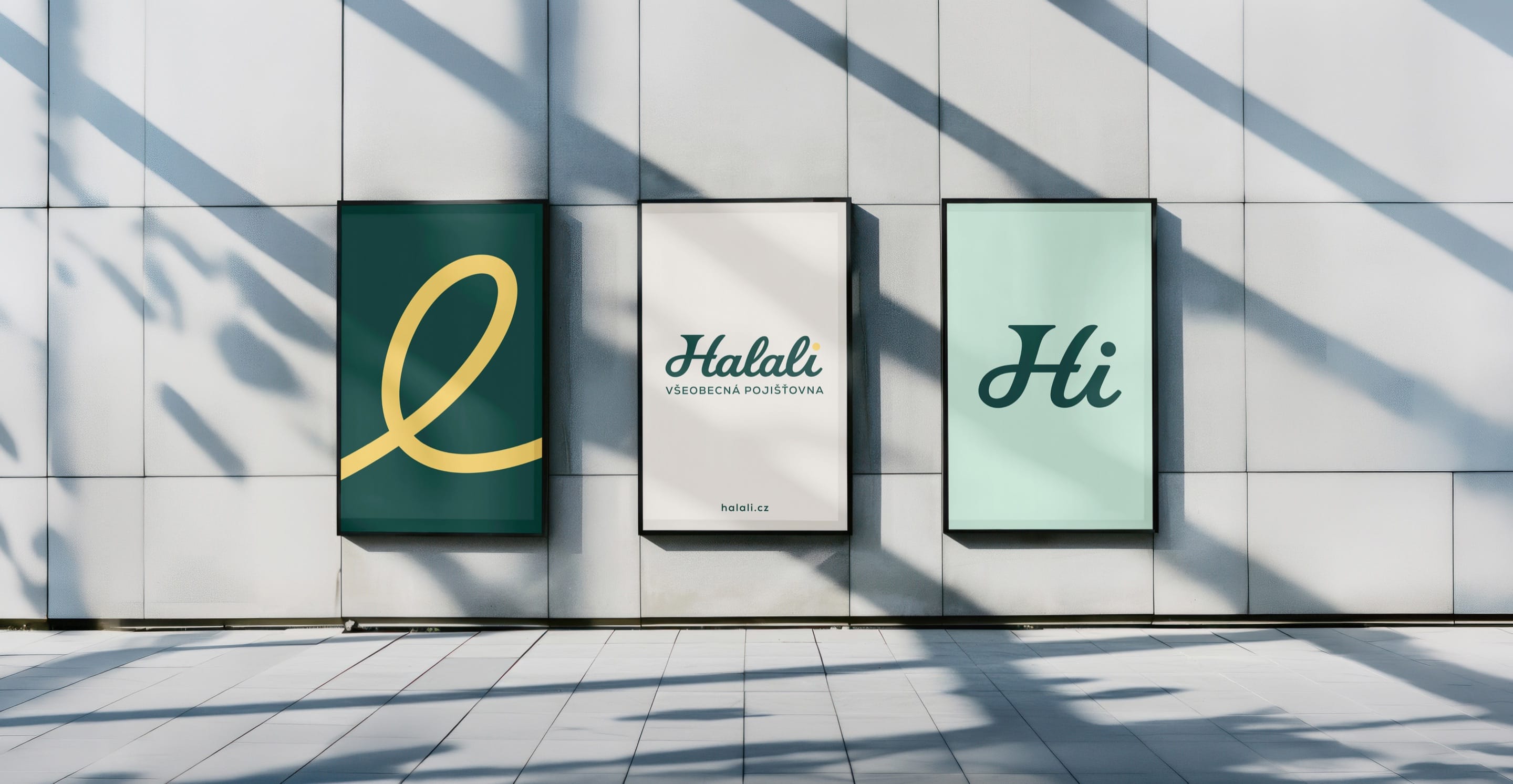 Financial ServicesHalaliEvolution, not revolution. A new identity built on existing trust.Branding / Campaign
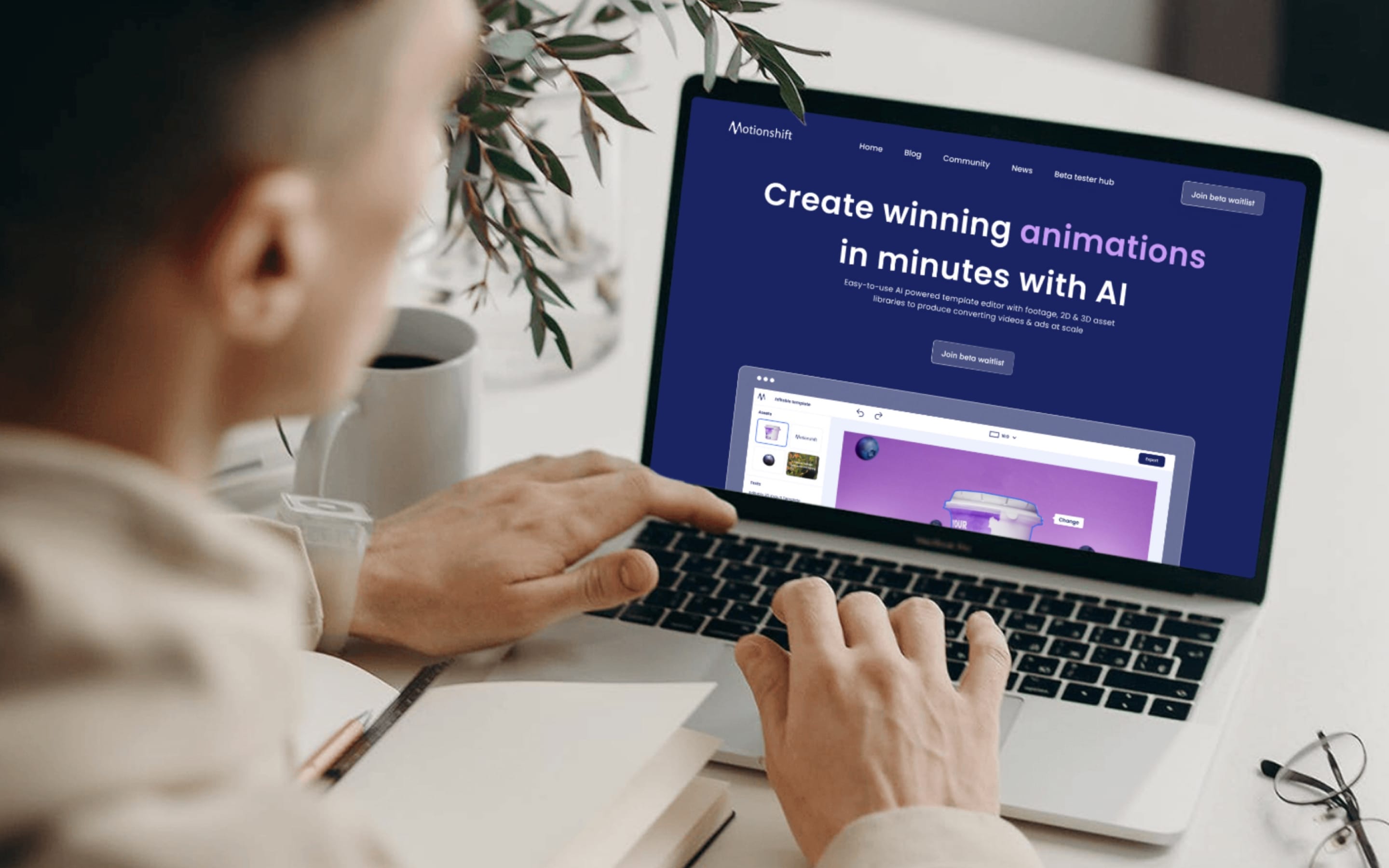 AIMotionshiftUnlocking AI-powered video & animation.Product & Design / Website / AI & Agentic